| Image |
Comment |
| 09/21/2008 10:24:16 AM |
|
 Photographer found comment helpful. Photographer found comment helpful. |
| 09/15/2008 04:26:33 PM |
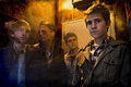
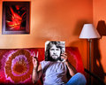
John's Funny Faceby SpongetoastComment: Hi, this is a comment from the critique club!
The expression of your buddy is pretty cute, but my experience learned that expressions like these don't really work here in challenges; this way it looks more like a snapshot.
The thing with challenges is also that you need to see the technique or subject in the entry what the challenge is about. I don't see "overexposed" in your photo, only the background, and that might just be in a studio.
Good luck in photography, I see in your other entries you have a good eye for good moments!! |
| Photographer found comment helpful. |
| 09/15/2008 04:12:50 PM |
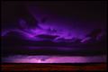
Fieryby zackdezonComment: Hi, this is a comment from the critique club!
Yes, this is overexposed. But looking at your portfolio I think you can do better ;)
The overexposed part almost has no detail left, while you could've done that and still remaining details. Also the half overexposed - half done right might be a bit too obvious, play with the lights and find out how you can do it in a different way.
The colors of your eyes are great though, they really pop out of the photo. Are they as blue like this in real life too? ;)
Hope this was a little helpful :) |
| Photographer found comment helpful. |
| 09/15/2008 04:00:49 PM |
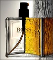
Boss by IreneMComment: Congrats again Irene!
I love the colored spray-tube in the empty side of the bottle.
One small piece of critique: the O of the brand "BOSS" isn't visible enough for me. For an ad-shot like this (used as a real ad) I think that would be better.
But who gives a .... ;) |
| Photographer found comment helpful. |
| 09/15/2008 03:19:36 PM |
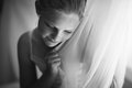
Game overby Rino63Comment: Hi, this is a comment from the critique club!
First of all I want to say that I love the beautiful b/w tones you used here. The high contrast makes it very dramatic. Light looks good.
Some things I'd change on this one. The composition could've been better, maybe a landscape orientated photo with negative space at the left would've solved that. Also I'd play around a bit with the broom and doll, but I don't know what you've been trying :) |
| Photographer found comment helpful. |
| 09/05/2008 04:14:55 AM |
|
| Photographer found comment helpful. |
| 08/27/2008 12:57:11 PM |
7by MajankaComment: my absolute fave, and you know it ;) |
| Photographer found comment helpful. |
| 08/22/2008 01:56:41 PM |
No quite myself...by awpollardComment: Originally posted by Art Roflmao:
Awesome! I remember seeing a whole website of these kinds of photos.
I'm stumped on the band though. :( |
it took some searching with the right keywords, but here it is:
//www.sleeveface.com/
Tomorrow I'm gonna do one, for my PAW-project. This one is cool! Thanks for the inspiration! |
| Photographer found comment helpful. |
| 08/14/2008 01:00:50 PM |
|
| Photographer found comment helpful. |
| 08/11/2008 03:07:16 PM |
|
| Photographer found comment helpful. |
Home -
Challenges -
Community -
League -
Photos -
Cameras -
Lenses -
Learn -
Help -
Terms of Use -
Privacy -
Top ^
DPChallenge, and website content and design, Copyright © 2001-2025 Challenging Technologies, LLC.
All digital photo copyrights belong to the photographers and may not be used without permission.
Current Server Time: 07/31/2025 03:38:43 PM EDT.