| Image |
Comment |
| 10/01/2004 01:59:43 PM |
Vickiby KonadorComment: Wow, her eyes draw all the attention, nice subtle coloring. I am not usually fond of partial saturation but the effect does work here, I am wondering whether it would be any less without the coloring. Good portrait, focus and depth of field is just perfect, as is the composition. |
 Photographer found comment helpful. Photographer found comment helpful. |
| 10/01/2004 01:47:58 PM |
Split Bout....the inner struggleby graphicfunkComment: I see it has been validated and am curious to find out how it was done, it feels like extensive photoshopped but apparently is not. It is a nice idea and the posture of the man on the right is dynamic, good. The left one looks a bit static, with both feet flat on the ground and with such a tight crop. I think it general it could have done with some more space around it. |
| Photographer found comment helpful. |
| 10/01/2004 01:42:45 PM |
Shadowboxerby scalvertComment: I am sorry I am not really impressed with this one. It is a nice idea but does not really work for me. At first I thought the shadow was supposed to be hers, but now I understand it is not. The shadow is so big that it does not fit. Also the blur it causes across her body feels somehow strange. I do like the drops flying of her face, that's a nice touch. |
| Photographer found comment helpful. |
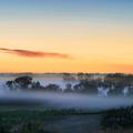
| 10/01/2004 01:38:14 PM |
Awakeningby kirbicComment: Another fine example that it is worth it getting up early. Great early morning atmosphere, the first warm light above the cold morning mist. Lovely soft colors. I would have cropped away more of the front, not only is this part darker and attracts attention, it also contains this nasty little iron pole on the left. Just cropping it straight above the pole makes it better, in my opinion. |
| Photographer found comment helpful. |
| 10/01/2004 01:34:51 PM |
Gasolineby GringoComment: A very special image, looks like it was painted with light with all those shadows and highlights. I am curious how it looks without the partial desaturation, the way you have done it is very special, not concentrating on one single item, but maybe just a bit over the top, I am unsure. Anyway a visually fascinating image. |
| Photographer found comment helpful. |
| 10/01/2004 12:25:19 PM |
Red Dragonby JackoComment: The colors are great, very vibrant combination, reminding me of late summer. I have some difficulty with the composition, I would have preferred to see some more empty space to the left, so the dragonfly moves out of the middle. Maybe that would also have given the opportunity to get a bit more depth of field. |
| Photographer found comment helpful. |
| 10/01/2004 12:21:13 PM |
Early Morning Seascape by jonpinkComment: Absolutely gorgeous, you early morning rise certainly paid off, it is hard isn't it ? Especially the blur of the flowing water, the glow from the sunrise on the water and the large stones breaking the water and giving a point to rest the eyes upon are perfect. The sunrise itself and the cliff finish the image off nicely but the front really creates the appeal for me. |
| Photographer found comment helpful. |
| 10/01/2004 12:17:01 PM |
"Back" Cover Girlby DougPazComment: Very creative idea, I like it. The match is not perfect, but I don't care. I think you could not have moved the magazine closer to achieve a perfect match with the face and at the same time have a natural look with a normal reading distance. What I do find disturbing are the imperfections around the edge of the desaturation, especially the edge of the left arm (viewer right) holding the magazine, a part of the hair and a small spot on the magazine. |
| Photographer found comment helpful. |
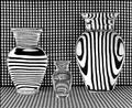
| 10/01/2004 11:52:44 AM |
Vases Filled With Waterby GolferDDSComment: I wonder how many people will notice the structure of lines in the vases is not all the same and does not match the background. Did you put separate cardboard with lines behind them ? Very nice. I find the very slight irregularities in the background material distracting, nothing major, but not perfect. Cropping in the middle of the last dark line on the left would have reduced attention to that. |
| Photographer found comment helpful. |
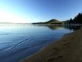
| 10/01/2004 11:47:34 AM |
First Lightby autoolComment: A nice peaceful and tranquil atmosphere, hard to get right with such extreme highlights and shadows in the image. The only thing I am wondering is how it would have looked twelve hours later, at sunset. I looks like the light is coming from the right and therefore a sunset from the left would put some more light on the sand and increase structure and add some more WOW factor. |
| Photographer found comment helpful. |
Home -
Challenges -
Community -
League -
Photos -
Cameras -
Lenses -
Learn -
Help -
Terms of Use -
Privacy -
Top ^
DPChallenge, and website content and design, Copyright © 2001-2025 Challenging Technologies, LLC.
All digital photo copyrights belong to the photographers and may not be used without permission.
Current Server Time: 06/27/2025 03:20:30 PM EDT.