| Image |
Comment |
| 10/08/2008 07:24:50 AM |
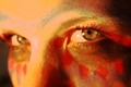
Behind the Eyesby emily212Comment: I didn't get to this during voting, but hypothetically, maybe a 3 or 4. Like the potential, but think more refined lighting and post processing will help get you where at appears you were trying to go. |
 Photographer found comment helpful. Photographer found comment helpful. |
| 10/08/2008 07:17:23 AM |
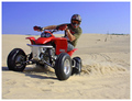
ZOOM ZOOMby mitchamusComment: I gave this a 3 - was a little 'snapshottish' for me - perhaps a more dramatic angle and/or variation in post processing to give it an edge.. next time. |
| Photographer found comment helpful. |
| 10/08/2008 07:14:34 AM |
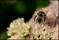
Buzzby bobnospumComment: I gave this a 5 - liked the composition and colors, but wished for sharper focus/deeper DOF mainly. |
| Photographer found comment helpful. |
| 10/08/2008 07:13:40 AM |
Ryshonby LERtasticComment: I gave this a 5 and remember studying this for a while, mainly noticing that you seem to have set the lighting up well, that and the fact that this girl looked so sad. Quite a nice image of her, with the moon behind and the good composition... |
| Photographer found comment helpful. |
| 10/08/2008 07:11:38 AM |
|
| Photographer found comment helpful. |
| 10/07/2008 04:03:26 PM |
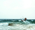
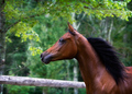
Unrestby lynnesiteComment: 7 - Gorgeous colors and love the movement captured, like your composition too - just that fence... not sure what to suggest, that and the bottom left tree trunk unstraightened just distract me.. Like the isolation though on the unrested one and that glint in the eye. |
| Photographer found comment helpful. |
| 10/07/2008 03:57:46 PM |
|
| Photographer found comment helpful. |
| 10/07/2008 03:47:20 PM |
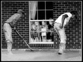
Foundationsby jasonlpriceComment: 7 - Very good candid/capture, like your processing (although wonder about variations to give it a little extra, who knows) - undecided if the image would be better if straightened.. but your call. Like the bare feet v boots 'element(s)'. |
| Photographer found comment helpful. |
| 10/07/2008 03:44:20 PM |
Voyager Dreamingby jettyimagesComment: 5 - Good potential. Like your colors and the LE effect/resulting flow and patterns/movement, but your horizon is crooked. Overall balance seems off as well - as nice as the colors are in the sky and distance, perhaps cropping this to the horizon/eliminating the sky, would have produced a stronger image, albeit a different one.. but your call, of course. |
| Photographer found comment helpful. |
| 10/07/2008 03:37:37 PM |
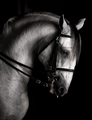
Classic Baroqueby RistyzComment: 7 - Nice classic, like your tones, although what looks like partial desaturation is at first confusing, because it is so subtle, grows on you. Like the saliva(?) captured, but after studying the image a while, gives a sense that this horse is discontent.. which uneases me as the viewer - but I don't know enough about equines to call that a fact. Like the curl in the mane too. Shame that the eye was not a little sharper, as some other elements seem to be... but I'm sure you're aware of that. The more I look at this, the more I see sadness in the image... I like your composition, but wonder about a fraction more off the bottom, for added balance.. but not sure. |
| Photographer found comment helpful. |
Home -
Challenges -
Community -
League -
Photos -
Cameras -
Lenses -
Learn -
Help -
Terms of Use -
Privacy -
Top ^
DPChallenge, and website content and design, Copyright © 2001-2025 Challenging Technologies, LLC.
All digital photo copyrights belong to the photographers and may not be used without permission.
Current Server Time: 06/22/2025 12:45:43 AM EDT.