|
|
|
Showing 431 - 440 of ~4217 |
| Image |
Comment |
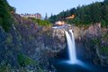
| 07/24/2009 06:12:29 PM | Ancient creatureby pallComment:  Critique Club Critique
First Impressions
Critique Club Critique
First Impressions
First impression is "oh cool, the Blue Ribbon image". That pushed aside, second is I admired this image the other day, my 'first impression' then was: what an awesome geological formation. Definitely well titled and indeed looks like a creature.
Photograph Information, Technicals & Composition Review
Composition wise I like the placement of the creature and also the placement of the colors within the image, they provide good visual balance. The reflection is well retained and the cloud formation leads the eye to the creature. The image overall looks like it needs a whisker nudge up on the left but could be a perspective correction option instead.
Despite not being able to see much detail in the rock itself, the mass and formation of it speak for itself. Part of the interest is in the shape the rock has formed, so going in closer would lose that aspect and be an entirely different image (although I'd hazard a guess, still very unique and interesting).
Comments, Score & Placement Review
First place - can't be complaining. I did look at the other image of this formation by  Brin Brin and, while an excellent image, shows a different scene and creates a different mood and feel entirely.
Some commenters mentioned the people, luckily I think they're subtle enough that you get away with it. Perhaps waiting for them to disappear next time - if that opportunity arises.
The commenters loved it - it's a Winner.
Summary
Nice lighting and capture of the hoovering mammothorhinotriceratopsyak. I like the bird elements and wonder about a slightly tighter crop to allow them to come into play more, but that is 'another image'. Thanks for sharing this image showcasing more of your country's amazing landscapes. |  Photographer found comment helpful. Photographer found comment helpful. |
| 07/24/2009 05:50:49 PM | Cyclistsby danculwellComment:
Critique Club Critique
First Impressions
There is some interest in the cyclists and other basic elements, which the simplicity helps come into play more - the fire hydrant, the ONE WAY sign, the red 'Stop' hand and the PARKING signs.
Photograph Information, Technicals & Composition Review
After reading your comments, I'm struggling to see a homeless man on the left. The composition is quite sound, although the perspective seems out by a fraction. This is an image that I think may have been stronger in b&w. I like the leading path with the person walking down it. Sounds like you enjoyed the challenge of Street Photography and will explore this photographic style more in the future, which is another added benefit of entering different themed Challenges at DPC.
Perhaps simplifying this image even more by cropping out the left person seated would have allowed the main characters to feature more. Nothing to be done (beside waiting for other passer-bys) about the fire hydrant view blocked by the passing cyclist, but my eye instantly wanted to see that isolated at first, especially because of the color element.
Comments, Score & Placement Review
121/135 with a score of 4.53 seems like a fair score, but perhaps a hard placement, especially given you seem to have made an effort to shoot for this Challenge. That's always a little disappointing, but don't let that deter you from pushing your boundaries in the future.
Each of your commenters seems to offer some good subtle points and pointers. Hearing what people like in an image (when they mention it) allows you insight into how your viewers perceive your image and what their eyes are drawn to.
Summary
Some interesting elements captured in an everyday scene. Nothing is holding my interest strong enough for me to linger too long within the image. My favorite part is probably the feeling of depth captured (despite the focal length), which I think the large PARKING sign helps come into play. | | Photographer found comment helpful. |
| 07/24/2009 05:28:41 PM | Twin Peaksby CraigDComment:
Critique Club Critique
First Impressions
First impression is that this is more about the water and overall scene than the geology. Second aspect I notice is that the rock/geology closer to the fore is too dark to discern.
Photograph Information, Technicals & Composition Review
A deeper depth of field may have produced more detail in the rock, especially at the fore. After reading your Photographer's Comments I see that you were aware that the main focus of the image was not the geology, although by default it is included. Even cropping the buildings out, whilst destroying the landscape scene, would still allow the geological formations to come into play more than they do with the composition and image as it is, in my opinion.
Comments, Score & Placement Review
25/82 with a score of 5.83 is a fair score and placement in a difficult Challenge. You awakened memories in many of your commenter's which was in your favor. One of your commenter's makes a good point.
Summary
The crop and lighting on the rock formation isn't showcasing it strong enough for this particular Challenge. The main subject dominates more than the Challenge theme, but you produced a strong enough image of that to woo the voters anyway. I like the flow of the water and the flowers in the corner, but would like to have seen this showcase the "erosion or a fault" more. | | Photographer found comment helpful. |
| 07/24/2009 10:29:51 AM | Passing Cyclistby nivek248Comment:
Critique Club Critique
First Impressions
Ah, good, I like this. This is what photography can capture so uniquely. I like the juxtaposition of the basketed bicycle parked under a tree and a passing cyclist with all the gear whizzing by.
Looks like there might even be a 'scooter thing' there too.
Photograph Information, Technicals & Composition Review
Composition - I like the composition but the cars in the rear do detract, maybe a slightly tighter crop at the top, not sure, as it seems to remove the needed space. Maybe the focal point slightly to the fore more may have blurred the background. Some slight blur in the bicycle, but you obviously didn't have much time with this. Perhaps tweaking in pp may have assisted - in b&w it might not be so noticeable (but you'd lose the motion element).
Comments, Score & Placement Review
Difficult, as this is an unconventional 'street photography' image, but given the main subject, I believe it squeezes in. 53/135 and 5.37 is not bad - quite a difficult shot. All your commenters like it.
Summary
Unique image that would likely lose impact in b&w. I see this is your first submission to DPC - nice start. It takes a good eye to see a scene like this and think quickly enough to take the opportunity to photograph it too. | | Photographer found comment helpful. |
| 07/24/2009 10:14:23 AM | Fiddlerby choltmeierComment:
Critique Club Critique
First Impressions
I like the candid nature to this and the focal point and the focus of the fiddler on his fiddling.
Photograph Information, Technicals & Composition Review
Composition wise, I'd like to see more context for this Challenge. The OOF forearm detracts a little, but difficult to get the good focal point you have and include that as well. I wonder whether a fraction darker may have softened the white areas, which, while not blown, seem to dominate the balance slightly, but fairly minor. Again, slightly darker may have brought a little more feel and drama to the textures and facial features. The crop of the hand/fingers detracts, but my guess is you didn't have it to include or you would have. This image is one that I think would be good, if not better?, in b&w.
Comments, Score & Placement Review
12/135, well there ya go - you'd be happy with that, especially with a 5.96. Somebody else noticed the string ends - I like that element too.
Summary
Nice candid, but I wish the face dominated more than the color of the clothing does, but mostly, I'd just like a little more 'street' for this Challenge. | | Photographer found comment helpful. |
| 07/24/2009 09:49:07 AM | War Tornby CorySmithComment:
Critique Club Critique
First Impressions
Street doesn't instantly come to mind. Looks a little posed and not so candid, as I would expect to see (mostly) for street photography.
Photograph Information, Technicals & Composition Review
Of course the benefit of post challenge comments is you get to see more information on the photograph - like the location. Photojournalism opportunities must abound where you are and your call to submit this type of image for this Challenge, but I don't get a strong street photography feel from it - maybe more context, who knows. Your call at any rate and, as mentioned in your Photographer's Comments, this image is part of a series you are doing on Women in War.
The lighting is good and I like the way you have captured her eyes and her focus - but again, not what I would be looking for in a Street Photography image. Whilst the isolated focus brings her into play well, I am interested in the background and so in this image, wish for a little deeper DOF. Composition wise - a little too centered for me, but again, hard to comment when I'm wanting more context anyway. I think a tighter crop, especially above her head, brings her eyes out more and adds a little more drama, for what it's worth.
Comments, Score & Placement Review
Comments seem to reflect some of what I have said above - it's a good portrait, but not carrying a street phtoography feel to it. 5.5 is good, it has a good quality feel to it and 42/135, amongst stronger contenders for the 'theme' is also a good placement.
Summary
I like the out of the box take on the Challenge, but just wish it had more context, which by default would give the image more of a story. | | Photographer found comment helpful. |
| 07/24/2009 09:26:37 AM | stone faceby JMoreiraComment:
Critique Club Critique
First Impressions
Nice collection of 'stones'. Second thing I looked at was your title, which made me look for a face - I thought I saw one, but then the 2 other stones/rocks/crystals/etc threw me. Maybe the face was within one of the 'stones' - I think I saw something there, maybe. I gave up and looked at the image as a whole, within the context of the Challenge. It came across as a fairly static, straight up image of a collection of crystals/etc. The OOF (out of focus) upper left one lessens the overall quality of the image.
Photograph Information, Technicals & Composition Review
If I interpret your Photographer's Comments correctly, it sounds like you put effort into your lighting and setup - which has produced a nice effect, but it slightly softer, with a smoother gradient effect, would enhance the image (and subjects) better in my opinion. The reflections are not strong enough to feature and too subtle and oddly placed that they almost become a distraction, but fairly minor.
Compositionally, it doesn't have strong balance, especially for a horizontal framing.
Comments, Score & Placement Review
You have two especially good and helpful comments that I agree with. 5.21 is quite a good score for this Challenge, and the placement not bad, but given some of the other scores, I might have expected it to be a little higher ranked.
Summary
I like the way the colors are showcased against your backdrop/lighting and like the choice of crystals, just wish I could see more detail in them. The upper right one is the most intriguing, to me. | | Photographer found comment helpful. |
| 07/17/2009 05:48:07 PM | | | Photographer found comment helpful. |
| 07/17/2009 05:47:49 PM | | | Photographer found comment helpful. |
| 07/17/2009 05:47:30 PM | | | Photographer found comment helpful. |
|
Showing 431 - 440 of ~4217 |
Home -
Challenges -
Community -
League -
Photos -
Cameras -
Lenses -
Learn -
Help -
Terms of Use -
Privacy -
Top ^
DPChallenge, and website content and design, Copyright © 2001-2025 Challenging Technologies, LLC.
All digital photo copyrights belong to the photographers and may not be used without permission.
Current Server Time: 06/20/2025 02:01:49 AM EDT.
|