|
|
|
Showing 421 - 430 of ~4217 |
| Image |
Comment |
| 07/25/2009 10:12:17 PM | Always on the sunny side.by EgillPComment:  Critique Club Critique
First Impressions
Critique Club Critique
First Impressions
The girl in the window adds interest and makes a good candid. The lady at the table appears somewhat uncomfortable and the jacket, etc makes this photograph seem more of a tourist type snap becase of that (girl in the window aside).
Photograph Information, Technicals & Composition Review
The eyes are unsure which subject to focus on, as mentioned above, the girl on the phone provides more interest - perhaps this image may have allowed more of the 'cross-mix' of stories/situations to be told better if there was a little more context.
A more refined crop at the top would be good too, but fairly minor.
Comments, Score & Placement Review
91/135 would seem that people were not stopping to study the image long enough during voting.
One commenter provides some insight into why the majority likely scored you around the 5 mark.
Summary
This may be a 'personal image' that may hold special meaning for you if you know the lady at the table in the sun (which may also be why you titled this as you have). Otherwise, for me as the viewer, I see two women in a sunny spot at a cafe, however only one seems truly candid and therefore doesn't dominate the image enough to carry it to another level for this particular Challenge. |  Photographer found comment helpful. Photographer found comment helpful. |
| 07/25/2009 09:31:00 AM | side walkin'by posthumousComment:
Critique Club Critique
First Impressions
Unusual effect and capture of life in color. The power/telephone line catches my eye.
Photograph Information, Technicals & Composition Review
The composition is quite sound and I don't mind the slight skew. The strange effect of the man, who almost appears to be shuffling along, is enhanced by the house in better focus in the rear. The power/telephone line at first detracts, but grows after a while, but not too much for me. The ivy/vine growing up it enhances that 'element growth' in the image.
A "drive-by shooting", well yes, it does look like that, but I think you've pp'd it to give a unique feel enough that it doesn't seem snapshottish. The feel from the pp is a little 'dark', but the contrasting 'bright blue sky' balances it out. Would like to have seen a little more context, or even a different vantage point giving more interest in the depth and rear.
Comments, Score & Placement Review
130/135 and a score of 4.02 probably doesn't surprise you. I know you submit images that appeal to you and that is the creative key.
You have to like the honesty in comments during anonymous voting.
Summary
It has some interest for me as the viewer, but once my mind absorbs it for what it is (suburban scene, old man shuffling down street), I'm ready to move on from it. That said, this is your artistic vision and outlet, but you obviously like the feedback on it - so now you have mine for this image. | | Photographer found comment helpful. |
| 07/25/2009 08:55:42 AM | Iceberg Melting on a Smooth Wave by JohannesFrankComment:
Critique Club Critique
First Impressions
Peaceful scene, beautiful colors. Interesting and unique take on the Challenge.
Photograph Information, Technicals & Composition Review
Good use of long exposure and good control of the whites, still showing the detail and color of the iceberg. I think the framing suits the image, but this is definitely an image that is underappreciated at this size, including the subtle flows.
Composition wise: a little tough, as I think it does work as is, especially with the water patterns and lines strategically placed. The black area on the left looks like it may have some issues, but at this size (not to contradict what I said above), it is barely discernible. Perhaps that left side cropped out, despite the iceberg 'pointing' out of frame, would still work well and retain balance in my opinion.
Comments, Score & Placement Review
19/82 is a strong finish - a score of 6.00 seems a little low for this image. Interesting comments, certainly a specialised science (icebergs and the study of them) - whether it fits the Challenge, I'm not commenting on, other than to mention the literal translation of iceberg to 'ice mountain' in Danish. Overall your commenters liked the scene and appreciated the interpretation.
Summary
A beautiful photographic creation that is underappreciated at this size. Not the strongest subject choice for the Challenge, but conveys the right spirit, in my opinion. | | Photographer found comment helpful. |
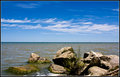
| 07/25/2009 08:33:10 AM | Heart of Stoneby SenayComment:
Critique Club Critique
First Impressions
Good potential for this Challenge, but the image seems to be more about the sky than the rocks.
Photograph Information, Technicals & Composition Review
Well done for the straight horizon, however in this image, it being placed almost smack in the middle of the frame isn't enhancing the image, especially the main subject for this Challenge. The rocks look very slightly OOF (out of focus), so it appears that when framing the image in camera you may have been focussed on the water and sky, rather than the fore - but apologies in advance if wrong there.
Composition wise, a much bolder crop eliminating most of the sky would be required to bring these rocks into play more. If you had it from the original shot, more of the bottom area, where the water is foaming around the rocks would have been better included, rather than cropped / 'cut' as it is.
Your title is a little lost on me unless it is that vaguely heart shaped rock a little right of center - if that is the case, then placing that within the frame so as to be the main feature would have strengthened the concept. A much tighter crop to show it would also have been required. Again, probably composing it within the frame so it is not smack center, but rather creating a visual balance, would probably have worked.
Comments, Score & Placement Review
49/82 and 5.35 is a good score for this Challenge and I suspect that the voters were taken with the rich sky, rather than the geological element. Just read your comments and confirms this. The last comment received provides some very good pointers.
Summary
Fill flash for the scene as is may have helped show up more detail in the rocks, but otherwise I think that a much bolder crop and attention paid to where your main subject (the 'heart of stone' rock, if I am not mistaken) is placed within the frame, would have created a more dramatic image in my opinion. | | Photographer found comment helpful. |
| 07/25/2009 08:21:30 AM | Toto in Pinkby geinafetsComment:
Critique Club Critique
First Impressions
A good photo opportunity, but the angle isn't so complimentary for Toto. Not enough 'street context' to be a strong street photography image.
Photograph Information, Technicals & Composition Review
I don't mind at all that there are no people in the image (although I see the OOF (out of focus) rear someone), but I would like to have seen more context, as mentioned above, especially for this Challenge. The scene looks like it may have been interesting and full of color too, which would have added some more story and interest overall.
With the close crop and focus on the subject as is, I find the image unbalanced and dominated by the upper area.
Comments, Score & Placement Review
44/135 and a score of 5.46 is quite a good placement for this Challenge. Your commenters didn't get a strong sense of street photography either. More context would definitely have helped you.
Summary
A good opportunity that you probably didn't have much time to compose and frame, the color combinations are interesting and work well (although the green throws the balance out a little). Perhaps a little more DOF (depth of field) and more context would have given the image more of a story to tell. | | Photographer found comment helpful. |
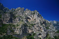
| 07/25/2009 08:10:15 AM | Amalfi coastlineby Rino63Comment:
Critique Club Critique
First Impressions
A nice specimen of this part of the world that shows man's engineering skills to get around it.
Photograph Information, Technicals & Composition Review
Whilst the blue is rich, the barely discernible gradient seems out of balance upper right. The scene doesn't seem to be placed within the frame in a way that leads the eyes in and around to explore. It would have been good to see a little tighter crop if the quality was there and be able to see more detail in the mountain face, that or a little more context, more background mountains showing the land formations may have given this some added interest. As is, the crop looks like parts are missing, such as below the road at the bottom of frame, the upper left peak of the mountain and the distant mountains to the right.
Comments, Score & Placement Review
53/182 with a score of 5.30 is not such a strong showing for this Challenge - I suspect that, whilst the geological formation is good, there was no main focal point, or feature placement compositionally, to hold a viewer's attention and draw them in to linger for a while. Your commenter's provide some good feedback and there are some helpful points made too.
Summary
A more refined crop and choosing a section of the image to feature more would likely have given this image a bit more of an edge. As rich as the sky is, it probably dominates the subject a little too much. | | Photographer found comment helpful. |
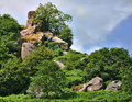
| 07/24/2009 07:14:07 PM | Robin hood's strideby alpharichComment:
Critique Club Critique
First Impressions
A good selection of rocks/boulders, but the trees are getting in the way.
Photograph Information, Technicals & Composition Review
You used Capture NX in anger, interesting - I'm sure you're not the first. You say you will go back later in better light, that might allow you to take a different vantage point to minimise the trees and shrubbery a little better. Perhaps a change of lens is in order, especially to focus better on the rocks. The most interesting area seems to be at the top, so my eyes are interested to see more detail there.
Comments, Score & Placement Review
52/82 is not that great, but I'm guessing you are there because nothing 'jumps out' in the image to hold a viewer's attention long enough to explore the image. Your commenters like the scene and most seem to like the greenery mixed in.
Summary
For me, much stronger for this Challenge with less greenery, maybe even a bold crop off the bottom to allow the top area to dominate more, if the quality was there in your image to allow that, which it does appear to be. | | Photographer found comment helpful. |
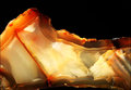
| 07/24/2009 07:03:28 PM | Brief history of timeby olbolComment:
Critique Club Critique
First Impressions
I like the way it looks somewhat like a landscape on first look. The lighting is interesting, but results in a harsh contrast that detracts from the subtle patterns, texture and colors of the rock/crystal.
Photograph Information, Technicals & Composition Review
The combined image you mention might have shown more detail, alas with Basic you had to 'redo' and abide by the Rules. Good for you for making that effort. Composition wise it is ok, as mentioned, this composition lends itself to another 'scene'. I can notice, only barely, what appears to be black fabric in the background, but minor. A more refined crop around the patterned areas of the crystal would have been better.
Comments, Score & Placement Review
31/82 is quite good. Your commenters all like your vision.
Summary
A good subject choice that a variation in lighting may have showcased even better. Would also have liked to have seen this a little sharper with more texture discernible.
| | Photographer found comment helpful. |
| 07/24/2009 06:55:28 PM | Street Photography In Color! by howie733Comment:
Critique Club Critique
First Impressions
Certainly quite a 'gay' image. There's a street sign, it's very colorful, your title reinforces the Challenge - I guess you made it over the line. However, there's not much interest in it for me to hold my attention.
Photograph Information, Technicals & Composition Review
I see you've selected the Humor gallery for this and I imagine many folk find this an amusing image, however it doesn't have that appeal for me. Composition wise, especially for this Challenge, it seems too 'squashed' into the frame. More street, more pose, more context would likely have allowed other elements to come into play more and create more interest and story. The image also looks like it may benefit from straightening.
Comments, Score & Placement Review
59/135 is pretty good for this Challenge and the score of 5.28 seems about average. Your commenters all seem to like it and enjoy the frivolity of the image.
Summary
Cropped this close the colors clash a little in my opinion and I can't help but imagine a richer scene out of the frame. It's a moment captured, but the character looks like he has more of a story than this crop is allowing to be told. | | Photographer found comment helpful. |
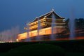
| 07/24/2009 06:35:28 PM | Beijing in the eveningby shamblesComment:
Critique Club Critique
First Impressions
Not getting a 'Street Photography' feel from this image. Comes across as a landmark/nightshot photograph more.
Photograph Information, Technicals & Composition Review
After reading your comments that you were trying to get the feel of the Forbidden City area in the evening - I think you achieved that quite well, but without people in the scene, or streets visible, it is struggling as a contender in this Challenge. The image as is can't be modified to show these aspects either. Composition wise it is too centered for me and the angle of the building is pointing 'out' of frame so throws the visual balance out. The hedge dominates the frame too much as well, without being a 'feature'.
Comments, Score & Placement Review
79/135 and a score of 5.06 is quite good, considering the Challenge and the lack of a stronger street scene. I agree with the first comment.
Summary
Looks like more potential venturing up into the City than has been captured from this distant vantage point. Street photography in itself requires a certain 'boldness' - it is not for everyone. As is, perhaps tweaking the colors and lighting in pp may have given this more pop - but would still fall short of the Challenge. | | Photographer found comment helpful. |
|
Showing 421 - 430 of ~4217 |
Home -
Challenges -
Community -
League -
Photos -
Cameras -
Lenses -
Learn -
Help -
Terms of Use -
Privacy -
Top ^
DPChallenge, and website content and design, Copyright © 2001-2025 Challenging Technologies, LLC.
All digital photo copyrights belong to the photographers and may not be used without permission.
Current Server Time: 06/19/2025 08:30:26 PM EDT.
|