|
|
|
Showing 3561 - 3570 of ~4217 |
| Image |
Comment |
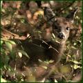
| 11/21/2005 09:50:12 PM | Mid Fall Colorsby scrum8Comment: 7 - Good, difficult capture. Good meet of the Challenge. Like the 'fore bokeh'. Criticism; difficult, but maybe a different crop (tighter too perhaps, not sure), trying to just get the lighter colors and 'thinner' darker ones, as is/are on the fawn(?). Just would like to see it 'blending' in more, which obviously means you captured a good shot, but for the Challenge, would like to have seen the 'camouflage effectiveness' captured 'differently', whether angle, 'context', not sure. |  Photographer found comment helpful. Photographer found comment helpful. |
| 11/21/2005 09:33:34 PM | Ground Squirrelby GeneralEComment: 5 - Good. Likely good perserverance on your part and maybe the squirrels too. Criticism; a little 'closer'/bigger would have made this better in my opinion, unless you were going for a lot of 'context'/environment. I like that it is in a natural setting, but just would like to 'see it' more. | | Photographer found comment helpful. |
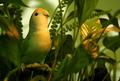
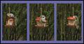
| 11/21/2005 09:15:05 PM | Escape artist hides in the hall plant....by notesinstonesComment: 6 - Ok, possibly a set up, possibly 'opportune', either way, even though obviously 'domestic', I like it. Criticism; seems just a fraction blurry, so sharper focus if it were possible (but you may not have had much time). The colors are nice but I think that a touch more saturation (but I can discern the beginnings of contrast issues even like this), enabling the greens/oranges to be more vivid, may have made this better in my opinion. Possibly also a different crop, if possible, with a bit more space above the escape artist's head, not sure. Lights on the leaves, while similar in coloring with the bird (and even though out of focus/'softened'), still slightly dominate/compete with the coloring of escape artist and therefore detract slilghtly in my opinion. | | Photographer found comment helpful. |
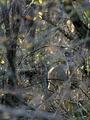
| 11/21/2005 04:02:12 PM | forest's secretby coolharComment: 7 - Excellent capture. Criticism; especially for the Challenge, would like to have seen just a little more context/environment. If the nose were as sharp as the eyes/ears make this even better in my opinion, but I doubt you had much time. The fore 'bokeh'(?) type effect is very nice and soft and adds to the shot. Colors are nice. Not sure on the frame, works - especially to enhance the camouflage, but not sure it enhances the reindeer(?) as best as another color may have. Maybe slightly more space to the right, not sure. | | Photographer found comment helpful. |
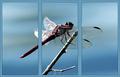
| 11/21/2005 02:50:40 PM | The Damselby idnicComment: 6 - Not many single shots were suited/enhanced by a triptych application in this Challenge in my opinion, but this was one that I liked. Good shot, nice and simple, good colors and well aligned/stitched. Criticism; as far as the triptych borders go, I think that either narrower spacing between the frames or a larger/wider padding on the outside (even though reducing even further the size of the frames) may have made this better in my opinion. The shot itself is good but the detail in the dark areas is lost a little, but this could just be a result of the reduction/size. Sharper if possible, perhaps a slightly different composition/crop (more space top &/or left, and 'less branch' at the bottom) may have also made this better in my opinion. Maybe a different 'cut' choice, especially in 3 as the very tip of the branch is showing, but this may have been your intent. edit:typo Message edited by author 2005-11-22 05:47:56. | | Photographer found comment helpful. |
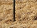
| 11/20/2005 10:47:17 PM | Daylight Robberyby AgaricusComment: 3 - Good potential. Criticism; frame doesn't suit and detracts too much in my opinion. Obviously size restrictions, but not enough detail, or rather clarity, in the squirrel and his robbery. Good shots, maybe a tighter crop/closer, depending on quality/ability to do so. | | Photographer found comment helpful. |
| 11/20/2005 10:18:25 PM | Breeding Colored Danceby jbsmithanaComment: 6 - Good. Excellent coloring. Criticism; especially in the last shot, #3, the detail gets lost in the background (good camouflage), difficult to get the definition I imagine, especially at this size. Good overall balance. Not sure on the frame, especially the inner white. Middle shot is very good, impossible with the restrictions for the Challenge, but that one even bigger, would make this a better shot (in general) in my opinion. Up to 6 from 5. | | Photographer found comment helpful. |
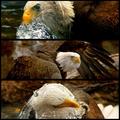
| 11/20/2005 10:17:41 PM | Bird of Prey by CutterComment: 8 - All very good shots, nice simple colors. Criticism; the obvious is losing so much detail with the size restrictions, but cannot be helped and I think you have still managed to show good detail with each in this size. The first shot I am not sure is a good choice (your call obviously) as the 'starter', mainly for the eyelid closed, looks a little 'odd', great shot, but that's the first thing I saw was the 'clouded eye'. So even at 'wall-size' I think this triptych, which would look impressive big, loses some impact with that first shot, in my opinion. Dependent how many other shots you got; a. perhaps a different choice for 1st, or just a different arrangement and b. hope you got another one, especially with the water, saved for the Free Study. The detail in the water in 1 & 3 is very good. Up to 7 from 6, these are great shots in a seemingly natural environment, but that eyelid still 'irks' me slightly in the first one. Up to 8, really like this & the eye is adding an 'unusual' element to this making it more unique. | | Photographer found comment helpful. |
| 11/20/2005 10:14:32 PM | Morning Flyoutby jemisonComment: 5 - Good shot and nice colors. Criticism; 2 & 3 work better with this style than the framing on 1, in my opinion. Not sure on the placement/crop, perhaps with more space on the left in 1, may have balanced this more and been more complementary to a triptych. The frame colors/style works well. Up to 5 from 4, just wish '1' had as much clarity and detail as 2 & 3. | | Photographer found comment helpful. |
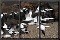
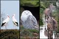
| 11/20/2005 05:06:21 PM | Animals of the Northby puzzledComment: 7 - Like this. All very good shots. Criticism; the only real 'criticism' I have had on this triptych (and I've looked at it a few times now) is there seems to be a lack of 'balance', or flow between the three, or their arrangement. Whether it is the colorings, or the 'compositions', I can't decide, but I keep thinking the 'level' (angle?) on 1 & 2 is fairly uniform, the 3rd doesn't 'suit', maybe if it were in the middle, not sure. There are similar colorings in each shot, but obviously blues/whites dominate in 1/2, but then 3 is different and not just because 3 is not 'birds'. Sorry, hard to put into words, but I tried. | | Photographer found comment helpful. |
|
Showing 3561 - 3570 of ~4217 |
Home -
Challenges -
Community -
League -
Photos -
Cameras -
Lenses -
Learn -
Help -
Terms of Use -
Privacy -
Top ^
DPChallenge, and website content and design, Copyright © 2001-2025 Challenging Technologies, LLC.
All digital photo copyrights belong to the photographers and may not be used without permission.
Current Server Time: 06/22/2025 09:53:52 AM EDT.
|