| Image |
Comment |
| 11/30/2005 05:08:19 PM |
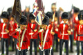
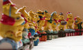
war without tearsby BrennanOBComment: 6 - Good. Nice colors. Criticism; difficult to tell if it is just the painting on the figurines or not, but seems the focus is slightly off on the faces of the two in the fore, not sure. Also, I want to say I'd like to see the flags also in focus, but this works too as is. Maybe a slightly different 'composition'/cropping (mainly to get full length), not sure. |
 Photographer found comment helpful. Photographer found comment helpful. |
| 11/30/2005 05:06:17 PM |
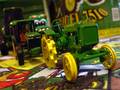
Nothing Runs Like A Deereby buddybuddy1226Comment: 6 - Like it. Criticism; seems it needs a slight nudge rotation up on the left, but difficult to tell. Given the subject(s), I think a sharper focus on the front of the tractor would have made this better in my opinion. The 'one' with the eyes in the background slightly detracts from the overall 'feel' in this shot also in my opinion - different 'style'. edit:typos Message edited by author 2005-12-07 07:42:49. |
| Photographer found comment helpful. |
| 11/30/2005 05:02:45 PM |
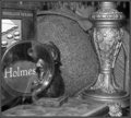
"When you have eliminated the impossible........."by espy2Comment: 4 - Good potential. Criticism; like to see more context (zoomed out) and at least 640 on one side if not both. Not sure on the b/w, works but needs some adjusting. I wonder whether color, coupled with slightly more 'depth' and a sharper angle/perspective, would have made this better in my opinion. |
| Photographer found comment helpful. |
| 11/30/2005 05:00:37 PM |
The Kingby AntanasComment: 6 - Good effort. Criticism; not sure on the lighting, seems too much of a yellow or purple 'tinge' to this, can't discern which. Slightly different composition, perhaps (no idea how) trying to get those skeletal hands more prominent, may have made this better in my opinion. |
| Photographer found comment helpful. |
| 11/30/2005 04:56:25 PM |
Photo With Santaby STEINRComment: 5 - Like the potential. Criticism; assuming this is (or needed to be) a macro, the focus seems 'off'. Like the colors, but perhaps adding more space between the feature and the backbround, may have given a bit more 'depth' to this shot. Possibly even a slightly different angle/perspective too (more side on?, not sure), and a crop/nudge rotation up on the left - to level the base, may have made this better in my opinion. |
| Photographer found comment helpful. |
| 11/30/2005 04:53:38 PM |
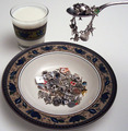
Lucky Charmsby hideoutComment: 6 - Good idea. Criticism; obviously your call on display choice of charms, and while I think the play on words idea is good, still, I would like to have been able to see more detail in your 'charms'. Whether you could do this in the set up you have (maybe with the spoon closer?) who knows. The color of the bowl etc, and the lighting, do not enhance the shot, nor the charms, in my opinion. Up to 6 from 5. |
| Photographer found comment helpful. |
| 11/30/2005 04:41:45 PM |
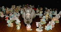
Standing Out in the Crowdby LadyLuna22Comment: 4 - Mainly for the potential. Colors are good and (from what I can discern) the focus & focal point is good too. Criticism; the size of this is the biggest negative. Needs to be 640 on either width or height, in this case width. I like the way you have set the middle unicorn facing up to the camera. A slightly different crop (carefully choosing what to 'cut out'), and the size, would have made this much better in my opinion. |
| Photographer found comment helpful. |
| 11/30/2005 04:36:28 PM |
What a lot of Poohby MudHutComment: 6 - Good. Criticism; seems a few distracting marks in/on the background and not sure on the color choice, whether it complements the color of the 'Poohs'. Perhaps if the focal point began a little more to the fore, or else a slightly tighter crop on the left, may have made this better in my opinion. |
| Photographer found comment helpful. |
| 11/30/2005 07:34:20 AM |
Gulliver and the Lapin Lilliputiansby GrayGhostComment: 5 - Mainly for your efforts and the potential. Criticism; the lighting really is the main thing. Possibly a sharper angle/perspective may have made this better in my opinion. It's a good idea, and while I am sure you had to have patience and couldn't 'experiment' too much, I just think there could have been some interesting 'potential' shots given your 'subjects'. Perhaps a more 'apt' base, or 'different'; grass, fur, not sure, just something 'different'. |
| Photographer found comment helpful. |
| 11/30/2005 06:43:53 AM |
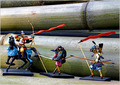
Figures of Japanese Historyby Pug-HComment: 5 - Like the concept and set up. Criticism; perhaps a sharper angle, trying to create a more dramatic effect may have made this better in my opinion. Perhaps also placing the bamboo further in the background, may have created a better 'depth' here too. edit:typo Message edited by author 2005-12-07 07:49:52. |
| Photographer found comment helpful. |
Home -
Challenges -
Community -
League -
Photos -
Cameras -
Lenses -
Learn -
Help -
Terms of Use -
Privacy -
Top ^
DPChallenge, and website content and design, Copyright © 2001-2025 Challenging Technologies, LLC.
All digital photo copyrights belong to the photographers and may not be used without permission.
Current Server Time: 06/22/2025 09:07:54 PM EDT.