| Image |
Comment |
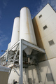
| 11/30/2005 06:17:25 PM |
City Breweryby EastKentGoldingComment: 6 - Good perspective. Criticism; like to see an even sharper perspective - creating an 'ominous' type of feel. The colors are good, with the variations in white, perhaps this accentuated somehow, may have made this even better in my opinion. The bottom left edge of the 'building' slightly detracts, but minor. |
 Photographer found comment helpful. Photographer found comment helpful. |
| 11/30/2005 06:10:14 PM |
untitledby TiberiusComment: 7 - Good shot, good almost silhouette effect. Criticism; difficult to tell, but seems it needs a slight nudge rotation up on the left, but the horizon in the distance seems level from what I can discern so not sure. This definitely needs 640 height to help it. The b/w(?) toning works well here, nice overall 'feel'. |
| Photographer found comment helpful. |
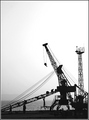
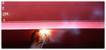
| 11/30/2005 06:07:14 PM |
Ship Repairmentby gsalComment: 6 - Like the potential here and I am sure the size restrictions do not do this shot justice. Criticism; seems slight rotation up on the left needed, or maybe it is the cropping. Like to see more detail, or focus, somehow on the welder. Just noticed the 'smoke', so that, if possible (no idea how and may be camera/lens dependent) incorporated or 'highlighted' more, may have made this even better in my opinion. Good coloring. Not sure on the frame. |
| Photographer found comment helpful. |
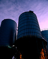
| 11/30/2005 06:04:37 PM |
Dark Vesselsby conglettComment: 6 - Nice colors, shapes and lighting. Criticism; would like to see that lighting at the bottom of the tanks/silos(?) on the right incorporated/used more if possible. Also seems it needs a slight nudge rotation up on the left, but difficult to tell at this sharp (but good) angle. Like to see the colors in the tanks/silos even more vivid, again if possible. |
| Photographer found comment helpful. |
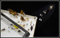
| 11/30/2005 05:40:23 PM |
Collectible & Colorfulby JEFFJSBComment: 7 - Good. Criticism; difficult, as this is fairly well flawless, save for perhaps the odd green at the top, but minor. But in my opinion, this shot / set-up needs something to 'lift it', not sure what, nor how. Whether a horizontal crop instead, or a 640 x 640, or a different colored 'base' (even though it is kind of 'road like'), or unusual lighting, not sure. Maybe a frame in this instance would have helped, no idea. |
| Photographer found comment helpful. |
| 11/30/2005 05:31:59 PM |
Eye for Colours by librodoComment: 6 - Very nice colors and composition and angle/perspective. Criticism; difficult, as this is a bit of a stretch for 'collections' in the spirit of the Challenge (and has restricted my score). Near perfect symmetry as far as I can discern, maybe a couple are 'off', but fairly minor. This shot may lend itself well to an abstract too if the focus were adjusted, but moot point. |
| Photographer found comment helpful. |
| 11/30/2005 05:26:03 PM |
The Bookwormby glodaComment: 7 - Good. Criticism; perhaps even a sharper angle and slightly better focus/detail in the books/foreground, may have made this better in my opinion. Not sure on the frame. |
| Photographer found comment helpful. |
| 11/30/2005 05:23:35 PM |
The Great Escapeby mpetersComment: 6 - Very good idea, well done if it is original. Criticism; you haven't quite achieved the full potential in this shot in my opinion. Whether it is the focus, angle, lighting, not sure. Perhaps using up 640 in both directions and gaining more symmetry may also have helped this. Not sure on the framing, it detracts in my opinion. edit:typo Message edited by author 2005-12-07 06:31:43. |
| Photographer found comment helpful. |
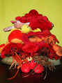
| 11/30/2005 05:18:18 PM |
Lobster Collectionby ashsComment: 3 - Like the potential, especially with such an unusual 'collection'. Criticism; background/base, lighting, arrangement and composition all need attention in my opinion. I think the potential to arrange these so that their 'character' dominates, as well as being mindful of complementing the colors placed next to each other, if you had achieved that, would have made this much better in my opinion. edit:typo Message edited by author 2005-12-07 07:40:45. |
| Photographer found comment helpful. |
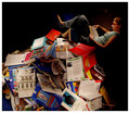
| 11/30/2005 05:15:28 PM |
The Ultimate Pez Collectorby gurlwithapenComment: 3 - A lot of potential here. Criticism; in my opinion, if you really wanted to include this lady in the shot, then she should be 'placed' secondary to the dispensers. The 'set up' potential you have with all those dispensers, including their variety - is vast. This just looks too 'snapshottish'. The background and lighting also needs attention in my opinion. |
| Photographer found comment helpful. |
Home -
Challenges -
Community -
League -
Photos -
Cameras -
Lenses -
Learn -
Help -
Terms of Use -
Privacy -
Top ^
DPChallenge, and website content and design, Copyright © 2001-2025 Challenging Technologies, LLC.
All digital photo copyrights belong to the photographers and may not be used without permission.
Current Server Time: 12/21/2025 03:54:20 PM EST.