|
|
|
Showing 3401 - 3410 of ~4217 |
| Image |
Comment |
| 12/02/2005 07:33:07 PM | what am I?by jessirooComment: No - can't guess (yet). Post a hard clue as a 'comment'.
I tried to cheat by looking at other shots in your portfolio and could take a stab at saying it is the edge of a bike handlebar - or the edge of a roller blade - but I don't think it is either of those. Looks metal, but 'light metal', I can see the curve at the top and what looks like the start of plastic down the bottom. Will come back 'in a while' to see if you post a 'clue'.
edit/'PS': would you please tick the 'helpful' box when you have seen this so I know to come back - thank you. Message edited by author 2005-12-06 19:06:12. |  Photographer found comment helpful. Photographer found comment helpful. |
| 12/02/2005 03:05:55 PM | Nearest Relativeby Mr_PantsComment: 9 - Excellent. Good color, texture, focus, crop, background and character. Criticism; not much, want to say the nose a bit sharper, but likely difficult to get those eyes so good as you have, not sure. Like the leaf/grass(?) in the mouth (if that also were sharper, be even better) and the bits of grass(?) 'here and there' on the fur, which maybe, a fraction more detail/texture in may have made this even better (the focus shift issues aside) but not sure on that as I like this like it is. Doesn't look over-processed, which is good. Maybe, wider (640), but not sure, like the vertical framing - also would depend what you had to work with. Great shot as is. Title (minor), 'works', but those eyes lend themselves to a more befitting title, 'maybe'. edit:wording Message edited by author 2005-12-08 15:40:09. | | Photographer found comment helpful. |
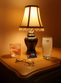
| 12/02/2005 02:47:07 PM | Retiredby GolferDDSComment: 7 - Like this, nice and simple. Criticism; to nit-pick, too much water in the glass with the teeth. Perhaps moving the glasses slightly so as to not get that reflection, or otherwise 'use it' more for effect, may have made this better in my opinion. Just noticed (2nd look) the 'spritz/bubbles/fizz' at the top of the glass with the 'Seltzer', could have used this more for added effect also, 'somehow', maybe shorter glass and under the light, who knows. edit:typo Message edited by author 2005-12-05 07:05:37. | | Photographer found comment helpful. |
| 12/02/2005 02:43:10 PM | Growing Painsby KiwiShotzComment: 6 - Like this. A lot of context. Criticism; slightly different arrangement/composition (for more balance), better focus/sharpness on at least a few items, the lighting adjusted, would all have made this better in my opinion. | | Photographer found comment helpful. |
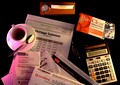
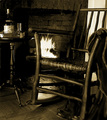
| 12/02/2005 02:41:25 PM | Forgot the pipe by graphicfunkComment: 6 - Like this concept. Criticism; like to see more context here and 'further out', cropping or zoom; more of the chair, table, etc. It also looks slightly 'off' so perhaps a nudge rotation up on the right, and more 'balance' in the composition, may have made this even better in my opinion. Toning works well, even though a bit 'hard' in places. Seems an 'issue' bottom fore to the right, 'something' there in front of the boots. edit:typos Message edited by author 2005-12-05 07:06:08. | | Photographer found comment helpful. |
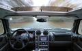
| 12/02/2005 02:39:07 PM | Ghost Driverby tjmuellerComment: 7 - Good execution, seemingly. Criticism; needs a slight nudge rotation up on the right. Depending how you did this, just for added effect, more movement if possible on the 'outside', sharper too of course on the 'inside', would have made this even better in my opinion. Maybe the gearshift/stick incorporated more instead of half chopped off, as doesn't seem you could eliminate it because of the steering wheel. | | Photographer found comment helpful. |
| 12/02/2005 02:37:03 PM | "Waiting 'Til Morning"by tfarrell23Comment: 7 - Like the perspective. Criticism; like to see even more 'Metamucil' powder, perhaps even using the texture of it to add something extra here. Like to also see it 640. Not sure on the frame. | | Photographer found comment helpful. |
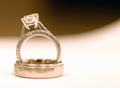
| 12/02/2005 02:35:46 PM | Commitmentby cadbikeComment: 7 - Like this, nice composition and lighting. Criticism; Although it looks like you've gone for a 'soft look/feel' to this, I think if either the stone or pattern on the ring were in sharper focus, or a variation in lighting, may have made this even better in my opinion. | | Photographer found comment helpful. |
| 12/02/2005 02:34:21 PM | Utilities!by RistyzComment: 7 - Nice simple colors and composition. Criticism; not much, perhaps a little sharper 'somewhere', the pen maybe, who knows. Maybe wider may have also helped this, incorporating the wallet(?) more too, to make this even better. | | Photographer found comment helpful. |
| 12/02/2005 02:32:46 PM | In recognition of their sacrificeby burtctComment: 7 - Like the concept and colors. Criticism; if it were either straight and symmetrical or even on the diagonal but 'balanced', make this even better in my opinion. A little more focus/sharpness too, and seems a variation in lighting may have also helped. Like the 'appearance' of depth behind the medals. | | Photographer found comment helpful. |
|
Showing 3401 - 3410 of ~4217 |
Home -
Challenges -
Community -
League -
Photos -
Cameras -
Lenses -
Learn -
Help -
Terms of Use -
Privacy -
Top ^
DPChallenge, and website content and design, Copyright © 2001-2025 Challenging Technologies, LLC.
All digital photo copyrights belong to the photographers and may not be used without permission.
Current Server Time: 06/23/2025 11:37:23 AM EDT.
|