|
|
|
Showing 3291 - 3300 of ~4217 |
| Image |
Comment |
| 12/14/2005 09:38:30 PM | Reflective Stareby loriprophotoComment: Nice capture. Like the way the whiskers are just touching the water. 'If only' there were more reflection. Perhaps this cropped even tighter at the top (and not just because of your copyright text), may have made this even better in my opinion. |  Photographer found comment helpful. Photographer found comment helpful. |
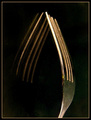
| 12/14/2005 07:53:30 PM | Fork Of The Futureby KitaComment: I gave this a 3. The quality was not there 'enough' in my opinion. It also seemed a little 'too close', causing the focus to blur. The composition/placement of the fork within the 'frame', perhaps could have used some more attention - to try to get an overall 'balance' using 'empty space' - unless you were going for the 'mirror effect', which, in my opinion, needed to have better 'symmetry' (balance again), so a 'nudge rotation' up on the right may have helped. There also seems to be some 'grain' &/or issues with 'gamma' in the darker areas. | | Photographer found comment helpful. |
| 12/14/2005 07:47:36 PM | Too Late! I missed the race!by KitaComment: I gave this a 3. It was a very difficult Challenge to 'think of a good idea' for - especially one that really made the photo 'scream' 'too late'. The colors and perspective/angle in this are nice though, a little more 'space' above the jockey's head would have made this better. Again though, this particular Challenge was a difficult one - I 'failed' to 'meet the Challenge'. | | Photographer found comment helpful. |
| 12/14/2005 07:35:34 PM | WAIT......by AzCKellyComment: Curious if I was correct in my 'presumption' of this being 'too early' because a long exposure effect was 'in play'..... or ? edit: thank you for the 'confirmation' about the long exposure 'concept', as you know, a bit of a long shot to 'get it' at a cursory glance, which is all that is usually given during voting Message edited by author 2005-12-22 20:41:20. | | Photographer found comment helpful. |
| 12/14/2005 07:32:54 PM | Yawnby CalliopeKelComment: Good capture. He/she seems to find something hilarious. Potential here to 'manipulate' this into something else (eg; playing on the 'hilarity', nudge rotation, cropping, etc) if you wanted to - but perhaps this is only here for the 'yawn thread' - who knows. edit:wording Message edited by author 2005-12-14 19:36:42. | | Photographer found comment helpful. |
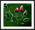
| 12/13/2005 08:47:28 AM | Standing outby gaurawaComment: Nice colors - although the green seems it has a 'blue/gray' ('mint green') tint to it/unnatural (apologies if it is natural). The background, while simple, and not a 'clashing' green (and 'works'), likely doesn't make the buds/stems flowers 'pop' as well as a different color may have (but obviously depending what you could have supplemented/variated it with via angle/lighting etc, (as this looks like a natural setting), but not sure on that. Perhaps (difficult likely even with a nudge rotation) a different 'crop' in the top left corner (for more simplicity) may have made this even better in my opinion. Like to see more detail/texture on the 'fur' and even the webs. Hard to discern, but looks as if there may be some lichen growing on the stem(s) too (which may account for some of the 'blue toning'), so more detail in that/contrast would also add another element, if possible. As you mentioned in the thread, the size of course doesn't help. Looks like it may be a Magnolia of some description. | | Photographer found comment helpful. |
| 12/12/2005 05:25:46 PM | It's all about saving a flameby srugoloComment: 6 - Met the Challenge fairly well in my opinion - "Use candlelight to create the impact of your photo.". Criticism; difficult, but perhaps an even tighter cropping on either side may have given this even more impact. The symmetry seems fairly good, detail in the skin is good, perhaps a little toning down of the skin color may have also made this better, not sure. Re your title, I guess to 'nit-pick', the 'hands' pose' should be more 'cupped', but minor - but your title does attract some attention to it (but yes I realize you are/were likely trying to attain an abstract 'shape' at the rear, which you have done). Difficult also, but even more detail in the texture of the skin (especially palms/'inside') may have also made this even better in my opinion. | | Photographer found comment helpful. |
| 12/12/2005 05:02:23 PM | The Reason For The Seasonby PixlmakerComment: 3/4/3..4 - Met the Challenge quite well in my opinion - "Use candlelight to create the impact of your photo.". Criticism; difficult with this angle/perspective (which is good, but the full potential has not been achieved in my opinion), however more attention to the base (which 'works' but perhaps 'features' too much, a more 'neutral' base may have worked better), 'symmetry' (a nudge rotation up on the right perhaps, not just because of the wreath but the candles as well), a variation in composition/crop/framing, variation in perspective (not sure) and perhaps a slightly different focal point (seems blurred/out of focus), or else 'softening' this perhaps to help hide 'imperfections', may have all helped this be even better in my opinion. | | Photographer found comment helpful. |
| 12/12/2005 03:34:37 PM | Sunbowlby BethraComment: 3 - Met the Challenge fairly well in my opinion - "Use candlelight to create the impact of your photo.". Criticism; attention to choice of flowers (including arrangement of) to 'complement' the candle 'theme' (in this case a sunflower) and colors, choice of bowl/dish, surrounding 'elements' (which all detract in my opinion), 'using' the shadow play more, 'composing' your shot/placement of the bowl/dish differently or else a different angle/persective (this looks too 'front on/snapshottish') and, lastly, a tripod or 'make do one', would all have made this much better in my opinion. | | Photographer found comment helpful. |
| 12/12/2005 03:28:53 PM | Mercyby sigrun_thComment: 5 - Met the Challenge fairly well in my opinion - "Use candlelight to create the impact of your photo.". Criticism; attention to minor things like the wax/candle not 'seated' properly in the foreground candle, the cropping and the one/two 'small spectrums' in the upper left. Perhaps a variation in angle/perspective and a slightly different composition (the bottom left candle is not as noticeable as the others), and possibly allowing more visible context/base (looks like little stands on a mirror or such, but the full effect/potential has not been achieved in my opinion) may have made this better, again, in my opinion. | | Photographer found comment helpful. |
|
Showing 3291 - 3300 of ~4217 |
Home -
Challenges -
Community -
League -
Photos -
Cameras -
Lenses -
Learn -
Help -
Terms of Use -
Privacy -
Top ^
DPChallenge, and website content and design, Copyright © 2001-2025 Challenging Technologies, LLC.
All digital photo copyrights belong to the photographers and may not be used without permission.
Current Server Time: 06/24/2025 09:24:29 AM EDT.
|