| Image |
Comment |
| 12/21/2005 05:07:33 PM |
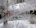
Frostingby dphillipsComment: 5 - Good potential. Criticism; perhaps a sharper angle/perspective may have helped this have more impact. The house/cabin/whatever in the distance/background detracts slightly, both because it is not 'out of focus' enough in my opinion, and also the color 'balance' of it (the colors don't clash, but just that the red, for example, being on the left, draws my 'eye' there more so, if that makes sense). Perhaps a sharper angle with the trees/darker areas mainly as 'backdrop', may have allowed this to pop more. Not much to be done in basic about the 'spots' on the glass etc. More detail/sharper on the 'feathering' of the crystals too, but difficult. Maybe also a slightly different 'composition'/framing/crop. Just think it has more potential. |
 Photographer found comment helpful. Photographer found comment helpful. |
| 12/21/2005 05:01:03 PM |
Liquid Copperby umbrisComment: 6 - Unusual and interesting, back 'PC' to see what this is. Nice coloring. Criticism; difficult, perhaps a tighter crop at the top to gain more symmetry, not sure. Sharper too, to be able to discern better what this is, but unsure on that, because -- I do not know what this is, and that may not have been possible, who knows. |
| Photographer found comment helpful. |
| 12/21/2005 08:57:28 AM |
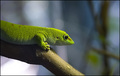
Lizardby nephotoComment: 7 - Excellent color and texture/sharpness. Criticism; difficult, maybe a tighter crop on the left, or just another variation on composition/balance, not sure. Up to 7 from 6. |
| Photographer found comment helpful. |
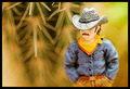
| 12/21/2005 08:55:36 AM |
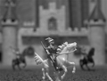
Knight in shining armorby RobMolComment: 4 - Good concept. Criticism; more detail/quality and 640, would have made this better in my opinion. Not sure on the toning/b&w, but your call. Perhas a slight nudge rotation to enable a more finely tuned crop at the bottom to eliminate the 'stand'. |
| Photographer found comment helpful. |
| 12/21/2005 08:47:53 AM |
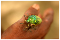
On handby ergoComment: 6 - Good contrast and depth. Criticism; difficult, but the focal point allowing the bug more in focus, and sacrificing less skin/texture (whilst a good element), would have made this better in my opinion. Not sure on the frame. Maybe a nudge rotation/composition variation too, but depends what you had to work with. Coloring is good, I just think there is more potential here. |
| Photographer found comment helpful. |
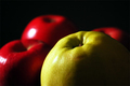
| 12/21/2005 08:41:19 AM |
les pommesby msieglerfrComment: 6 - Nice. Criticism; just a little more detail in the apple (if the core, then a slightly tighter crop and nudge rotation up on the left), and possibly trying to eliminate or reduce the 'glare'/reflections, may have made this even better in my opinion. |
| Photographer found comment helpful. |
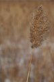
| 12/21/2005 08:39:20 AM |
The Soft Brown Weedby JEFFJSBComment: 5 - Nice coloring. Criticism; difficult, but needs to be sharper on the seedhead in my opinion, especially to discern more texture. Not sure on the composition/framing. edit:typo Message edited by author 2005-12-28 21:03:39. |
| Photographer found comment helpful. |
| 12/21/2005 08:37:43 AM |
The Lonerby kyeboshComment: 5 - Unusual. Criticism; wish it were 640, the colors are good, unusual focal points and background, not sure on the thickish frame at this size. Like it. Perhaps 'taller' as well may have given this something more, with a little more space above &/or below the 'loner'. |
| Photographer found comment helpful. |
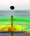
| 12/21/2005 08:33:30 AM |
Colorfull Dropby JasenkaComment: 6 - Good, especially for basic editing. Criticism; difficult re the shallow depth 'featuring', but perhaps (depending of course what you had to work with), incorporating that reflection may have given this even more. The 'flow of color' within the elevated drop is good, and unusual. Nice colors, difficult, but perhaps if they were enhanced more somehow to make them even more vivid, but likely conrast issues, as this seems getting close to bordering on them now, in the rear. |
| Photographer found comment helpful. |
| 12/21/2005 08:30:49 AM |
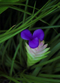
Floraby jpetersComment: 5 - Well that's unusual. I like the 'lines' etc. Criticism; no idea what type of flower this is so will come back post challenge to see, looks 'out of place' but who knows. Given the unusual color combinations, perhaps a slightly more 'off centered' composition may have made this even better, possibly a slightly sharper angle too, not sure. |
| Photographer found comment helpful. |
Home -
Challenges -
Community -
League -
Photos -
Cameras -
Lenses -
Learn -
Help -
Terms of Use -
Privacy -
Top ^
DPChallenge, and website content and design, Copyright © 2001-2025 Challenging Technologies, LLC.
All digital photo copyrights belong to the photographers and may not be used without permission.
Current Server Time: 06/24/2025 09:23:20 AM EDT.