| Image |
Comment |
| 12/29/2005 04:53:43 PM |
Freak'n String!! Oops!by GivemeashotComment: 5 - Good idea/potential. Criticism; sharper focus on the string (overall the shot seems blurred or out of focus), nudge rotation up on the left, or else perhaps more 'diagonal' composition and perhaps a variation in lighting to diminish the 'blown' part, may have made this better in my opinion. |
 Photographer found comment helpful. Photographer found comment helpful. |
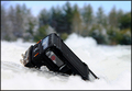
| 12/29/2005 04:51:42 PM |
On thin Ice ... ooopsby ShutterPugComment: 3 - Looks like good potential. Criticism; looks like this is a little blurry, or could be focus issues, hard to discern. I also can't tell if this is a little truck or train, so better focus and perhaps 'showing more' of your subject, may have made this better in my opinion. Also more 'context' of the 'oops' - ie; if it has 'gone off a cliff'/etc, then showing an edge there somewhere may have boosted this. |
| Photographer found comment helpful. |
| 12/29/2005 04:49:24 PM |
Not Milk?!by ChilibeanComment: 6 - Like it. Criticism; think this has more potential, a few suggestions would be clothing 'choice', especially on the girl on the right - a plain shirt or a particular color that would 'enhance' the 'milk', difficult, but either a different angle, or lighting adjustment, to get the detail on the tip of the paint brush more and a variation in cropping/framing, would have all likely made this better in my opinion. The facial expressions are near perfect. Good idea. |
| Photographer found comment helpful. |
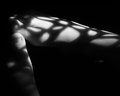
| 12/29/2005 03:38:23 PM |
toes.jpgby wavelengthComment: '5', maybe '6', it took a while to see the shadow play/pattern, the feet are the dominant feature in this in my opinion, so if 'somehow' enhancing the pattern and minimizing the 'feet'/toes, may have made this better for this Challenge - but only 'hypothetical'/pretend anyway. Fairly nice 'clean feel' to this shot, save for the 'something' under the right heel. |
| Photographer found comment helpful. |
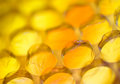
| 12/29/2005 03:36:08 PM |
You Can't Resistby KonadorComment: '7', likely, it's unusual and looks like 'bubblewrap'/packing bubble wrap, with a 'golden glow' or 'tint', given your title, I at first thought 'candy', but realize it may be the '...to pop it' - nice abstract'ish' kind of pattern and nice colors and the shallow DOF enhances it, perhaps a little sharper on one of the bubbles that are in focus may have made this even better, not sure, especially given that that may have diminished the pattern effect. |
| Photographer found comment helpful. |
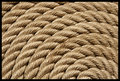
| 12/29/2005 03:33:11 PM |
Dockline Artby JEFFJSBComment: '5', maybe '6' - the lighting or what seems to be 'glare' is too dominant on the rope in my opinion and overall not enough texture detail - although I realize to enhance the pattern you may have been going for this 'softness'. |
| Photographer found comment helpful. |
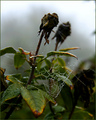
| 12/29/2005 03:23:46 PM |
A Web of Polygonsby MeeraComment: 6 - Like the abstract'ness' of this, coupled with the shallow DOF. Criticism; difficult, but wish it were sharper, although I realize perhaps you've gone for a 'soft' look, especially to enhance the pattern(s). The frame 'works', but be better without it, in my opinion. |
| Photographer found comment helpful. |
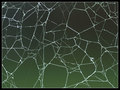
| 12/29/2005 03:13:02 PM |
Nature's Workby autoolComment: 6 - Nice. Criticism; especially for this Challenge, if the web were more dominant (zoomed/tighter crop quality dependent), would give this more impact in my opinion. Like the 'deadheads'' effect. |
| Photographer found comment helpful. |
| 12/29/2005 12:03:24 AM |
Netby phoenix46Comment: 7 - Nice. Criticism; good like this, but wonder whether not cropping on the left would have worked better, depending what you had to work with of course. Toning works well here. |
| Photographer found comment helpful. |
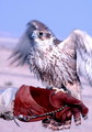
| 12/28/2005 11:54:36 PM |
Do you think my pattern look good enough to join the prey show ?by lolor275Comment: 5 - Good potential. Criticism; depending on quality and what you had to work with, a really tight crop on this, eliminating the keeper's hand (even if that means 'cutting' the tail/feet/talons/etc), especially for this Challenge, would have likely made this much better in my opinion. Likely still be 'blurred', but still would enhance the pattern more. edit:typo Message edited by author 2006-01-05 22:55:04. |
| Photographer found comment helpful. |
Home -
Challenges -
Community -
League -
Photos -
Cameras -
Lenses -
Learn -
Help -
Terms of Use -
Privacy -
Top ^
DPChallenge, and website content and design, Copyright © 2001-2025 Challenging Technologies, LLC.
All digital photo copyrights belong to the photographers and may not be used without permission.
Current Server Time: 06/25/2025 11:27:37 AM EDT.