| Image |
Comment |
| 12/31/2005 06:52:13 AM |
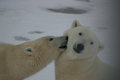
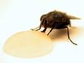
Beargroup_48_kissing.jpgby idemaerschalkComment: Good capture.
temporary note and photo inclusion just so you can get an idea;
.. 
and a crop and resize..

done with ten second editing adjusting hue/sat/lightness/curves, whatever.. and then a sharpen
I am sure one of the 'gurus' can help you, but just a quick look to show you that if you experiment you should be able to do it yourself, especially with the manual tools to fix that 'darkness' or fore 'bokeh' on the right |
 Photographer found comment helpful. Photographer found comment helpful. |
| 12/31/2005 06:11:22 AM |
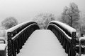
2 a.m.by M.O.C.Comment: Nice perspective and crop. Having said that, looks like the crop/zoom may have been a fraction too tight and the quality has diminished, either that or just a bit of grain. Shame about the graffiti. |
| Photographer found comment helpful. |
| 12/30/2005 10:16:04 PM |
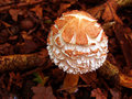
fung.jpgby polkopComment: Nice colors. Looks like a good capture, what I can discern - needs to be 640, width in this case. |
| Photographer found comment helpful. |
| 12/30/2005 10:15:36 PM |
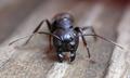
mfung.jpgby polkopComment: Quality dependent, if this were 640w, make this better (for here anyway) in my opinion. Looks like fairly good texture detail. Perhaps a crop variation (again depending what you had to work with), especially bottom left, creating a slightly more abstract kind of composition, may have made this better in my opinion. |
| Photographer found comment helpful. |
| 12/30/2005 10:13:27 PM |
Tats for Totsby dsa157Comment: Really like his expression, suits this to a T. It's nice and sharp on the arms/tattoos which is good, the main 'criticism' would be the position of the arms; although the 'pose' is good, they are perhaps 'wrapped' a little too tightly so that it looks just a little 'odd' - in my opinion. Perhaps if a slightly sharper angle/perspective, bringing in more space between the arms and the body, the head further back and still with that expression (if that makes sense), make this even better in my opinion. If this is original, well done. Assuming these are 'play/fake'. |
| Photographer found comment helpful. |
| 12/30/2005 10:08:30 PM |
Don't Eat the Shellfish!by dsa157Comment: Good idea for a portrait in my opinion. Perhaps a little more space, crop variation on the right (depending what you had to work with of course) and an adjustment in the colors/tone, especially the reds, may have made this even better in my opinion. The light/reflection in their eyes is just a little too 'pronounced' (especially the lady) and therefore slightly detracts, but minor. |
| Photographer found comment helpful. |
| 12/30/2005 10:06:54 PM |
|
| Photographer found comment helpful. |
| 12/30/2005 09:55:59 PM |
Honey Suckleby dsa157Comment: Excellent macro. Guess you've applied toning to this which 'works' but if the honey had more color may have given this an extra element, not sure, perhaps just a (obviously) 'different shot'. |
| Photographer found comment helpful. |
| 12/30/2005 07:47:28 PM |
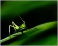
Its Not Easy Being Greenby elsapoComment: Like the transparency you've captured here. Colors are very good. Composition good. The only real thing to 'pull apart' here, may be the slight grain in the darker areas near the feet, but very minor. Make a nice large print. |
| Photographer found comment helpful. |
| 12/30/2005 07:44:03 PM |
Blue Siberian Irisby jencurrieComment: Nice colors. 'If only' the outer petal at the fore were a little sharper make this even better in my opinion. That part of the shot/composition is so dominant that it detracts from the more finely focussed area, in my opinion. The yellows/golds in the background are complementary, but perhaps a little less depth of field/blurring could have allowed the iris to 'pop' more. |
| Photographer found comment helpful. |
Home -
Challenges -
Community -
League -
Photos -
Cameras -
Lenses -
Learn -
Help -
Terms of Use -
Privacy -
Top ^
DPChallenge, and website content and design, Copyright © 2001-2025 Challenging Technologies, LLC.
All digital photo copyrights belong to the photographers and may not be used without permission.
Current Server Time: 06/25/2025 04:39:35 PM EDT.