|
|
|
Showing 3061 - 3070 of ~4217 |
| Image |
Comment |
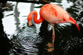
| 01/10/2006 05:29:50 PM | Sinkhole reflectionby MaverickComment: Originally posted by Maverick:
Thanks for your comments, I cropped it a little tighter on the top and bottom and do like it better this way. |
The top 'branches'/whatever did give some context, as I said: "Difficult, especially at the top, but I think a 'more finely tuned crop' top and bottom, may have made this even better.." - as you have 'overwritten' the other, I can't compare how much context is gone now, top and bottom. Still a good shot though, 'either way'.
While nice to see you did a recrop, my comments are more 'ripping photos apart to aim for perfection', and are only my opinions/suggestions (usually only after viewing for a short period) and generally 'retrospective'. So long as you are doing what you want with your photo (at shooting &/or 'pp'), taking comments into consideration, or not (as not all are 'valid' nor apt for your 'style'), that's the main thing. I wouldn't want you to have changed this when I may have been wrong - I am no expert in photography, just like looking at good photos and 'ripping them apart', in the hope it somehow 'helps' toward the photographer having a more 'critical eye' and taking a 'perfect shot' in the future, if that makes sense. Commenting/'ripping apart'/'critiquing' helps me to have a more 'critical eye' with my own shots too. edit2:another typo, fixed misquote of SELF & wordingMessage edited by author 2006-01-20 20:18:47. |  Photographer found comment helpful. Photographer found comment helpful. |
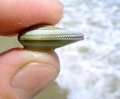
| 01/10/2006 06:32:17 AM | shell at huntingtonby briantammyComment: Nice, and 'unusual' (with the finger pads/prints) macro. Nice detail in the shell and good simple background.
temporary note #1: Re my previous comment on this 'shell at huntingdon' shot, I did try to 'rip it apart' (as I normally try to do), but there wasn't much to 'criticize' (constructively of course) with it, perhaps that is why you did not 'check the box', so not an issue. However on 2nd 'review', this is about the 'best' I can do to 'pull/rip this apart' (aka 'constructive criticism'); I guess it borders on a personal type shot in some respect, re the 'fingers', but minor. It is not so 'personal' that it could not be used 'commercially', in other words, a 'quality shot', in my opinion. Maybe a crop variation, especially bottom left near the nail, but minor. There is a little 'glare'/reflection here and there, but I actually think it adds to the shot. Perhaps 'more space' between the shell/fingers and the background for added depth, but again, works well as is so who knows.
Message edited by author 2006-01-11 19:56:06. | | Photographer found comment helpful. |
| 01/10/2006 06:14:39 AM | Sinkhole reflectionby MaverickComment: Nice capture, especially of the webbed feet under the water. Difficult, especially at the top, but I think a 'more finely tuned crop' top and bottom, may have made this even better in my opinion. Not much you can do aside from cloning about the 'leg tag'. | | Photographer found comment helpful. |
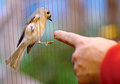
| 01/10/2006 06:05:03 AM | Making a connectionby MaverickComment: Nice capture. The 'cage wire' makes a good unusual element here. Perhaps a rotate up on the left and recrop may have made this even better in my opinion, but does work well as is. | | Photographer found comment helpful. |
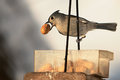
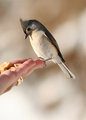
| 01/08/2006 08:19:18 PM | IMG_3793.jpgby Rando D300Comment: Excellent capture. Make a good quote/motivational shot/poster. Not sure what type of bird this is, but looks like the same one in the other (3857), so much for that comment I made about the beak size. | | Photographer found comment helpful. |
| 01/08/2006 06:18:48 PM | Nature's Feather Dusterby loveComment: Looks like a good concept, what I can discern.. not sure if it is a 'glitch' or not, or if this is the 'space saver thing', but like to see this bigger. Maybe the intention to see these bigger is to click on the 'Print Available!' link (which I did) - not sure. After seeing it bigger (and still not 640 in the 'print view' - not sure on that), I think it works quite well. Perhaps for added effect re your title/concept, a softening/feathering on the upper edges of the petals, or some movement in the hand, or perhaps 'dusting something', may have given this a little extra to help with the illusion/concept, in my opinion. edit: nice to see it bigger - the 'space saver' confuses me a bit, I guess it's intended as a '2nd print version' of an already submitted shot.. not sure.. thank you for the update Message edited by author 2006-01-08 19:41:05. | | Photographer found comment helpful. |
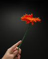
| 01/08/2006 05:14:19 PM | IMG_3857.jpgby Rando D300Comment: Nice (and 'special') capture. As you said, you should have used ISO 100 instead of 800, but as you also said, you've learned a lesson the hard way now. I like the way the shadow of the beak is on the 'neck' of the bird. They look like peanuts in the hand - but 'it's' beak is quite small, perhaps that explains the somewhat perplexed look 'it' has. Better luck next time. | | Photographer found comment helpful. |
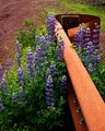
| 01/08/2006 08:34:47 AM | Purple flowers and a Guardrailby KivetComment: Nice color combinations. Nice composition. Seemingly good contrast control. Maybe a fraction more 'space' at the top may have made this better in my opinion. Judging by the leaves, might be a type of lupin, if interested. | | Photographer found comment helpful. |
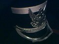
| 01/08/2006 08:22:16 AM | Marching Band Hatby zillahlewisComment: " I think it would make a decent picture if I could just hide that chin strap." - I think the chin strap is fairly minor. Perhaps this taken from a slightly different angle, a little more space around the hat, less grain and sharper would all have likely helped this in my opinion. I was trying to comment on your portfolio but even though you have these cameras listed: Nikon Coolpix 880, Canon EOS-300D Rebel, HP PhotoSmart 120 - all your shots are from a camera phone. Look forward to seeing you enter a Challenge. | | Photographer found comment helpful. |
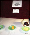
| 01/08/2006 08:09:10 AM | Blue Ribbon for Swiss Cheeseby vergComment: I really liked this concept, just felt that it hadn't reached its full potential. I see by your comments that you set this up for school, and didn't really like it. Sometimes 'setting something up' pays off, but then you need to be able to 'realize' the vision/idea that you had, both in your camera and possibly also with 'pp'. This particular shot, if it were 640 (height in this case, although I think 'wider' is needed here too), the 'Judge' sign on the rat not 'blown'/overexposed, the far left bowl included or excluded entirely and a little more attention paid to the cropping, would all have likely helped this shot a lot. All that said, 35th placing was pretty good. | | Photographer found comment helpful. |
|
Showing 3061 - 3070 of ~4217 |
Home -
Challenges -
Community -
League -
Photos -
Cameras -
Lenses -
Learn -
Help -
Terms of Use -
Privacy -
Top ^
DPChallenge, and website content and design, Copyright © 2001-2025 Challenging Technologies, LLC.
All digital photo copyrights belong to the photographers and may not be used without permission.
Current Server Time: 06/26/2025 02:34:18 AM EDT.
|