|
|
|
Showing 2901 - 2910 of ~4217 |
| Image |
Comment |
| 02/11/2006 08:02:19 PM | Color Bornby sajinComment: 8 - Nice. Criticism (somewhat difficult with abstracts); really only the couple of reflections which are a fraction too bright in my opinion, but minor anyway. Perhaps more height, not sure. More finely tuned crop, especially on the left. |  Photographer found comment helpful. Photographer found comment helpful. |
| 02/11/2006 07:46:04 PM | Snake Eye?by karmatComment: I gave this a 4. In my opinion it was off-centered 'enough' to adequately meet the Challenge, but the overall composition and elements didn't really emphasize the placement nor the subject or 'story' enough. As best I can recall, I first saw it and accepted it as 'met the Challenge', then moved on to what it was, the quality and then the concept/story/title. As far as I knew/know, 'snake eye(s)' is 1 on the die/dice - so when looking at this, whilst I thought the placement of the one 'pip' (just learned through commenting on this that's the term for the 'dot') was odd, but honestly didn't study it long enough to see manipulation, visual effect, etc. I think the concept is quite good but would need to be 'captured' in a very strong way, without any distractions. The surface the die is on blends from black to brown and also has a few minor 'blemishes'. The blank white area on the die was quite dominant, especially over the somewhat weak reflection - which if that were stronger, would also have likely helped this in my opinion. Perhaps also a more finely tuned crop, especially at the top to give the die and reflection a better position within the frame, and possibly a nudge rotation for more symmetry, may have also helped make this a stronger image - again, just my opinion. Perhaps using just the 'natural 1 pip' and cloning it out on the real and leaving it on the reflection - but then I realize perhaps you did it this way as .. the pip is also off-centered. If so, that was lost on me during voting due to 'attention time'. | | Photographer found comment helpful. |
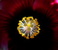
| 02/11/2006 07:23:47 PM | Protrusionby CutterComment: Nice angle/perspective on this hibiscus. Colors are good, although perhaps a fraction dark. If the very tips of those fuzzy stigmas were nice and sharp and the DOF able to be retained to still see the filaments on the stamens, make this even better in my opinion. The top right brighter area detracts, but fairly minor. Maybe also a 640x640, or even just tighter at the top & more horizontal, not sure, and depends what you had to work with, obviously. | | Photographer found comment helpful. |
| 02/10/2006 05:24:34 PM | | | Photographer found comment helpful. |
| 02/10/2006 04:25:31 PM | Abbyby MarjoComment: Interesting watching your studio/portrait 'learning shots' - I am learning just by looking. Not sure how much help you're getting with these, and whilst I can't offer any knowledge or experience with them, I'd like to suggest something - just ignore it if it's no good: depending how many lights you have, perhaps trying three placed strategically (with or without "brollies" etc etc), maybe one in the background 'up', one (using this shot as an example) up on the left pointing down (which it seems you've done?), and one on the right almost level height. I guess it depends if you are going for traditional studio portraits or something a little different. As for this shot, I think the eye capture is good, but like to see more detail in the black fur, especially around the body (as is on the face/head) and also sharper and 'using' the lightplay on the whiskers/fur outline. Hope all this makes sense and is helpful. The background fabric and colors fit well in my opinion. | | Photographer found comment helpful. |
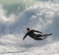
| 02/10/2006 04:05:35 PM | The-elegant-wipeoutby MacDonaldComment: Good capture. Like how you've cropped it, especially leaving the top of the wave in for size and scale. Again like the foam capture bottom left and that shadow is also a good catch and an unusual element to this, in my opinion. | | Photographer found comment helpful. |
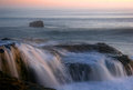
| 02/10/2006 04:04:00 PM | Grayson's Beautyby MacDonaldComment: This looks like a longer exposure than 'beauty-after-dark', but could just be the water/wave lengths/captures. Nice shot. The fore rock/edge of cliff is a little distracting, but fairly minor and likely difficult to 'avoid'. | | Photographer found comment helpful. |
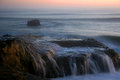
| 02/10/2006 04:00:30 PM | beauty-after-dark.by MacDonaldComment: This is nice, as is 'Grayson's Beauty'. Interested to see the exposure times if you could include them.. I like the way the water is 'circling' that 'rock' off-shore. Colors are nice. The horizon seems straight, yet looks just slightly off visually - if that makes sense - but might just be the perspective/angle the shot was taken at or the 'mist' masking it, or could just be me. Overall maybe a little dark, needing the colors 'tweaked' just a fraction to bring out more variance, if possible. | | Photographer found comment helpful. |
| 02/08/2006 07:19:41 AM | Feeling.......by missinseattleComment: I gave this a 5. I thought the concept was 'ok' but .. the 'blue', sad, etc.. is not my taste/style, so I am likely not the best to provide feedback. Having said that, this Challenge of course opened up the perfect opportunity for such shots and therefore was 'acceptable', if that makes sense, and I think you captured that 'sense' fairly well. Quality wise it looks like it could be sharper, but it might be resizing issues, not sure. Perhaps a variation in perspective/angle, a different reflective surface used, more attention paid to 'composition'/subject placement and a more finely tuned crop, may have made this better in my opinion. Perhaps also 'using' the glass transparency more into your shot may have added another element as well. Sure isn't "rotten" in my opinion. | | Photographer found comment helpful. |
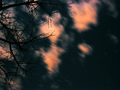
| 02/08/2006 07:04:02 AM | someone really is watching.....by AzCKellyComment: I gave this a 7. Thought the night sky capture was fairly good. The silhouetting branches added a good element. If overall more clarity, more of a 'quality' type feel (less 'grain'/noise) - difficult - and perhaps a more finely tuned crop, likely have made this even better in my opinion. | | Photographer found comment helpful. |
|
Showing 2901 - 2910 of ~4217 |
Home -
Challenges -
Community -
League -
Photos -
Cameras -
Lenses -
Learn -
Help -
Terms of Use -
Privacy -
Top ^
DPChallenge, and website content and design, Copyright © 2001-2025 Challenging Technologies, LLC.
All digital photo copyrights belong to the photographers and may not be used without permission.
Current Server Time: 06/27/2025 06:42:17 AM EDT.
|