|
|
|
Showing 281 - 290 of ~4217 |
| Image |
Comment |
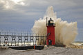
| 11/05/2009 06:57:41 AM | Halloween Galeby DrakeComment: 6 - Whilst this is interesting with the person widely straddled on the left - the person in front of the lighthouse looks in quite a predicament. If the quality was there - a specific crop on this part of the scene would make a fantastic image/capture/photograph. Some tweaking in post processing too, just to bring out the depth a little more and also clone out the couple of specks on the right. Your call of course, but the title detracts/doesn't seem to suit the image. |  Photographer found comment helpful. Photographer found comment helpful. |
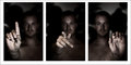
| 11/02/2009 05:04:27 PM | D P C, can you hear me?by InsomniacComment:  Critique Club Critique
First Impressions
Critique Club Critique
First Impressions
Despite the unusual photographic effects created in these captures, I found the images and triptych of them, uninteresting and quite a 'personal study'. I gave this a 3 during voting.
I also had no idea what the sign language was and did not stop to consider it during voting as the main subject was not my personal viewing preference, so I moved on fairly swiftly.
Photograph Information, Technicals & Composition Review
An aperture of 2 explains the good and unusual effect produced, however, it also created a rather dark and 'odd' effect coupled with the lighting and 'shirtless' subject.
The composition itself within each photograph and then placed within a triptych would have been better if the torso was aligned in each image.
Comments, Score & Placement Review
85/145 and a score of 5.56 is not bad, considering the subject matter, which may not have engaged many viewers. An average of 6.88 from your commenters reflects their comments and that most knew the sign language being displayed or knew the intent and either way, liked how you captured it. This just reflects how people view photographs and subject matter differently - just because it isn't something that appeals to me, doesn't mean it won't appeal to others.
Summary
If doing the signs for DPC was your main focus then more attention to distractions that would take attention away from the hands/signs - such as if there is person in the background, whether they are in focus or not, whether they are clothed or not, if so what clothing, the lighting, etc - would have allowed your message to come across much more clearly.
PS
I see this is your first DPChallenge submission - welcome to the 'fun' of entering & voting in Challenges.
Congratulations on taking the plunge, this is a good score and a decent quality photograph for your first submission.
| | Photographer found comment helpful. |
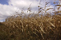
| 11/02/2009 04:46:58 PM | Deep DOF, Rule of Thirds and Stop Actionby snafflesComment:
Critique Club Critique
First Impressions
Surprised there is no 'Leading Lines' in your title, that was the first thing I noticed.
Photograph Information, Technicals & Composition Review
Whilst I can see stop action in the image, it is not strongly evident and I wonder whether allowing a much faster shutter speed/higher ISO may have created more impact regarding this technique - if the breeze was strong enough of course. The deep DOF is visible, however because of the composition, the eye cannot see too far further than the crop (of corn), which coupled with your extremely fore focal point, minimizes your deep DOF. The Rule of Thirds technique I'm struggling with here, as it seems fairly centered to me all up.
Challenge/titles aside - this image cropped much bolder on the right hand side produces a stronger image in my opinion. A tweaking of colors/lighting would also enhance the image.
Comments, Score & Placement Review
118/140 is fairly low down the pack and I suspect it is a combination of your subject and the way you have presented it, along with your title/choice of techniques - which are not overly apparent in the photograph.
An average score of 5.18 is fairly good, considering the placing. The average of 4.71 from your commenters, seems to mirror the honesty from most in regard to meeting the Challenge and using techniques. You received a couple of exceptionally helpful comments, one sugar coated, the other not, both of which are stating very similar observations.
Summary
Not the strongest contender in this difficult Challenge - which was virtually 3 Challenges in one. A different angle/perspective/crop on this particular subject matter (which is not that interesting in itself), coupled with use of additional photographic techniques, to work with your chosen three, would likely have produced a stronger image. | | Photographer found comment helpful. |
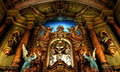
| 10/31/2009 07:23:11 AM | Diocesan Pastoral Conspiracyby marcusvdtComment:
Critique Club Critique
First Impressions
It's a bit soft, or is there a slight blur, hard to tell. Either way, the detail needed to be seen for such an intricate photograph is not there.
Photograph Information, Technicals & Composition Review
Composition wise, it seems a very busy scene crammed into an uncomfortable crop/framing. A majority of the features and elements in the scene are vertical/tall in nature and the framing is not showcasing them well, especially at this angle.
Ok, I see this is a HDR, with all quite slow shutter speeds - explains the lack of clarity. It could possibly work, but the exposure seems wrong - beautiful craftsmanship/art captured here, but the angle it has been captured and the lighting, etc is not allowing it to come to life. I can't offer advice on gaining a better result using indoor lighting technicals, but I would strongly suggest seeking advice from the Forums or elsewhere, as it seems you may have the opportunity to shoot this again.
Cropwise, I think you have 'chopped' some major elements that needed to be whole in a composition such as this.
Comments, Score & Placement Review
55/80 is fairly low down the pack, but your score of 5.58 is quite good. An average of 7.16 from your commenters tells me that most were intrigued with it, especially for this Challenge.
Summary
Bit of a wordy title for this Challenge, one that doesn't instantly seem like a movie type title to me. A variation in cropping/framing, may have allowed more life to the scene and image. I can't also help but wonder about reducing the image to one of your exposures, in this instance - as the HDR doesn't seem to be enhancing the finished image. | | Photographer found comment helpful. |
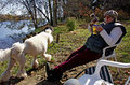
| 10/31/2009 07:12:19 AM | On a Canadian afternoonby snafflesComment:
Critique Club Critique
First Impressions
A bit of a snapshot, but one of a moment in time and in your corner of the world. Nice relaxed feel to the image.
Photograph Information, Technicals & Composition Review
Difficult because of the Challenge, but this scene would likely be enhanced by a nice shallow DOF, but again - because of the Challenge, you need the context of 'your part of the world'. In saying that, I think the image/scene is more about a moment and also a slight candid and not really about showcasing your part of the world.
Composition wise: shame the dog's tail is chopped, but the cropping at the bottom, where your knee is visible, could have been improved. Also, depending how much more you had to work with, including more of the background in would have been better for this Challenge, in my opinion.
Comments, Score & Placement Review
132/159 probably reflects that most didn't get a sense of 'your part of the world' strongly from this image, which your score of 4.86 also indicates. However, the somewhat 'snapshootishness' of the image probably pulled it down as well.
Average of 5.0 from your mirrors a few of your comments, but certainly not all of them.
Summary
Not a strong meet of the Challenge and from reading your Photographer's Comments, this image probably has a different meaning to you. | | Photographer found comment helpful. |
| 10/29/2009 03:19:11 PM | Dream's Pale Castleby posthumousComment:
Critique Club Critique
First Impressions
I like this. Really like the perspective, especially when taken of a bird. At first glance I wondered if the bird was alive, as the feathers seem a little 'unruly', however the pose/position of the beak makes me think he/she is indeed alive and well in a Dream's Pale Castle.
Photograph Information, Technicals & Composition Review
Difficult, as you obviously had a vision here and kept experimenting until you captured an image as close as possible to it. For me, I like the very shallow DOF and like the focal area/point, but do wish that either a fraction wider to allow more of the crow in, as well as the surrounding stone, or else, just shifted a little, in lieu of the stone and to get more crow. I like the 'blown outness' of this. The main thing that bothers me is that dark area (roof?) at the top of the image. Maybe just less of it (perhaps cropped), or else none, maybe. It competes against the crow too much for attention, especially because it is the only other dark area in the image.
I like the placement within the frame, especially with the direction the crow is looking/facing.
Comments, Score & Placement Review
80/81 is too harsh in my opinion, but what can you do. Same with the score of 4.25 - I'd expect an 'artistic' style image such as this to score low, but maybe closer to the 5 mark. I'd hazard a guess it was the overexposure that burned people's eyes and made them score low - without lingering to 'get it'. Of course, maybe they 'got it' but it just isn't their thing.
An average score from your commenters of ... 3 is telling and does match their comments, which seem honest enough.
Summary
For me, whilst this could be a movie poster, I don't gel with the title befitting a movie - a book or poem, yes, perhaps. Otherwise, a unique image and vision. Just wish the crow didn't compete with the stone and that other dark area, 'somehow'.
edit:typoMessage edited by author 2009-10-29 15:21:51. | | Photographer found comment helpful. |
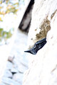
| 10/28/2009 09:20:56 AM | Dark Phantom's Castleby Rino63Comment:
Critique Club Critique
First Impressions
I like this. Really like the processing and it suits your title and the Challenge well.
Photograph Information, Technicals & Composition Review
A lot of processing there (just read your Photographer's Comments). The effect is good. I do wish this image had a whisker nudge up on the left to straighten the building (house!). I like the bridge placement in the composition, but do wonder whether more drama could have been achieved in this image overall by a slightly more angled perspective. Minor, but the bench/seat element detracts slightly from the 'fantasy' mood and feel of the building and what it conjures up in the imagination, especially with the help of your good title.
Maybe a little darker overall, but that is personal taste. The bottom right chain post/structure perhaps cropped and/or cloned out would be better, however I do see the boat dilemma.
Comments, Score & Placement Review
5/81 is excellent scoring and your score of 6.83 very strong.
You received a good mix of interesting and well thought out comments. I tend to wonder also about this not cropped so tightly and allowing a little more 'distance'. But maybe that was not possible with the surrounds or maybe you wanted it this tightly cropped.
Summary
Despite what I said above about the bridge, it is slightly unsettling that the 'leading line'' (entrance) to the building is positioned in the left of frame - for some reason I find it hard to be easily 'drawn into' the building - if that makes sense. I like the contrasting effects within the image and for me, a little more depth/darkness and drama, would have packed a little more punch. | | Photographer found comment helpful. |
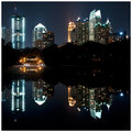
| 10/28/2009 09:06:50 AM | LIVE :: WORK :: PLAYby ericwooComment:
Critique Club Critique
First Impressions
I like the centered reflection, the reflected colors and lights are good, but detail seems lacking. The square crop seems a bit misplaced, especially with the half building on the left.
Photograph Information, Technicals & Composition Review
As mentioned above, the crop, especially on the left needs refining - the overall balance is out. Appears to be some slight tilt happening too, so some straightening would help. Compositionally, whilst I like that you've centered the reflection, it does make the 'blackness' in the silhouetted trees dominate the image too much and whilst there is some unusual and good effect there in those trees, especially with some discernible shapes and subtle details and the interesting lights, there is not enough interest in them to compete with the main subject, the cityscape. Also, the composition as is, having the 'lesser quality reflection' using more real estate than the good clarity and exposure on the buildings, weakens the image somewhat and if it had been the reverse, would have produced a much stronger image. Of course, if the reflection were good, as is would likely work well too.
Comments, Score & Placement Review
11/159 and a score of 6.69 is very good scoring and placement. All of your commenters really liked this image and that is confirmed by the average vote from them of 8.0. I can't see any comments that give suggestions or criticism.
Summary
I like the blues and that interesting 'darkness', the little building is also interesting. Overall it is at first an odd contrast, between that 'lake scene' and the city and buildings in the background, my thoughts are that there is too much in this image competing for attention. Having said that, all these elements do grow on you the more you look at the image. The composition, framing and crop bother me a little though and I can't quite put my finger on what it is - I try to imagine a more vertical, taller framing, with more taken off the right hand side and wonder whether that may have given this the little extra this seems to need to make it more 'polished'. However, I do like the square crop as well. Either way, your vision, your call. | | Photographer found comment helpful. |
| 10/26/2009 06:29:05 AM | DEF-LEPPARD-260408-DPC2.jpgby jblaylockraynerComment: Thanks for sharing these. I did look soon after you uploaded back in 2008, but just wanted to actually say thanks and let you know someone appreciates the images and you sharing them. A comment on the picture? - You gotta laugh when you look at these guys in this particular picture... they got some good tunes though! ;) Very well photographed, as always - like those shiny red Macks Peterbilts(?) - trucks!
edit:correctionMessage edited by author 2009-10-26 15:14:26. | | Photographer found comment helpful. |
| 10/23/2009 05:18:47 PM | | | Photographer found comment helpful. |
|
Showing 281 - 290 of ~4217 |
Home -
Challenges -
Community -
League -
Photos -
Cameras -
Lenses -
Learn -
Help -
Terms of Use -
Privacy -
Top ^
DPChallenge, and website content and design, Copyright © 2001-2025 Challenging Technologies, LLC.
All digital photo copyrights belong to the photographers and may not be used without permission.
Current Server Time: 06/18/2025 02:48:40 PM EDT.
|