|
|
|
Showing 2871 - 2880 of ~4217 |
| Image |
Comment |
| 03/04/2006 11:55:44 PM | |  Photographer found comment helpful. Photographer found comment helpful. |
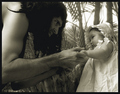
| 03/04/2006 11:09:53 PM | Lost and Foundby anthonyczajaComment: 9 - Good photograph. A few technical issues, mainly in the 'hair'. An odd odd couple story.. plus it's interesting, a good capture and has innocence. | | Photographer found comment helpful. |
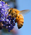
| 03/03/2006 05:36:35 PM | Bee - up frontby MacDonaldComment: Originally posted by MacClavey:
I re-cropped the shot at your suggestion (see the new posting)- tell me what you think if you revisit ... |
Left a comment on that one. Hope you didn't misunderstand me - I do like this shot, especially the detail. It was just the grain detracted slightly, 'in my opinion' - but as you said, it is about 'preferences' etc ---> correct. edit:removed temporary note Message edited by author 2006-03-04 17:58:44. | | Photographer found comment helpful. |
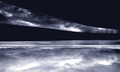
| 03/03/2006 05:27:12 PM | night-seaby MacDonaldComment: I actually like this more than your entry. But as you yourself said, it is all about personal preferences/tastes. This one looks like it has been nudge rotated (compared to the original) up on the right (?), but still looks like it needs a whisker more - but that's really 'nit-picking'. Perhaps this with a little more height for added impact too, not sure. Hypothetically, if interested, I'd have likely given this a '6' as well, possibly '7'. | | Photographer found comment helpful. |
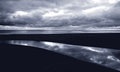
| 03/03/2006 05:22:19 PM | Night Sky Reflectionsby MacDonaldComment: I gave this a 6. In retrospect, not sure what I was thinking about the 'ground' (but perhaps realized at the time it was flipped - don't remember), but I recall deciphering what I thought was some type of fence railing .. or such - and this taken through that railing. Obviously way off after seeing your comments, etc. Brave first entry (re the flip and abstract etc). Certainly wasn't one of the 'few' I had picked as yours as I was voting. At any rate I liked the perspective, lines, 'texture' and most importantly, the way the toning enhanced the image - hence my score. Good result for your first Challenge, as expected. | | Photographer found comment helpful. |
| 02/25/2006 05:21:51 PM | Watchfulby JutildaComment: Like this, especially the reflection in his eye. Perhaps a more finely tuned crop, especially on the right may make this even better, in my opinion. More definition in the dog and/or clarity in the eye also, but depends what you are able to work with, obviously. The retention of the blue/black coloring in the fur is good, but in the darker areas toward the nose, looks like may be the beginning of slight gamma issues, not sure. | | Photographer found comment helpful. |
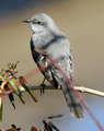
| 02/25/2006 05:17:30 PM | mockingbird-640.jpgby richComment: Nice clarity and coloring, including the 'fore bokeh' and the nice simple background. Perhaps a more finely tuned crop at the bottom may make this even better - depending what you have to work with. | | Photographer found comment helpful. |
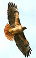
| 02/25/2006 04:50:03 PM | Redtail - re-editby MacDonaldComment: This is good too - and I did try to look for the original of this but could only find:

which, as you know, I thought was a very good shot.
At any rate, two things 'in my opinion' for this. Firstly I am not sure on the natural coloring of the red-tailed hawk, perhaps this shot depicts the true color better than the above posted, not sure. However (2), this seems a little 'stark', if that makes sense, it's good but - just seems to need maybe some more space 'somewhere' or - not sure. The other one, while perhaps not as vivid, just has a little extra in my opinion, whether it is the fact that the hawk is looking more toward the camera, or the sky color or the added context/more balanced composition - not sure. Just my opinion anyway and could be wrong and really haven't touched on any true technicals - and you know why. Hope this helps. | | Photographer found comment helpful. |
| 02/25/2006 04:43:22 PM | Bee - up frontby MacDonaldComment: I like this, 'but' - (and this may sound contradictory to my other comments) - this seems just a fraction oversatured, but it may be the bright lighting. There seems to be a touch of grain, so maybe 'zooming out' just a fraction (in pp obviously) - depending what you have to work with - may help this, otherwise maybe manually 'painting'/softening using a tool/brush in pp. For presumably hand held it's a good capture, with fairly good detail for a macro in natural conditions. Don't intend to be 'painful', but if you know the name of the flower would be good - as I can't quite place it, and no it doesn't matter, I'm just 'wondering'. Also, another reason for 'zooming out', would be that it may balance out the shot a little more, perhaps slightly off-centering the bee may give this a little more overall. Whether more space left or right, not sure - in my opinion, a fraction more space to the right of the wings and some more flower incorporated would probably be good - but again depends what you have originally. I'd hazard a guess that given the ranges in this shot, it is likely a difficult one to adjust the lighting/color/etc in pp. | | Photographer found comment helpful. |
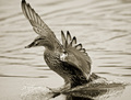
| 02/25/2006 07:38:16 AM | The Landingby Kevin WaiteComment: 7 - Nice capture, especially of the skiing feet. 'If only' the tip of the other wing as well, and 'somehow' this bigger/more in the frame, especially at the bottom, make this even better in my opinion. Toning works well here. | | Photographer found comment helpful. |
|
Showing 2871 - 2880 of ~4217 |
Home -
Challenges -
Community -
League -
Photos -
Cameras -
Lenses -
Learn -
Help -
Terms of Use -
Privacy -
Top ^
DPChallenge, and website content and design, Copyright © 2001-2025 Challenging Technologies, LLC.
All digital photo copyrights belong to the photographers and may not be used without permission.
Current Server Time: 06/27/2025 11:02:30 AM EDT.
|