| Image |
Comment |
| 04/03/2006 06:37:50 PM |
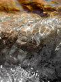
Liquifyby LucidLotusComment: I gave this a 6. I recall having to study this shot quite a while (a minute, maybe 2 (long time in voting)), trying to decipher what it was. The frozen forms within the ice (cubes?), which look like bubbles perhaps, didn't make this instantly recognizable as ice. I liked the concept, but the clarity was not sharp enough for what appeared to be a macro, or macro attempt with this subject (no expert on lenses, but doesn't appear you've used a macro lens here). I didn't mind the toning but not sure it enhanced the subject(s) as well as leaving them natural may have. The angle/perspective was fairly good but perhaps sharper may have given this an edge. Compositionally, less background and more foreground, giving more balance and showcasing your 'textures' here and more frame 'height', would have likely made this better in my opinion. The 'base' looks like wood grain to me and would never have guessed tin foil, so again, perhaps leaving the natural coloring may have allowed the color and texture of the foil to complement your subject(s): ice and water. |
 Photographer found comment helpful. Photographer found comment helpful. |
| 04/03/2006 06:10:01 PM |
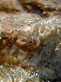
Liquid Lensesby GeneralEComment: Left a comment on:
 .
The shot is definitely all about water, which for this Challenge, was a very important factor (always is for me). Liked the angle and the fact this was a macro was also good. Nice capture of the light play on the water overall, in my opinion. |
| Photographer found comment helpful. |
| 04/03/2006 06:03:43 PM |
Ripples_P3260010-DPCx.jpgby GeneralEComment: Don't mind the partial desaturation, however in my opinion it does detract from the 'sparkle' of the water a little, even though I realize you are trying to enhance it. May just be a visual thing, as the eye gets 'drawn' to that lower half of the shot. The main thing for me in your entry:

was the out of focus fore/bottom (which you've desaturated here). Perhaps a tighter crop (quality dependent), still trying to retain the vertical frame may have helped, not sure.
Nice capture of the light play on the water overall though, in my opinion. |
| Photographer found comment helpful. |
| 04/01/2006 07:45:59 PM |
No juice yet...by ajschelComment: 8 - Very good. Nice simple colors. Sharper with the green make this even better in my opinion, but difficult I know. Good concept and title (without which I'd never have 'got it'). |
| Photographer found comment helpful. |
| 04/01/2006 07:44:12 PM |
Its Australian by GolferDDSComment: 9 - Very good. Colors, textures and composition all very good. The only 'nit-pick' would be the blue reflection, but fairly minor. Even more definition and clarity - but that is likely lens dependent. Might sound 'minor', but for such a good shot, wish there was no 'typo' in the title. edit:typoMessage edited by author 2006-04-05 06:09:50. |
| Photographer found comment helpful. |
| 04/01/2006 07:37:29 PM |
Balanceby stare_at_the_sunComment: 8 - Very nice. Nice composition and colors. Difficult, but 'if only' the drop &/or 'strand' it is on were even sharper. |
| Photographer found comment helpful. |
| 04/01/2006 07:31:24 PM |
Artificial Lifeby Dr.ConfuserComment: 7 - Nice color and light play/bokeh effects. 'If only' to capture more of those effects, would have given this a little extra and made it even better in my opinion. |
| Photographer found comment helpful. |
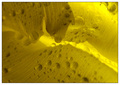
| 04/01/2006 07:27:15 PM |
Yellowby agwrightComment: 7 - Like this. A little more light play and less grain, make this even better in my opinion. |
| Photographer found comment helpful. |
| 04/01/2006 07:26:28 PM |
Bladeby bryanbrazilComment: 8 - Nice colors and composition. Like the slightly elongated frame. |
| Photographer found comment helpful. |
| 04/01/2006 07:25:51 PM |
Weatheredby michelejoieComment: 3 - Good concept and composition. Needs to be bigger, 640 width in this case. |
| Photographer found comment helpful. |
Home -
Challenges -
Community -
League -
Photos -
Cameras -
Lenses -
Learn -
Help -
Terms of Use -
Privacy -
Top ^
DPChallenge, and website content and design, Copyright © 2001-2025 Challenging Technologies, LLC.
All digital photo copyrights belong to the photographers and may not be used without permission.
Current Server Time: 12/21/2025 03:53:26 PM EST.