| Image |
Comment |
| 04/15/2006 07:47:08 PM |
Kick-flipby spydrComment: 7 - Good moment/concentration capture. Simple clothing helps. Perhaps a variation in cropping may have given this a little extra, in my opinion. |
 Photographer found comment helpful. Photographer found comment helpful. |
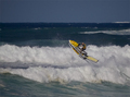
| 04/15/2006 07:46:18 PM |
Wave Jumpby StagoleeComment: 7 - Good capture. Difficult, especially with the whites, but perhaps a tweaking of the colors, etc may have given this a bit more 'pop'. Quality dependent, perhaps a tighter crop too, but the context/scale is also good here so who knows. |
| Photographer found comment helpful. |
| 04/14/2006 07:17:00 AM |
alongby BowieComment: I gave this a 7. Really liked the strong perspective and bitumen/asphalt/road texture captured. A slight variation in the composition, to try to gain even more balance and symmetry, likely given this a little extra in my opinion. |
| Photographer found comment helpful. |
| 04/14/2006 07:11:47 AM |
A-peel-ingby MikeOComment: I gave this a 7. Thought the texture captured was quite good and the composition also good. The colors tweaked, a fraction sharper (difficult) and a slight variation in the framing, likely make this even better in my opinion. |
| Photographer found comment helpful. |
| 04/14/2006 07:02:39 AM |
Faultlineby KonadorComment: I gave this an 8. Liked the colors, perspective, lines and texture captured. Difficult without losing the good perspective and lines as just mentioned, but perhaps a more finely tuned crop may have made this even better in my opinion. Possibly also a little wider, not sure, as does work well as is. |
| Photographer found comment helpful. |
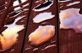
| 04/14/2006 06:46:04 AM |
Quicksilverby srbrubakerComment: I gave this an 8. Good shot and perspective. Couldn't work out at the time if this was just water with cloud/sky reflections. Either way, your title was good and very apt. Colors were nice and the texture of the wood/deck and the 'quicksilver' was very good. A variation in composition, cropping or angle/perspective (although I realize difficult without losing that unusual reflection), may have made this even better in my opinion. |
| Photographer found comment helpful. |
| 04/14/2006 06:27:51 AM |
Lava Channelsby Art RoflmaoComment: I gave this a 4. To be honest, I don't remember this image strongly enough from voting to give purely 'retrospective' feedback. However, after reading your Photographer's Comments and looking more closely at the image now, I can see what it is and what you were likely aiming for. Perhaps just a little more context (still keeping it abstract'ish'), not quite so close (otherwise a macro (apologies in advance, doesn't look like you used a macro lens(?))) and perhaps a slight variation in the lighting and angle/perspective, especially to show the texture(s) more, may have made this better in my opinion. Overall a little dark and not enough 'pop', especially in the definitions of the textures either on the surface of the shell or the 'waves'. The lines and cropping are good. |
| Photographer found comment helpful. |
| 04/10/2006 09:23:00 PM |
Mediterraneanby AranchaComment: 7 - Like this. Tweaking of the colors/'lighting', whilst difficult I realize with the whites, may have made this even better in my opinion. Not sure on the frame color, perhaps a color from within the shot may have complemented and lifted the shot more. Texture detail middle-down, is good, 'if only' to have that detail in more of the shot, also make this even better in my opinion, especially for this Challenge. |
| Photographer found comment helpful. |
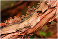
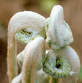
| 04/10/2006 09:12:22 PM |
Birth of a Fernby The EskimoComment: 6 - Very good concept. Difficult shot, I know. The detail and texture on/in the areas that are in focus is very good, unfortunately the OOF areas dominate more, in my opinion. A slight tweaking of the colors, perhaps a nudge rotation up on the right (for added symmetry and balance) and a more finely tuned crop, especially on the left, likely have helped this in my opinion, however you'd still be left with the fact that the two fronds are 'in the way', so perhaps a different angle, who knows. |
| Photographer found comment helpful. |
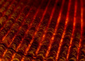
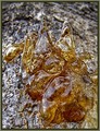
| 04/10/2006 09:07:09 PM |
Amber: Jewel of Natureby magueroComment: 6 - Nice. Good concept. Colors are good. Different angle perhaps, the OOF area dominates this too much within the composition in my opinion. Like the detail and clarity on the other areas though. Not sure on the frame. |
| Photographer found comment helpful. |
Home -
Challenges -
Community -
League -
Photos -
Cameras -
Lenses -
Learn -
Help -
Terms of Use -
Privacy -
Top ^
DPChallenge, and website content and design, Copyright © 2001-2025 Challenging Technologies, LLC.
All digital photo copyrights belong to the photographers and may not be used without permission.
Current Server Time: 06/28/2025 08:52:01 AM EDT.