|
|
|
Showing 251 - 260 of ~4217 |
| Image |
Comment |
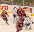
| 11/14/2009 05:58:31 PM | The Blur Of A Momentby SledZepplinComment:  Critique Club Critique
First Impressions
Critique Club Critique
First Impressions
Nice movement with the colors but overall too busy, especially with the mix of movement and stillness of the spectators/crowd. I gave this a 4 during voting.
Photograph Information, Technicals & Composition Review
Depending what your aim was with the image (just taking a shot during the game, or going for a specific effect), perhaps trying to focus further to the fore, especially at the players and the action and using a shallower depth of field to eliminate / reduce the crowd, would have produced a stronger image. Again, depends what you were going for - from your Photographer's Comments, I cannot tell.
Comments, Score & Placement Review
390/403 is quite low down the pack and your 5.2 average from your commenters seems to reflect their comments, some of which seem to be especially helpful.
Summary
Perhaps cropping out the spectators and going for a more abstract/movement type of image may have produced something that held more interest but as is, I suspect it didn't hold people's attention long enough because of the busyness and slight snapshot feel to the image.
edit:typoMessage edited by author 2009-11-15 14:33:52. |  Photographer found comment helpful. Photographer found comment helpful. |
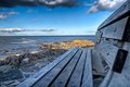
| 11/11/2009 07:17:05 PM | Ocean Viewby kcuiComment:
Critique Club Critique
First Impressions
Do/did like this perspective and the inclusion of the bench. I remember pondering this for a very short while, imagining myself sitting on the bench looking out to sea and thought you captured that 'moment' quite well. I gave this a 6 during voting.
Photograph Information, Technicals & Composition Review
The image needs just a fraction more width, room to the left of the bench (maybe at the bottom too), in my opinion as the bench dominates the shot a little too much - plus because some of it (especially the fore) is OOF (out of focus), it (the oof) dominates a little too much at the fore of the image. Having said that, I do like how the bench is minimized somewhat in the image as a whole, because that does let the 'view' dominate - if that all makes sense.
I like how you have left the dark clouds in - they provide a good framing. The light on the rocks is unusually placed within the image compositionally, but does work. The lines on the bench lead you out to that.
Barely noticeable, but the horizon is out by a whisker.
Comments, Score & Placement Review
117/403 is a decent showing in a Free Study and at least you score over 6. 7.83 average score from your commenters does strongly reflect their comments - all of which seemed to appreciate your vision and how you have captured & processed it.
Summary
As mentioned above, a little more room at the left and possibly at the bottom, makes the 'expanse' grow in the image and as a viewer, takes you 'there' a little easier. | | Photographer found comment helpful. |
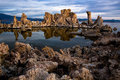
| 11/11/2009 07:04:59 PM | Mono Lake Mirror Poolby ManRayfanComment:
Critique Club Critique
First Impressions
Good potential, I like the reflection. For me, the biggest issue in this photograph is that your 'mono lake pool' is competing too much against the foreground and the background/distance, which also makes the image on the whole a bit busy.
Photograph Information, Technicals & Composition Review
As is, a more refined crop to showcase the pool better would improve the image, in my opinion. If you get a chance to go back, I'd suggest trying a variation in angles to, at least, eliminate the water behind - or maybe include it more but either way, trying to ensure that the "tufas" (?) stand on their own against either a shallow depth of field if land in the background, or else be able to 'use' the water behind them. This would seemingly mean that a very careful 'clamber' across the rocks at the fore would be required to be able to get a somewhat extreme angle, but you might end up with a photograph that truly showcases what you are trying to show.
Comments, Score & Placement Review
144/403 in a Free Study is a very good placing, especially for your 2nd entry at DPC. A score of 5.90 seems about average that placing. Your average of 6.75 from your commenters, is a little more information for you to couple with their comments.
Summary
Nice lighting and, as mentioned above, just some variation in cropping/composition, plus possibly a perspective correction (water levels, fore & rear, reflections, etc (?)), make this an even better image in my opinion. | | Photographer found comment helpful. |
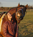
| 11/11/2009 06:54:25 PM | Sharing a laughby snafflesComment:
Critique Club Critique
First Impressions
I like the action, but overall the snapshottish feel dominated the photograph more than the moment captured, in my opinion. I gave this a 4 during voting.
Photograph Information, Technicals & Composition Review
With the image as is, I wonder whether a much tighter crop on the left and bringing their faces into the frame/dominating more may have given this more of an edge. Because some of the colors in the fabrics contribute toward a slight busy feel for this image, perhaps a toning/b&w may have complemented this image. Fairly minor, but looks like it needs a whisker straightening and/or perspective correction.
Would like to have seen sharper focus on the horse.
Comments, Score & Placement Review
15th is good placing, and 6.05 a nice score. An average of 7.0 from your many commenters reflects their sentiments - they all liked the humor in this image.
Summary
As mentioned above, eliminating some of the distractions to allow the 'interaction' to dominate more, make this better in my opinion. | | Photographer found comment helpful. |
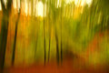
| 11/09/2009 11:47:05 PM | Autumn Rushby PelleComment:
Critique Club Critique
First Impressions
Difficult Challenge, nice abstract but the sun/light top left dominates a little too much.
Photograph Information, Technicals & Composition Review
You mention the unwanted curved effect, I quite like that (if you're talking about the 'waves'). For me, as mentioned above, the overexposed sky is a fraction too dominant and takes my attention away from the nice flows and colors. Perhaps cropping it out, but as always, your call.
Comments, Score & Placement Review
12th place is very good. Score of 6.04 doesn't seem to match that, but a difficult Challenge with not many entries.
Average of 7.0 from your commenters - all of which seemed to really like the beauty in it. You received one comment with a suggestion about cropping out the top part, so I am not the only one to see/think that.
Summary
The overall visual balance of the movement/lines/color perhaps is a little thrown out by the tree on the left, so I wonder about a variation in cropping/composition - but your call. My favorite part of the image is the two trees/trunks in the center and the colors and movement surrounding them. | | Photographer found comment helpful. |
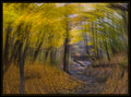
| 11/09/2009 11:33:06 PM | The Bridgeby pekeloComment:
Critique Club Critique
First Impressions
That's interesting and good movement technique.
Photograph Information, Technicals & Composition Review
Well done for doing a lot of experimenting to achieve your vision with this technique. I certainly like how you've centered it with the river/river bed in the center of your movement (and then obviously chosen your composition/crop from there in pp). I also like the way that you have created both movement in the tree branches/leaves as well as extended them into an arch.
I really like the colors and overall palette, however do wonder about some subtle tweaking in pp to bring those colors to life just a little more - packing a little more punch and getting the image to pop off the screen, as it looks like it has the potential to do.
I wonder whether a fraction off the top (and possibly the bottom) of the frame would make this image/scene even stronger.
Fairly minor, but for me, your framing (border) detracts. It is too dominant for the 'delicate wispiness' of the image.
Comments, Score & Placement Review
9 - very very good. 6.21 is a little surprising, but a difficult Challenge, so that may explain it a little. An average of 8.0 from your commenters - all of which seemed to really like your end result and appreciated the effort that went into a difficult image such as this.
Summary
As mentioned above, just some further refining in pp, mainly cropwise and color/contrast boosting, and this might be an even better image - but still very good as is. Congratulations on placing in the top 10 with your (only) 5th entry in nearly 7 years at DPC. Good luck with your photography goal!
edit:typoMessage edited by author 2009-11-09 23:35:46. | | Photographer found comment helpful. |
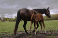
| 11/09/2009 11:16:12 PM | Storm comingby snafflesComment:
Critique Club Critique
First Impressions
The centered composition isn't showcasing these two well. The title confused me because of the subjects. I gave this a 5 during voting.
Photograph Information, Technicals & Composition Review
As mentioned, a much tighter crop on the left to get these two more in the frame would have been better in my opinion, or even, a bold crop, chopping half the mother and going for a square or even vertical type framing, may have produced an interesting image as well.
The poses of the horses and the angle are not reaching the full potential perhaps available to you - but I wasn't there, so assuming a little.
There seems to be some haloing on the edges, perhaps oversharpening in pp, not sure - could just be resizing issues. With your title, the clouds/storm are not very prominent or showing any particular form. They do not feature enough within the frame to see all the drama too them.
There is a tree, far left in the background, that looks almost 'grey'... not sure what is going on there.
Comments, Score & Placement Review
255/403 and a score of 5.48 is circa middle of the road for a Free Study. An average of 6.0 from your two commenters (when one apparently didn't vote...) shows that they thought this image above average (as a general rule).
Summary
The image as is, with a variation in crop and perhaps some subtle 'pushes' in pp to gain a little more boost, may have given this something extra. If you get another opportunity with these two (or even one of them), perhaps experimenting with different angles, especially trying to showcase selective features may produce an interesting image. | | Photographer found comment helpful. |
| 11/09/2009 08:52:55 PM | | | Photographer found comment helpful. |
| 11/09/2009 08:51:36 PM | | | Photographer found comment helpful. |
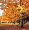
| 11/08/2009 12:30:05 AM | Fall in the Parkby janieceComment: I gave this a 6. I liked it - for me what would make it an even stronger image is a little more clarity at the fore and to (and this is very difficult, especially to judge/experiment with your depth of field) but have the very distant background (road/cars/etc) blurred/unnoticeable, as they distract. I remember pondering that bench/seat/swing for quite a while as it looked quite unique. | | Photographer found comment helpful. |
|
Showing 251 - 260 of ~4217 |
Home -
Challenges -
Community -
League -
Photos -
Cameras -
Lenses -
Learn -
Help -
Terms of Use -
Privacy -
Top ^
DPChallenge, and website content and design, Copyright © 2001-2025 Challenging Technologies, LLC.
All digital photo copyrights belong to the photographers and may not be used without permission.
Current Server Time: 06/17/2025 10:25:45 PM EDT.
|