|
|
|
Showing 171 - 180 of ~4217 |
| Image |
Comment |
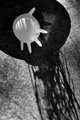
| 03/13/2010 03:49:03 PM | Theater of the Absurdby RKTComment: 7 - The b&w works well to pick up on the shadows and shapes. Your call, of course, but for me - the scene itself is not that 'absurd' - maybe if it was a little bunch of them or something else (and no not that) blown up, might make me think, as the viewer, "oh that's absurd".. Also, because of your title, my mind wants to see some type of theatre scene in the shadows there - puppets, strings, props, something. I like the concept though, just think there's more room to explore/create with the idea. |  Photographer found comment helpful. Photographer found comment helpful. |
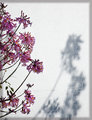
| 03/13/2010 03:45:04 PM | Spring is nearby jnenvirComment: 7 - Nice, but for me the border detracts from the simplicity, colors and shadow element. | | Photographer found comment helpful. |
| 03/13/2010 03:42:44 PM | Look directly into the sunby JulietNNComment: 8 - This is a tricky one for me, as I do really like the image, especially the shrubs/bushes/trees at the fore and the distant colors, mist/haze and light creeping in. That part of the image, personally, I can perceive more as 'fine art', but the border detracts and the visible sun and disproportionate mountains (including that their 'shape' doesn't add to the image, isn't 'used'), throws me from the scene and makes this more of a landscape photograph - almost like two images in one. It just seems unbalanced, in more ways than one. Despite the urge after writing this, I still can't take it down to 7 from 8 - I do like it. | | Photographer found comment helpful. |
| 03/13/2010 03:25:19 PM | di macchinaby yankoComment: 8 - Well, of course I have been trying to decipher what I'm looking at - I'll take a small guess that it is some type of 'sink/drain hole', perhaps partly fabricated by you. Either way, I like the machine look to it and your title echoes that. I like the tinted tone and composition, although it seems slightly off balance to my eye. | | Photographer found comment helpful. |
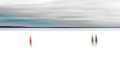
| 03/13/2010 03:23:15 PM | New Horizons by salmiakkiComment: 8 - I like the uniqueness of this. In photography, I haven't seen anything similar to this (but I don't get around much these days). The simplicity and the lines and the colors and the three figures all work well and there is good balance in the composition, especially with the rise in the distant landscape on the left side with the solitary figure. The colors, while very muted, work well - if you changed any hues or adjusted the saturation, this must be your personal color wheel choice - a variation would likely have more impact for me, but this is your vision, not mine. | | Photographer found comment helpful. |
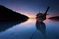
| 03/12/2010 04:59:15 PM | Stranded Long Tail Boatby orvaratliComment:
 Critique Club Critique
First Impressions
Critique Club Critique
First Impressions
'Ding Ding' - This is my 100th Critique Club Critique and I'm very pleased to have drawn this image from the stack.
I gave this an 8 during voting - beautiful image.
Really like the strong perspective, colors, but mostly my favorite part of the image is the rope visible/captured under the water.
Photograph Information, Technicals & Composition Review
I really like how your exposure time and depth has created a borderline milky effect on the water, yet still retaining that transparency. Of course the reflections, subtle from the boat but more dominant on the left from the mountain, add extra interest to the image and in no way create a sense of 'busyness'. These and the other elements just allow you to view 'new things' when revisiting the image.
I like the composition and any change to it would create another (excellent) image. My only real 'niggle' with this image and it is fairly minor, but one that my mind always finds unsettling, is that the horizon & water 'level' seems out by a whisker (needs the smallest of fractions up on the right), but could be the perspective/angle, plus the fact the angle of the boat, which perhaps just fools the eye.
The shape on the distant pinkish clouds 'sweep in' toward the boat which is good - but does make me wonder about accentuating that in your composition, but again - another image. Maybe I'd like to see a little more detail on the fore of the boat, especially where the writing/drawing/artwork is in white... but again - another image.
Comments, Score & Placement Review
10th place (out of 378) in a Free Study is excellent and a score of 6.80 is strong (a little surprising, to be honest I was expecting to see it higher). An average of 7.77 from your commenters with one or two 'suggestions for improvement', but these sound more like personal taste and I'm not sure that they would improve this image (again, another image). Otherwise, your commenters mostly just tell you what they like about the image and their reactions, which of course is usually a good thing.
Summary
This must bring back those pleasant feelings and thoughts for you when you look at this and I hope you have it somewhere, whether printed or digital, to 'take you there' when you need it most.
Congratulations on the top 10. I'm thankful this image was #100 for me.
A beautiful image. | | Photographer found comment helpful. |
| 03/11/2010 10:55:32 PM | February Zenby davidwComment:
Critique Club Critique
First Impressions
Ohh - nice.
I didn't get to this one during voting, but hypothetically would have been at least an 8 from me. I like your title, very apt.
Photograph Information, Technicals & Composition Review
I'd hazard a guess that you are very pleased with the end image here, based on your comments. This would be lovely as a big big canvas type (or whatever) wall sized in a room. Very peaceful and relaxing, easy to wander off to another place.
Technicals all seem very sound, especially seeing that this is likely the end result you were wanting. The shallow DOF works well. I can't quite decipher if it is snowing or mist or fog or what, perhaps it is there 'larger', who knows - but the end effect of 'haze' (for want of a better word) adds to the feel in the image and works well, in my opinion.
The toning is good, maybe a little more definition here and there - don't know, would likely change it too much and create just 'another' image. The main reason I mention this is that the 'flat' b&w just seems... 'plain' - but that's the whole idea. Simplicity in scene and presentation of such (guessing here, or it is my interpretation).
Composition is good, I like the way it trails off to the right.
Comments, Score & Placement Review
148/378 is a bit of a shame, I guess not enough voters stopped to appreciate this image/scene - or perhaps they did but it didn't connect with them... who knows.
7.66 from your commenters - all of which were in unison it seems. I'm a little surprised the average from them wasn't higher... but there ya go.
Summary
It's good. Print it. | | Photographer found comment helpful. |
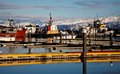
| 03/11/2010 10:34:03 PM | Coincidence of Colorsby tehbenComment:
Critique Club Critique
First Impressions
Good clarity and quality in the image, nice capture of a semi-remote (?) harbor scene. I gave this a 5 during voting.
Photograph Information, Technicals & Composition Review
Overall, there is too much contending for attention in the image. There is the foreground(which does dominate the image, and is also slightly OOF), the boats and harbor, the water, the colors (of course) and the distant mountains. It is hard to find a balance, compositionally, let alone with the colors - and also contrasting scenes, which, while not a 'bad' in my opinion, do not work well in this image, for me.
The depth from the middle part of the image to the outer is good, but as mentioned above, the OOF (out of focus) foreground dominates too much and 'unsettles the eye' for the remaining travels around and within the image.
If you wanted to highlight your observation (seemingly, by your title), I would suggest a much bolder crop, focussing in and composing to enhance the selected color(s).
Comments, Score & Placement Review
304/378 is getting down the bottom end of the pack but your score remained over 5 (5.19) which is usually indicative of an 'acceptable' photograph, in the eyes of the voters (although I'm not speaking for them of course).
6.33 average from your 3 commenters, all of which tell you what they like about your image and one giving some good suggestion on a potential improvement, which I tend to agree with for the most part (about the sharpness).
Summary
As mentioned above, a variation in cropping or else more of a 'scene' and a different title (to ensure you do not confuse the viewer).
PS
I see you have recently joined DPC and that this was your first submission - Congratulations and welcome to DPC.
| | Photographer found comment helpful. |
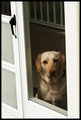
| 03/11/2010 10:11:25 PM | What do you mean "I can't go out"?by Ja-9Comment:
Critique Club Critique
First Impressions
I like this - but does look like more potential...
Photograph Information, Technicals & Composition Review
I like the effect that slight blur and/or screen/mesh has created on the dog. I find the door dominates the image too much and I am distracted by the skew. I did a quick edit on this image, mainly rotating it, and I like it better when the dog is straight and the door frame also straighter, but your preference may be as is.
I didn't vote in this Challenge, nor enter it, and whilst I see that you may have been trying to enhance the framing aspect (or just 'finish' the photograph) with another frame (border) around the image, I find that it detracts from the theme for the Challenge and doesn't allow the frame you have to really pop.
Whilst the challenges within the image, such as the whites of the door/frame and the darkness of the dog inside, and behind the screen, create a difficulty for you to edit, I wonder about either trying to minimize that outer white, by a much tighter crop and/or use it to an extreme, by going for a highly pushed contrast effect - but that is a personal creative inkling perhaps and may not appeal to you. Essentially what I am suggesting is creating an effect with your base image using post processing.
Comments, Score & Placement Review
116/125 is low low down the pack and your score of 4.86 from the voters tells your average from the voters was and why it falls so low in the pack. 5.66 from your commenters is of course much stronger and most seemed to like your vision, with some helpful suggestions and comments thrown in as well.
Summary
Nice moment captured, that in my opinion, with some further refinement in post processing (primarily crop/angle/etc), could have produced a stronger image. | | Photographer found comment helpful. |
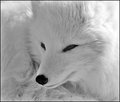
| 03/11/2010 04:41:51 PM | Arctic Beautyby KatheComment:
Critique Club Critique
First Impressions
Beautiful animal, like the focus on the snout - the b&w conversion seems to have detracted in this instance.
Photograph Information, Technicals & Composition Review
There seems to be some under & overexposed areas, which make me wonder whether this contributed to your choice to convert to b&w. I find the areas distracting that are overexposed, especially in the b&w. The b&w itself, I wonder whether some further processing and refinement, including some added drama/depth in certain areas, would have allowed the image to pop and come to life more.
I have just moved to another monitor to verify whether the dodging on the eyes that I was seeing was due to the monitor or not, and it is the same on this other monitor. I am not an advanced pp user, so suggest asking around for advanced help, but as a suggestion, if the eyes were dark and you were trying to lighten them, without making them opaque, perhaps creating a separate layer (or two) and using curves to adjust - all this should be ok under Advanced Editing.
I did a quick 10 minute edit on your image:
 (temporary, will be removed in a few days)
I used 3 layers, one on the eyes (curves up), one on the overexposed fur at the rear (curves down), deleted the areas that I didn't want to keep, sharpened all (hard to work with this size file) and added a touch of contrast up on the final merged image/layers. Finally, I removed the border and resized back to 800. Feel free to comment on this edit or totally disregard it ";)" - I'm only trying to give a visual backup to my suggestions.
The other two suggestions would be, shoot in RAW (I can't see that you did with this, based on your comments) and then you can have two exposure proofs to work with. Perhaps a deeper depth of field would also help with getting the details. The time of day, when the light is better placed, may also help you get an advantage.
Comments, Score & Placement Review
26/378 in a Free Study is a very strong placement,, along with a good solid score of 6.44. An average score of 7.75 from your commenters is also very good and gives you a truthful look at how they scored you. You didn't really receive any criticism (constructive or otherwise) in your comments, nor really anything that gives you an indication of what really appealed to the voters, besides of course the animal itself - Arctic Foxes are beautiful creatures.
Summary
A nicely composed image, however I see much more potential in the image - just a little more depth and/or drama, or a variation in tones to add some interest, not sure. That is personal taste though and if this was your vision exactly, then that's ok - of course. | | Photographer found comment helpful. |
|
Showing 171 - 180 of ~4217 |
Home -
Challenges -
Community -
League -
Photos -
Cameras -
Lenses -
Learn -
Help -
Terms of Use -
Privacy -
Top ^
DPChallenge, and website content and design, Copyright © 2001-2025 Challenging Technologies, LLC.
All digital photo copyrights belong to the photographers and may not be used without permission.
Current Server Time: 06/17/2025 08:42:28 AM EDT.
|