| Image |
Comment |
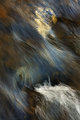
| 03/13/2010 04:58:53 PM |
Sound Through Scratchby MagnumphotographyComment: 6 - I like the colors, the abstractness, the transparency and even the framing - hard to explain, but it seems a little harsh - might be that black area. |
 Photographer found comment helpful. Photographer found comment helpful. |
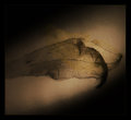
| 03/13/2010 04:57:34 PM |
Deveinedby macwilyumComment: 6 - I like the subject and the shadow element, but wish it were more defined/sharper and the composition slightly different - the angle of the shadow and the angle of the leaf/veined thing (might be a pod), just isn't sitting well - despite the good darker corners to try to balance it out. I quite like your framing too. Just seems out, somehow, but may be different on a different medium/larger. |
| Photographer found comment helpful. |
| 03/13/2010 04:53:41 PM |
A Quiet Moment.by BarbBComment: 6 - Maybe it is because of the size constraints, but I wish I could decipher what that orange/yellow thing is. Otherwise, I like the tones and wish this had a little more of a dreamy/fantasy feel overall. |
| Photographer found comment helpful. |
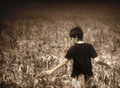
| 03/13/2010 04:39:09 PM |
Soloby BeckyTComment: 7 - I like the texture and detail discernible - would like to see more. Compositionally, it seems unbalanced, also seems tilted slightly. I like the tones & light. Up to 7 from 6. |
| Photographer found comment helpful. |
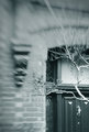
| 03/13/2010 04:37:36 PM |
Doorby RetroesqueComment: 6 - I like the blur effect, but a more refined crop and some tweaking with contrast/something make this better in my opinion. |
| Photographer found comment helpful. |
| 03/13/2010 04:35:47 PM |
Aging (from the Sunset Series)by wheeleddComment: 6 - Looks weird enough to warrant 'art' but wonder about either more extreme processing and/or trying to minimize the 'self portrait'/home shot feel to this. |
| Photographer found comment helpful. |
| 03/13/2010 04:33:23 PM |
Ophelia's Net Weightby posthumousComment: 6 - I think you won't like this comment, but it seems, visually, like it needs a nudge up on the right to straighten, even for a visual balance. However then the seemingly 'chopped' right hand side would be further accentuated. I especially like the flick up of water down center right. |
| Photographer found comment helpful. |
| 03/13/2010 04:31:35 PM |
A Song for Bernadetteby njsabsComment: 6 - Nice feel, nice light, nice colors, nice moment, nice title - seeing the distant figures far right takes me back to reality though... A slightly more refined crop at the fore/bottom too, make it stronger in my opinion. |
| Photographer found comment helpful. |
| 03/13/2010 04:30:23 PM |
The Lady in the Lampby JudiComment: 6 - I like the effort, but it is not strange enough (I know) for me - as in, looks too staged, maybe a much bolder crop on the left, to eliminate 'normality', who knows. The compositional balance is also out - what with that lonely lamp on its own on the right there and all. I like that element. Fairly minor, but there seems to need a whisker nudge up on the left. |
| Photographer found comment helpful. |
| 03/13/2010 04:28:03 PM |
Water Gardenby loveComment: 6 - I like this, but wonder about more potential with a more refined crop. |
| Photographer found comment helpful. |
Home -
Challenges -
Community -
League -
Photos -
Cameras -
Lenses -
Learn -
Help -
Terms of Use -
Privacy -
Top ^
DPChallenge, and website content and design, Copyright © 2001-2025 Challenging Technologies, LLC.
All digital photo copyrights belong to the photographers and may not be used without permission.
Current Server Time: 06/17/2025 02:22:44 AM EDT.