| Image |
Comment |
| 03/13/2010 05:41:25 PM |
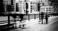
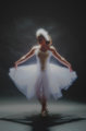
Boys Meet Girlsby GatorguyComment: 6 - Wish we could see the boys a little more and the distractions at the top of the building were somehow minimized (cropped maybe). |
 Photographer found comment helpful. Photographer found comment helpful. |
| 03/13/2010 05:40:15 PM |
|
| Photographer found comment helpful. |
| 03/13/2010 05:39:40 PM |
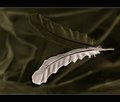
u n t i t l e d by PenelopeKComment: 6 - I like the simplicity and your composition (although wonder about a fraction more off the right, but your call of course), undecided on the frame - whether it is enhancing, especially at this size. |
| Photographer found comment helpful. |
| 03/13/2010 05:38:20 PM |
|
| Photographer found comment helpful. |
| 03/13/2010 05:37:20 PM |
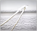
St David's Dayby daevansComment: 6 - A little more clarity on the flower, don't know, as is on the 'thing' at the fore.. I don't know what to focus on. The composition is nice... |
| Photographer found comment helpful. |
| 03/13/2010 05:35:05 PM |
Modern Tribute to Degasby bcrantsComment: 6 - Nice feel, more shadow playing in the image would be good - and perhaps a variation in composition/crop - but your call. |
| Photographer found comment helpful. |
| 03/13/2010 05:34:17 PM |
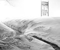
3:00 a.m.by kolasiComment: 6 - I like the little scene, but the sign isn't doing much for me in the image. |
| Photographer found comment helpful. |
| 03/13/2010 05:32:41 PM |
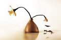
Life & Deathby JacksonGarietyComment: 6 - I like this, especially the unusual disappearance of the vase (or is it the vase) - however, I prefer 'life' as the main focus and therefore want it to be on the right hand side and/or dominating the image more. I like that the visual matches your title, left side right side... but still.. |
| Photographer found comment helpful. |
| 03/13/2010 05:23:16 PM |
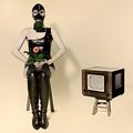
At home with my allergyby PaulComment: 6 - Yes, a bit odd - the ol' gas mask, whilst not exclusive to certain artists, is a bit cliche for me. The quality of the image is good and seemingly studio set up makes for good lighting etc - but, I don't know, personal preference I guess - the style just doesn't appeal to me much these days. |
| Photographer found comment helpful. |
| 03/13/2010 05:20:30 PM |
Frame of referenceby LutchenkoComment: 6 - Don't mind the concept, my eyes wanted to see the 'eyes' more 'eye level' on first look, and this second look, same thing. Also, a more refined crop (especially to lose some of the hair) to accentuate those elements make it even better in my opinion. I also like the 'feathered crown'. |
| Photographer found comment helpful. |
Home -
Challenges -
Community -
League -
Photos -
Cameras -
Lenses -
Learn -
Help -
Terms of Use -
Privacy -
Top ^
DPChallenge, and website content and design, Copyright © 2001-2025 Challenging Technologies, LLC.
All digital photo copyrights belong to the photographers and may not be used without permission.
Current Server Time: 06/16/2025 07:52:42 PM EDT.