| Image |
Comment |
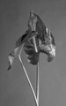
| 03/13/2010 10:39:34 PM |
Two Calla Leafsby Nadine_VbComment: 5 - Good potential, but I find the composition isn't enhancing/showcasing them in an artistic way enough. The tones are also a little dull. |
 Photographer found comment helpful. Photographer found comment helpful. |
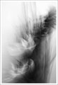
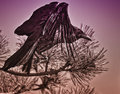
| 03/13/2010 10:38:51 PM |
Stormby mqnaufalComment: 5 - Flowers in a vase with movement (I know I shouldn't necessarily be trying to guess what it is), either through camera movement or manually moving the vase/objects ... I like the composition, I like the shapes/patterns/lines, I like the gradients and shadings.. but I'm just not getting much from the b&w with this - not sure why. Also, maybe my eyes want it mirrored (as in flipped), I'm not sure. I also wish the top of the 'reeds' were not chopped. |
| Photographer found comment helpful. |
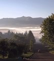
| 03/13/2010 10:36:15 PM |
Rural Poetryby AmmieComment: 5 - I think I understand the concept, but there is nothing 'extra-ordinary' for me about the image, including the processing, etc - however (and I realize this may well be the case), if that is your intent, because 'rural poetry' in an everyday scene such as this, is what you deem 'fine art' - then that's your call, of course. For me, without the car and maybe a little less sky... but another image. |
| Photographer found comment helpful. |
| 03/13/2010 10:33:07 PM |
The Woman in the Tunnelby ZellerStudioComment: 5 - Yes I see, but I'm distracted too much by other elements, including the 'uncomfortable' horizontal framing - but just my perception. |
| Photographer found comment helpful. |
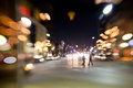
| 03/13/2010 10:32:10 PM |
nightlife 47by Spork99Comment: 5 - Like the effect and the potential with it, but the scene is too 'ordinary' for me and doesn't add anything. |
| Photographer found comment helpful. |
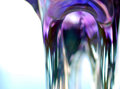
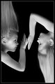
| 03/13/2010 10:31:43 PM |
Dualityby DrAchooComment: 5 - The one on the right appeals more in an 'art' sense to me. |
| Photographer found comment helpful. |
| 03/13/2010 10:30:06 PM |
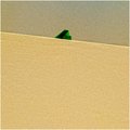
The Taxman Comethby hahn23Comment: 7 - I like this, wish he/she popped a fraction more (even though there is good pop now) - a more refined crop at the bottom too. Personal preference, but either the sat (especially on the eye) up a bit weirder or otherwise down, as the background colors are competing too much for attention, maybe - not sure. Also wish there was a little more room 'above'. Up to 7 from 6. |
| Photographer found comment helpful. |
| 03/13/2010 09:16:15 PM |
|
| Photographer found comment helpful. |
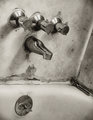
| 03/13/2010 09:15:48 PM |
Time To Get My Feet Wetby HipychikComment: 5 - Kind of like the gritty feel, but it adds to the fact that my mind knows it is looking at a very dirty bathtub - which doesn't make me want to linger. |
| Photographer found comment helpful. |
| 03/13/2010 09:14:55 PM |
untitledby rooumComment: 5 - Not doing much for me. I like the simplicity, but doesn't hold my interest. |
| Photographer found comment helpful. |
Home -
Challenges -
Community -
League -
Photos -
Cameras -
Lenses -
Learn -
Help -
Terms of Use -
Privacy -
Top ^
DPChallenge, and website content and design, Copyright © 2001-2025 Challenging Technologies, LLC.
All digital photo copyrights belong to the photographers and may not be used without permission.
Current Server Time: 06/16/2025 11:17:48 AM EDT.