| Image |
Comment |
| 11/17/2007 02:03:04 AM |
Poesie of Wineby mannjuditComment: Could be slightly sharper on the subject, but I like the way you've used the focus point to pull a particular bottle out from behind the others. I'd try cropping just a little of the RHS. |
 Photographer found comment helpful. Photographer found comment helpful. |
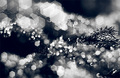
| 11/17/2007 02:01:05 AM |
Hexagonsby krukvaextComment: Without the bokeh, it's not that great a photo, but the interesting shape, and so many of them overlapping makes it quite interesting. Almost a Christmas feel to it. You're score goes up the longer I look at it. :) |
| Photographer found comment helpful. |
| 11/16/2007 10:05:43 PM |
Boxer Entryby Bernard_MarxComment: This is probably my favourite of these three. I like the action and lines. They are all good though. I bet he had fun making these shots with you. |
| Photographer found comment helpful. |
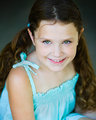
| 11/16/2007 10:04:06 PM |
Sydneyby njsabsComment: Nice shot and great lighting. Nice work on the eyes, but they are about on the limit of too much. I would probably back them off just slightly. Very striking though! |
| Photographer found comment helpful. |
| 11/16/2007 06:01:12 PM |
Hilary Hoodby latentflipComment: This is really cool. I'm not a fan of the high-contrast look, but it really works here. Love the colours, and the umbrella does a great job on the diffusion.
|
| Photographer found comment helpful. |
| 11/16/2007 01:03:10 AM |
IMG_0542a-4x6.jpgby dwterryComment: I bet she loves this one. :) A great shot to show her so relaxed on the day. Works well in sepia. |
| Photographer found comment helpful. |
| 11/15/2007 07:35:09 PM |
Hilaryby latentflipComment: I love the subtle colours here, and the lighting looks very natural, not like a flash at all! My only suggestion would be to try to bring the flash more front on, so that it helped to fill the eye shadows a little better. |
| Photographer found comment helpful. |
| 11/14/2007 10:01:06 PM |
Skate in the Cityby CalamitysMaster00Comment: Great moment capture, and a very cool location. I love the idea of the texture, and I like it being really in-your-face, but I'm not so keen on that particularl texture. It looks a bit too much like computer painting, from the constant width, constant strength lines coming out the edges. A more natural grungy texture would really make this shot. |
| Photographer found comment helpful. |
| 11/14/2007 09:55:43 PM |
Rachelby CalamitysMaster00Comment: Wow, great hair, and yes, the hat works really well. For me, the technical side of this shot is lacking a little. The blown top edge, the desat I feel is too much, the lack of sharpness. In thumbnail, it all looks great, but blown up, it doesn't quite deliver. The focus seems to be too far back. Maybe it was set on centre spot focus? I find that particularly with closeup portraits, I either have to carefully focus/recompose every shot, or I set to all focus points.
(because the face/eyes are often closer than the centre, such as we see here). For the desat, I would tend to leave more colour than this, or possibly use a selective desat to paint out most of the colour, but leave some in her face and possibly hair. So, a few details to consider, but overall, I really like this image.
|
| Photographer found comment helpful. |
| 11/14/2007 09:45:20 PM |
Edyenby njsabsComment: Nice shot, and a great portrait lens. Care to post what was used?
|
| Photographer found comment helpful. |
Home -
Challenges -
Community -
League -
Photos -
Cameras -
Lenses -
Learn -
Help -
Terms of Use -
Privacy -
Top ^
DPChallenge, and website content and design, Copyright © 2001-2025 Challenging Technologies, LLC.
All digital photo copyrights belong to the photographers and may not be used without permission.
Current Server Time: 08/14/2025 08:05:58 AM EDT.