| Image |
Comment |
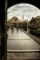
| 01/04/2009 06:51:42 AM |
Hagia Sophiaby PascalComment: I like the colours here, but the skewed composition is a little distracting. Perhaps using the door as a more centred frame would be a better choice? |
 Photographer found comment helpful. Photographer found comment helpful. |
| 01/04/2009 06:49:32 AM |
Soba by LonniComment: Something is missing here - I think the main light from behind is upsetting it a little, by casting shadows toward the front. |
| Photographer found comment helpful. |
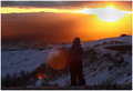
| 01/04/2009 06:47:42 AM |
Foothill Lookoutby goinskiingComment: You might get mixed reactions about that lens flare. I think it is probably a better photo without it. Other than that, a nice scene, possibly a little dark in the foreground and subject. |
| Photographer found comment helpful. |
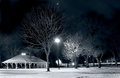
| 01/04/2009 06:45:25 AM |
Winter picnicby QuigleyComment: Nice crisp BW show, but it lacks a focus in the image. The line of trees leads the eye to the right, away from the shelter. Cropping off the right, and leaving in more snow at the bottom may help to balance the image better. |
| Photographer found comment helpful. |
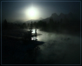
| 01/04/2009 06:43:31 AM |
Winter Lightby Len ScapComment: Love the colours. It might get marked down for being so dark (will show up differently on different monitors), but I love the feel of it. |
| Photographer found comment helpful. |
| 01/04/2009 06:42:32 AM |
I Am SUCH a Handsome Fellowby MaryOComment: Nice capture, but the space on the left side and some on the top could be cropped off. If that feels crowded, some more space on the right might open it up. |
| Photographer found comment helpful. |
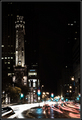
| 12/08/2008 01:32:53 AM |
Life in the Big Cityby StOlafPhotographerComment: You requested an honest critique, so here's mine... :)
I find the scattered lights a distraction from the main subject. It's very difficult to get shadow detail, so the floating lights don't form any coherent objects - they are just visual dirt on the background. Similarly, the shadow detail is lost on the tower, making it rather disconnected and insubstantial as the main subject. Some less contrasty editing, and possibly some HDR treatment might help to connect the building back and get it to be clearer in view.
The light trails have about the right level of shutter speed, although the colours are washed out. The red trails are a washed out grey/orange colour, and the green traffic lights are blown-out cyan. Getting vivid natural colours is quite difficult in a night shot like this, particularly in wet weather, where everything is so high contrast.
Composition wise, the light trails and the building are competing subjects - both are hovering near the edges of the frame, and neither are strong enough to own the picture, and neither is supporting or adding to the other. Possibly standing in a different view point, you might get a better angle of the building, and get the light trails to lead to the building, so that they complement each other.
|
| Photographer found comment helpful. |
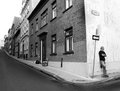
| 10/31/2008 12:14:47 AM |
Quebec-2.jpgby ColeyComment: You've probably worked out by now that I'm looking through your folio. :) Lots of great images here. I like this shot, the way everything works together with his disagreement with the world - his back to the street, looking out of the frame, against the direction of the arrow, black shirt against the white wall, his agressive stance of denial. The darkness of the street and the rubbish on the pavement helps give him reason to go his own way. Great communicative work! |
| Photographer found comment helpful. |
| 10/31/2008 12:09:36 AM |
DSC_7405AAADP.jpgby ColeyComment: Nice shot, and I love the editing work. The overall photo is lovely and crisp, and the blown out areas don't stand out. The dark top right works well, but maybe a little too much there. |
| Photographer found comment helpful. |
| 10/31/2008 12:07:59 AM |
DSC_7288AAADP.jpgby ColeyComment: The shadows here are amazing. What's even more amazing is that there isn't a huge obvious burnt out spot or flare where the sun is. The only thing that's slightly distracting is the tilted horizon. |
| Photographer found comment helpful. |
Home -
Challenges -
Community -
League -
Photos -
Cameras -
Lenses -
Learn -
Help -
Terms of Use -
Privacy -
Top ^
DPChallenge, and website content and design, Copyright © 2001-2025 Challenging Technologies, LLC.
All digital photo copyrights belong to the photographers and may not be used without permission.
Current Server Time: 07/31/2025 03:32:54 AM EDT.