| Image |
Comment |
| 06/01/2008 06:44:21 AM |
|
 Photographer found comment helpful. Photographer found comment helpful. |
| 06/01/2008 06:43:08 AM |
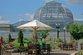
Upon Further Reflectionby Les_FeckComment: Very interesting greenhouse, although the image overall is very busy, with many subjects competing for attention. |
| Photographer found comment helpful. |
| 06/01/2008 06:42:24 AM |
|
| Photographer found comment helpful. |
| 05/13/2008 09:05:27 AM |
Collage 2-2-2.jpgby idnicComment: Nice collage of images. Great dcolours, and the poses work together really well. She will love it. |
| Photographer found comment helpful. |
| 05/13/2008 08:57:47 AM |
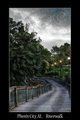
Phenix City, AL Riverwalkby SDWComment: This is a nice image on it's own, but the critiques made by others are very true. For a nice inviting postcard-type image, you do need to warm up the colours and punch the saturation. Bring out the reds in the wooden railing, bring out the lush yellow/greens in the trees (important to remember that lush trees and grass are often more toward the yellow spectrum, not real green)
The overcast sky is nice and dramatic, but rather forbidding. You could overcome it with some nice tungsten warmth from the lamps (there's a little there around each light, but you could go much bigger, maybe even spilling into pools along the boardwalk. The patches of sunlight on the trees will also be helped with a little orange kick. But start with adjusting the overall colour balance more toward red/orange, and saturate it, and then work on local adjustments later. i'd also be inclined to darken in some more shadows under the trees on the left. The HDR look is nice, but it's also good to have areas of more shadow and less detail to help define the main lines. |
| Photographer found comment helpful. |
| 05/06/2008 09:28:36 AM |
|
| Photographer found comment helpful. |
| 05/06/2008 09:27:25 AM |
iby raishComment: Nice crisp focus. Interesting choice of crop. I would probably have tended toward cropping off the shadow area, but this does give it a very different feel. |
| Photographer found comment helpful. |
| 05/06/2008 09:24:25 AM |
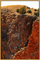
Life On The Edgeby Nikolai1024Comment: With the strong colours throughout this image, and not much real distinction between oranges and greens, the tree doesn't really stand out as the subject. |
| Photographer found comment helpful. |
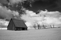
| 05/06/2008 09:21:38 AM |
Palouse Barnby tjandjwsmithComment: Nice BW tones. Some of the detail is blurred, perhaps from too-strong noise reduction? |
| Photographer found comment helpful. |
| 05/06/2008 09:20:22 AM |
Just an owl or twoby treyvusComment: Some lightening is needed in the editing here to bring out the details of the face. The one in the background looks rather eerie - like a ghost twin. :) |
| Photographer found comment helpful. |
Home -
Challenges -
Community -
League -
Photos -
Cameras -
Lenses -
Learn -
Help -
Terms of Use -
Privacy -
Top ^
DPChallenge, and website content and design, Copyright © 2001-2025 Challenging Technologies, LLC.
All digital photo copyrights belong to the photographers and may not be used without permission.
Current Server Time: 08/04/2025 10:56:25 PM EDT.