| Image |
Comment |
| 01/29/2003 06:57:32 PM |
Abstractby stephanComment: I like the colours here, meets the challenge very well too. A large reprint of this shot would be probably great in a modern furnished apartment. But I don\\\'t like this shot very much as a submission to a photography contest. I trust in you, that this shot is really a photo, but it looks more as computer art to me. Nevertheless a unique and outstanding submission. I changed my vote from 3 to 6 after coming back and thinking a 2nd time about it... |
 Photographer found comment helpful. Photographer found comment helpful. |
| 01/29/2003 06:22:09 PM |
Eyes Sq Onby redfigComment: A very creative interpretation of the challenge and a well done shot too. Perhaps I would have cropped a little different. IMHO the photo shows too much of the hand in the upper left corner. Overall it could be a little sharper too. Nevertheless a beautiful shot, I voted 8. Good luck! |
| Photographer found comment helpful. |
| 01/27/2003 09:42:33 PM |
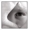
Life inside the Frameby arnitComment: Congrats to this highly impressive shot! I really like the composition and the idea with the frame around her face. The width of this frame is harmonising perfect with the border of your photo. Only one single mistake I saw after 2-3 minutes: There is a hard shadow in the top of her face, caused by the frame. Nevertheless an outstanding awesome shot and my only 10 this week. Good luck! |
| Photographer found comment helpful. |
| 01/27/2003 09:19:57 PM |
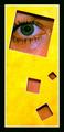
Yellow & Greenby svitalComment: Wow, a very creative idea! The yellow paper and the green eye are working good together. But IMHO there is some space for improvement too. You should have used some powder to eliminate / decrease the shine around the eye. I also don't like the shadow of the paper above the eye and the eye could have been brought into a sharper focus. Nevertheless great idea, good luck for the challenge! |
| Photographer found comment helpful. |
| 01/27/2003 06:46:08 PM |
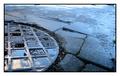
Circle of squaresby vjozComment: Very nice, I really like your shot. The eye of the viewer is guided immediately by the reflections to the squares on the manhole cover. Good eye to catch this! Perhaps I would have cropped a little smaller. There are some distracting objects on the top and the right side. Apart from it the composition is perfect. Good luck for the challenge... |
| Photographer found comment helpful. |
| 01/27/2003 06:23:31 PM |
Subtle Squareby BJComment: Nice still life, I like the unobtrusive colouring very much. Unfortunately this shot is completely out of focus. Perhaps this is a part of your composition and well considered. But IMHO it works not very well. Nevertheless good luck for the challenge! |
| Photographer found comment helpful. |
| 01/26/2003 02:35:17 PM |
|
| Photographer found comment helpful. |
| 01/26/2003 02:14:06 PM |
Duck Crossingby Wheeler1992Comment: Funny idea, but the photo is IMHO not very nice. I think a closer cropping and using the rule of thirds (for the roadsign) would be helpful here. There is too much uninteresting on the right side of this shot. What about a faked skidmark ;-)? |
| Photographer found comment helpful. |
| 01/26/2003 01:55:55 PM |
At the Corner of Charles and Mapleby karmatComment: Congrats to this shot, good eye, to catch this! I really like the conntection between the old signs and the broken tree. IMHO more structure (clouds) in the sky would add something to this shot. The upper right corner is too empty. But I can't change the weather myself ;-). Perhaps you sharpened a little too much. Nevertheless a really great shot and my favourite this week! - 10 |
| Photographer found comment helpful. |
| 12/30/2002 06:13:22 AM |
View from Seat 6A, 33,000 ft.by albright1Comment: IMHO the black frame is too wide for this (apart from it) nice shot. The black border doesn't match to the spirit of lightness, freedom and wideness in the shot. But that's just me... |
| Photographer found comment helpful. |
Home -
Challenges -
Community -
League -
Photos -
Cameras -
Lenses -
Learn -
Help -
Terms of Use -
Privacy -
Top ^
DPChallenge, and website content and design, Copyright © 2001-2025 Challenging Technologies, LLC.
All digital photo copyrights belong to the photographers and may not be used without permission.
Current Server Time: 08/23/2025 01:51:01 AM EDT.