| Image |
Comment |
| 03/03/2003 06:47:45 PM |
Starring The Egg!by nathaliedooComment: Interesting contrast in color and shape, the lighting is well done too. But IMHO the placement of the eggcups is a little bit confusing. The two ones in the foreground are blocking the view to the main subject. But they should lead to it. Perhaps it would have been better with only one to three eggcups. Nevertheless I voted 8. Good luck! |
 Photographer found comment helpful. Photographer found comment helpful. |
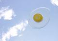
| 03/03/2003 06:04:13 PM |
Egg Yoke by JMSComment: Unique and very creative, one of my favorites this week. The colors are working great together, the saturation is awesome. Your cropping makes it an interesting photo. Apart from the little reflection in the bottom left area of the egg there is nothing, what you could have done better here. But I know, that it's nearly impossible to eliminate them on a wet surface. Great work an good luck for the challenge! |
| Photographer found comment helpful. |
| 03/03/2003 05:54:14 PM |
Up...Up...and away!!!by skitz2000Comment: I like your creative and unique idea! But IMHO there is some space for improvement by post processing. More contrasts in the sky (darker blue) and a little higher saturation of the yellow could have been helpful here. Nevertheless a nice shot! |
| Photographer found comment helpful. |
| 02/25/2003 11:22:13 AM |
Bluesby nathaliedooComment: Can't say exactly why, but this shot makes a great visual impact to me. Maybe because of the color, or because of the nice grain - it has feeling! Thanks for sharing - 9 |
| Photographer found comment helpful. |
| 02/25/2003 09:43:43 AM |
Not A Happy Pictureby DrJOnesComment: Not really a nice story, but I like your shot. The lightning through the hidden window works great and is highlighting the subject. The models color and the lower saturation of the rest is well done too. The high camera position is IMO well deliberated. It brings some distance between the viewer and the sad scenario. Perhaps I would have cropped a little closer on the left side of your shot. IMHO there ist too much uninteresting space. The victory sign of her hand looks a little overstated, but that's only marginal. Great work! - 9 |
| Photographer found comment helpful. |
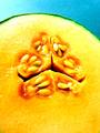
| 02/18/2003 01:17:34 PM |
SEEDYby BukiosComment: Nice colors and well done lightning! Here and there a little blown out and overexposed, but that's only marginal and doesn't disturb me that much. Perhaps I would have cropped a little different. IMHO this shot could be more impressive, if the core is not centered. In addition there ist too much uninteresting space on the bottom of your shot. But that's just me ;-). Nevertheless a unique and interesting submission! (9) |
| Photographer found comment helpful. |
| 02/17/2003 03:23:22 PM |
It wasn't me!by kiwinessComment: Funny idea! IMHO it could be better with a non black line. Perhaps white, or yellow too. The cheese slices are looking a little bit like hovering in the air :-) |
| Photographer found comment helpful. |
| 02/17/2003 03:09:55 PM |
Abstract Yellow Bugby DCThiessenComment: Nice abstract and well done cropping. Very clear and tidy use of lines. Could have been a picture in a illustrated advertising catalogue. I like it! Just an idea: Did you tried one with switched on lamps, or would it be too much distracting? |
| Photographer found comment helpful. |
| 02/17/2003 01:14:27 PM |
|
| Photographer found comment helpful. |
| 02/17/2003 01:10:38 PM |
|
| Photographer found comment helpful. |
Home -
Challenges -
Community -
League -
Photos -
Cameras -
Lenses -
Learn -
Help -
Terms of Use -
Privacy -
Top ^
DPChallenge, and website content and design, Copyright © 2001-2025 Challenging Technologies, LLC.
All digital photo copyrights belong to the photographers and may not be used without permission.
Current Server Time: 08/23/2025 01:37:47 AM EDT.