| Image |
Comment |
| 09/09/2008 02:27:56 PM |
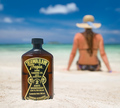
Tanning Oilby nutzitoComment: Fit Challenge Criteria: 2/2
Contrast/Color: 2/2
Composition: 2/2
Photo Quality: 2/2
My Subjective Affinity: 2/2
Definitely the best of the bunch. Excellent idea! I don't think it could get any better than this. The HT bottle is perfectly exposed, as well as the background. And the limited DOF works perfect for your idea. |
 Photographer found comment helpful. Photographer found comment helpful. |
| 09/09/2008 02:23:44 PM |
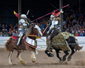
Xtreme Heavy Duty Armor...for Men and their Horsesby hahn23Comment: Fit Challenge Criteria: 0/2
Contrast/Color: 2/2
Composition: 2/2
Photo Quality: 2/2
My Subjective Affinity: 1/2
Although I don't feel this would work good as a "product shot", the rest of the qualities of the photo are excellent. Good use of limited DOF. Excellent color and sharpness. If only the ropes weren't in there. And great stop action also. |
| Photographer found comment helpful. |
| 09/09/2008 02:21:59 PM |
Mortar and Pestleby scrybzComment: Fit Challenge Criteria: 2/2
Contrast/Color: 1/2
Composition: 1/2
Photo Quality: 1/2
My Subjective Affinity: 0/2
The object in the foreground is very distracting, and it is not apparant what it is. The lighting is a bit harsh for my tastes. Just a bit too bright along the right side of the product. The cropping is also really tight on the upper edge of the photograph. |
| Photographer found comment helpful. |
| 09/09/2008 02:20:28 PM |
Smooooooothby CuttoothComment: Fit Challenge Criteria: 2/2
Contrast/Color: 2/2
Composition: 1/2
Photo Quality: 2/2
My Subjective Affinity: 1/2
Overall nice shot. The downwards angle makes me a bit dizzy, but the idea is great. |
| Photographer found comment helpful. |
| 08/27/2008 08:38:19 PM |
Viola Ragazzaby Purple_GirlComment: Overall I would say that the lighting in this photos is extremely harsh. It is very apparent that the flash was "on camera". I say that because of the harsh shadow below the chin, the catchlight in the eyes, and the lack of contrast throughout the rest of the face. I didn't vote on this particular photo, but I will say that I generally will not go much higher than a 6 if you can tell that. I was going to say that the focus was a bit off, but after reading about the neat image filter in your notes, I would say to do a little practice with that, because it is extremely overdone. Aside from that, the composition is also very plain. If I would have voted on this photo myself, I would have given it a 4. Hope this helps to udnerstand. |
| Photographer found comment helpful. |
| 06/27/2007 11:40:45 AM |
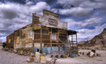
Mercantileby LanceWComment: What an awesome shot. I'm impressed by the subject, but even more impressed by the subject. I'm going to guess that you used tone mapping to get the desired effect, is that right? I've never done much with that, but really like the look. And you did an excellent job with it on this shot. Love it. |
| Photographer found comment helpful. |
| 06/25/2007 01:38:39 AM |
|
| Photographer found comment helpful. |
| 06/25/2007 01:31:55 AM |
Duck on a Log in a Lakeby ssodellComment: Fit Challenge Criteria: 2/2
Contrast/Color: 1/2
Composition: 1/2
Photo Quality: 2/2
My Subjective Affinity: 1/2
Nice image. I really like the blueish color of the water in the lower right corner. The log is perfectly placed, but the duck feels too far toward the center of the photo. The lighter water is a bit too distracting. |
| Photographer found comment helpful. |
| 06/25/2007 01:30:32 AM |
The sprinklers did it.by HollywoodHoebagComment: Fit Challenge Criteria: 0/2
Contrast/Color: 1/2
Composition: 0/2
Photo Quality: 1/2
My Subjective Affinity: 0/2
The negative space does not complement the main subject, nor is it a "wow" factor on it's own. The contrast is very flat and the colors dull. The angle the photo was taken at is too awkward for this shot. The centered composition doesn't help either, as well as the cut off toes. The image has very soft focus. |
| Photographer found comment helpful. |
| 06/23/2007 06:14:48 PM |
Lighthouse Point Pierby acoppolaComment: Fit Challenge Criteria: 2/2
Contrast/Color: 2/2
Composition: 2/2
Photo Quality: 2/2
My Subjective Affinity: 1/2
The only thing that I think could improve this shot would be to use an ND grad filter on the sky so that there is some detail in the foreground. Nice work. |
| Photographer found comment helpful. |
Home -
Challenges -
Community -
League -
Photos -
Cameras -
Lenses -
Learn -
Help -
Terms of Use -
Privacy -
Top ^
DPChallenge, and website content and design, Copyright © 2001-2025 Challenging Technologies, LLC.
All digital photo copyrights belong to the photographers and may not be used without permission.
Current Server Time: 08/20/2025 11:51:47 AM EDT.