| Image |
Comment |
| 06/01/2007 10:20:17 AM |
Science At Your Finger Tipby rick13601Comment: I expected to see a lot of these in this challenge. This one seems similar in composition to the previous science challenge  . No doubt that was intended. I like the inclusion of more space in the other challenge entry. This shot is so close and quasi macro that it is hard to tell what it is at first and second glance. Still, a nice image though, with some decent work put in to it. |
 Photographer found comment helpful. Photographer found comment helpful. |
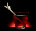
| 06/01/2007 10:14:20 AM |
Refractionby sfaliceComment: I love the subject (glass with liquid and controlled lighting, not the playboy bunny). The placement of the glass in the frame seems a bit odd. It's too close to the center, but not close enough at the same time. The glass and light, with their symmetrical qualities would look better in a centered composition. The other thing would make it look better off-center, but more than it is. Other than that, the coloring of the playboy bunny is kind of an ugly, muted grey. It would have been nicer to find something that contrasted more with the red light instead. |
| Photographer found comment helpful. |
| 06/01/2007 01:47:44 AM |
Enlighten the world with scienceby marvinComment: This is a very nice concept. I've seen it done before. I really like the bulb in this photo, but it seems a bit small. I'm not sure why. The hand doesn't really fit in well with the sky. The color of lighting is extremely different. Very apparent that either a) you took a picture of the hand in front of a print, or, more likely, a monitor, or b) you fooled around with it in PP. With that fixed, this would be a much better photograph. Without it, it still stands well against the composition in this challenge. |
| Photographer found comment helpful. |
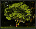
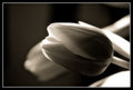
| 06/01/2007 01:45:19 AM |
The Young Botanistby APComment: What a perfect crop on this shot. This photo definitely proves that there is a place in photography for centered compositions. I love how the light skims across the grass, right to the little girl. I love how it lights up the trunk of the tree, making it glow against the dark, shady background. I just wish that it would have found it's way to all of the leaves. That is the only improvement that could be made on this photo IMO. |
| Photographer found comment helpful. |
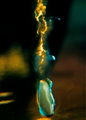
| 06/01/2007 01:43:12 AM |
Icy Chemical Reaction by Man_Called_HorseComment: I can only imagine how difficult this must have been to set up. I'd be interested to knew exactly what it is. Unfortunately, the focus seems a bit off, enough so that the subject is not easily recognizable. |
| Photographer found comment helpful. |
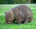
| 06/01/2007 01:41:34 AM |
Lasiorhinus krefftii (Wombat)by MichaelCComment: This is a nice shot of an adorable little creature. I like how you seem to have taken the camera down low to get this shot. The DOF is just perfect, and the lack of harsh, contrasting shadows is nice. The overall photo does seem a bit on the soft side of focus though. |
| Photographer found comment helpful. |
| 06/01/2007 01:39:58 AM |
E=mc²by JawnyRicoComment: Very nice setup and creativity. I really like the idea behind this photograph. I love the stuff coming out of the bottles. My only complaints would be that it is a bit on the dark side, the DOF is a bit too limited, and the photo is a bit confusing with so many elements to look at. |
| Photographer found comment helpful. |
| 05/30/2007 11:49:44 AM |
16by mia67Comment: This is a lovely black and white flower photo. Nice work. |
| Photographer found comment helpful. |
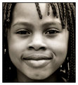
| 05/30/2007 11:48:59 AM |
5by mia67Comment: I love the centered composition of this shot. How everything unnecessary is cut off, leaving only an adorable child. The focus seems right on, which really makes her hair stand out too. If I could make one suggestion, it would be to work on the area around the eyes a bit more. You'd be amazed what just a bit of dodging would do to brighten up that area and make the overall photo that much better. I also do two curves layers for the eyes in a portrait too. For the first one, I select the entire eye, feather the selection 3-10 pixels, depending on the resolution of the photo and size of the eye, and then bring the whole curve up in the middle quite a bit. Then, I select just the iris, feather 1-3 pixels, and do a slight "s" curve, darkening the pupil and increasing contrast in the iris. Just a thought. Other than that, very, very nice work. Message edited by author 2007-05-30 11:49:17. |
| Photographer found comment helpful. |
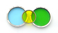
| 05/30/2007 11:44:30 AM |
Colorful Circlesby crikComment: These filters do make an interesting subject. The distinct colors are pronounced ver well against the white background. Someone commented on not having the filters aligned horizontally in the photo, and I would agree that that is distracting from the overall composition. I would also recommend trying other compositions. Maybe sitting a single filter on edge, and photographing it on a level plane with very limited DOF. You could maybe use the other filters in the background, but out of focus. And then play with the lighting more to make it more dramatic. |
| Photographer found comment helpful. |
Home -
Challenges -
Community -
League -
Photos -
Cameras -
Lenses -
Learn -
Help -
Terms of Use -
Privacy -
Top ^
DPChallenge, and website content and design, Copyright © 2001-2025 Challenging Technologies, LLC.
All digital photo copyrights belong to the photographers and may not be used without permission.
Current Server Time: 08/21/2025 07:53:19 AM EDT.