| Image |
Comment |
| 10/06/2005 03:39:38 PM |
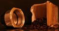
Beans for the Pressby dsherwinComment: i really like the composition of this photo, with the beans spilling out of the bag and the press right there. it makes me want to stick my nose in there and inhale the lovely scent of coffee. i also like the warm tone of the picture. i would be interested in seeing how this photo would look with greater definition between the background and the handle of the press. The handle appears to merge into the background, which appears to merge into the countertop below the handle. this detracts from the picture, imo. having greater definition in that part of the photo would make the image pop more for me. |
 Photographer found comment helpful. Photographer found comment helpful. |
| 10/06/2005 03:37:01 PM |
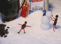
Starbucks... After Hoursby LeeDComment: how fun! a groovy still-life (i always suspected something like that was going on after-hours...) : )
there's something about the bean person making the sugar angel that isn't coming through as well as the rest of the picture for me. i think it may be because the snowman maker is rich and glossy looking, and the one lying down looks duller in comparison? i adore this composition, and think it would make a great holiday card for someone's local coffee house! |
| Photographer found comment helpful. |
| 10/06/2005 03:32:24 PM |
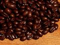
Fresh Coffee Beansby HornOUBetComment: your beans have a nice, rich brown tone to them! they are also very glossy, though, and they appear to be a bit out of focus. i would be interested in seeing how this image would look with more diffused lighing and sharper focus. |
| Photographer found comment helpful. |
| 10/06/2005 03:20:09 PM |
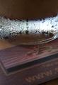
Coffee Tabletopby Wilson LowComment: i think the condensation and light through the glass looks beautiful. compared to the glass, the coaster looks a bit washed out and lacks the interest that the glass holds. i would be interested in seeing how this image would look in b&w, with all that groovy lighting in the glass. i would also be interested in seeing how this image would look with richer colors in the coaster. |
| Photographer found comment helpful. |
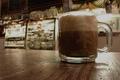
| 10/06/2005 03:17:38 PM |
Too much coffeeby alegugaComment: this is an interesting image, the way the shadow works on the background with the angle of the cup. it would be interesting to see how this image would look with the background/beans more in focus. or, i would be interested in seeing how this picture would look with more of the top cropped off, to balance the cup and shadow in the frame. |
| Photographer found comment helpful. |
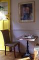
| 10/06/2005 02:52:17 PM |
table for twoby RiponladyComment: my first impression is that it's a "table for two" but the two is cut off in the photo. this makes it feel out of balance to me. the table setting and placement by the door is quite nice. i would be interested in seeing this image including more of the second chair, with a filter over the lens to remove the reflection from the picture on the wall (the reflection detracts from your image, imo). such a lovely setting, with that yellow door and the stained glass, and the sunlight streaming in! |
| Photographer found comment helpful. |
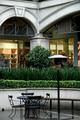
| 10/06/2005 02:47:12 PM |
Rained Outby FleaNZComment: when i read "rained out", i think "black and white image"...
it's such a pretty setting, but empty--the pulled-back image lacks energy, imo.
i would be interested in seeing how this image would look as a closer shot, or as it is currently set up but with someone reacting to the wet environment...that kind of thing. |
| Photographer found comment helpful. |
| 10/06/2005 02:43:25 PM |
Teresa'sby samchadComment: what a groovy neon sign! i like the sign, and the colors. for such a groovy sign, the straight-across photo does not lend much excitement or energy to the image. i would be interested in seeing what this image would be like if captured from different angles. that may help to off-set the large amount of black background as well... |
| Photographer found comment helpful. |
| 10/06/2005 02:39:15 PM |
de-sat not de-cafby tenfrozentoesComment: de-sat it is! (not decaf if i can help it!) : )
i like the color tones in this picture, and the composition. it's a bit difficult to see the logo on the cup against the color of the drink, so i find my eyes straining there. i would be interested in seeing this picture with the lighing adjusted (so that it's not as bright in the display cases and behind the glass cup). or, i wonder if this image would show richer contrast and definition converted to a b&w? |
| Photographer found comment helpful. |
| 10/06/2005 02:35:12 PM |
Coffee Museby enashComment: i like the angle for this shot. the colors look grained out (if that's a real term) in my eye, though. perhaps its an effect of sharpening the image? i would be interested in seeing how this picture would look with less saturation/contrast for a smoother look, or converted to b&w to play up on the contrasts. |
| Photographer found comment helpful. |
Home -
Challenges -
Community -
League -
Photos -
Cameras -
Lenses -
Learn -
Help -
Terms of Use -
Privacy -
Top ^
DPChallenge, and website content and design, Copyright © 2001-2025 Challenging Technologies, LLC.
All digital photo copyrights belong to the photographers and may not be used without permission.
Current Server Time: 06/20/2025 12:20:03 PM EDT.