| Image |
Comment |
| 04/29/2006 09:53:38 PM |
Medieval Viewby loveComment: I like the idea, but I think the model should have been a little closer to the window so she would fill the space better. It also looks like the dodge and burn tools were used agressively (at least on my monitor). In any event, the lighting is unusual. |
 Photographer found comment helpful. Photographer found comment helpful. |
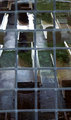
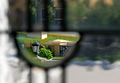
| 04/29/2006 09:49:24 PM |
The Church Pewsby WobbleComment: This is a bit busy for my taste. If you hadn't told me they were pews I might not have figured it out. Colors are good. The leaded window is probably a good choice. I think a simpler reflection might have helped this one. |
| Photographer found comment helpful. |
| 04/29/2006 09:47:23 PM |
Backyard viewby srdanzComment: The window is framing a lot of stuff here. The composition might be improved if a few of the foreground items were removed and the windo did not cut throught the woman's back. |
| Photographer found comment helpful. |
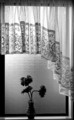
| 04/29/2006 09:45:27 PM |
The vaseby trainComment: Good clear picture. Perhaps a bit more detail in the vase and flowers would be better (another light source perhaps). I like the simple composition. |
| Photographer found comment helpful. |
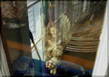
| 04/29/2006 09:41:52 PM |
Angel under glassby lahernComment: This photo is a bit busy for my taste. Other objects in the glass compete with the angel for attention. Personally, I think that reflective pictures are difficult because lines appear fuzzy (I know, because I did the same kind of thing for this challenge with similar results). |
| Photographer found comment helpful. |
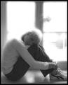
| 04/29/2006 09:38:57 PM |
Nikkiby facesastheycomeComment: I would try to tone down the background lighting a bit. I think it overpowers a very attractive model. I like the composition and "feel" of the photo. |
| Photographer found comment helpful. |
| 04/29/2006 09:37:18 PM |
Window magicby max90034Comment: This photo is a bit hard to follow. There is so much blurring that I am a bit disoriented. I assume this is a stained glass window, but I am not sure. Other than that the picture is crisp, well-framed, and an overall creative effort. |
| Photographer found comment helpful. |
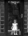
| 04/29/2006 09:30:01 PM |
Elements of Realityby karmatComment: I like the concept of this picture. For me, however, the reflection of the truck is a bit of a distraction (even if the truck is the reason she is at the door). Otherwise, it is done well. Cute model, BTW. |
| Photographer found comment helpful. |
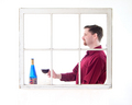
| 04/29/2006 09:28:15 PM |
Bonjour!by ClubJuggleComment: This is a nice effort, but I think the white background is a little too washed out. Makes it hard to see the details such as the stem on the glass. Over all, though, it shows some thought and expression. It is especially good if you are both the photographer and the model. |
| Photographer found comment helpful. |
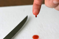
| 04/29/2006 04:57:34 PM |
OUCH! Sharpby tngrndreamComment: I didn't vote in this challenge because of family commitments, but if I had I probably would have given it a 4 or 5. While I like the idea and I think it would be fun to stage this photo, it seems to me that the execution doesn't quite carry it off (e.g. the picture cuts off the blood stain but leaves an essentially unnecessary dark background line at the top). I would have cropped out the top and added more to the bottom (you would have to re-shoot to keep your hand in the image, of course). Focus is good. Perhaps some 'blood' on the blade would help too. (BTW, if I seem too 'sharp' with my observations, I need to add that I probably wouldn't have carried this off any better myself.) |
| Photographer found comment helpful. |
Home -
Challenges -
Community -
League -
Photos -
Cameras -
Lenses -
Learn -
Help -
Terms of Use -
Privacy -
Top ^
DPChallenge, and website content and design, Copyright © 2001-2025 Challenging Technologies, LLC.
All digital photo copyrights belong to the photographers and may not be used without permission.
Current Server Time: 08/01/2025 09:02:07 PM EDT.