| Image |
Comment |
| 09/05/2005 03:26:48 AM |
Sympathy for Sheepby CorySmithComment: Creative, original , colors, focus, lighting, exposure, cute factor, --you name it this photo has it. Perfect 10. |
 Photographer found comment helpful. Photographer found comment helpful. |
| 09/04/2005 11:53:34 PM |
DEATH & The LOVERSby mesmerajComment: Not a bad idea, just needto play with the llighting alittle more to add more interest to the photo. |
| Photographer found comment helpful. |
| 09/04/2005 11:50:55 PM |
Dark & lightby StructorComment: The dark spot on the top right almost looks like your lens was obstructed by possible a camera strap or finger in the way. Your subject is a bit too far away to draw attention to it as it should be, causing the lines to overwhem the photo. Maybe a closer different angle. |
| Photographer found comment helpful. |
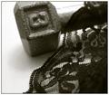
| 09/04/2005 11:28:24 PM |
"Dumbell and Lace..."by tfarrell23Comment: It fits the challenge, although I think "dumbell and lacey" (like the old show "cagney and lacey) would have been a cuter name. It just isn't too exciting, and for some reason you have some odd double/triple shadows coming off the dumbell, possible 2or 3 lighting sources fighting for control. |
| Photographer found comment helpful. |
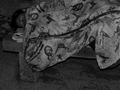
| 09/04/2005 11:24:56 PM |
Dark & Lonelyby arsenalComment: I could barely make out anything in this photo and I had my monitor calibrated and it still is too dark. Work on exposure, if you have questions about that area, lots of people on the forums will help or PM me and I will try to help, although I am no expert. Just don't get discouraged, we all have had our share of over and under exposed photos, sometimes that's the toughest thing to control . |
| Photographer found comment helpful. |
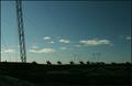
| 09/04/2005 11:20:04 PM |
Dark & Lightby HornOUBetComment: The colors are beautiful, but it isn't very original, lots of sky scenes out and about. The electric lines and too many thin branches still the the scene . |
| Photographer found comment helpful. |
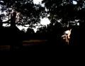
| 09/04/2005 11:17:18 PM |
dark and lonelyby drz01Comment: I guess it is too dark, i could barely make out what it was. I believe a person on a bench? It seems overexposed and grainy, but the idea was good. You may want to submit it to the forum to see if any of the photoshop experts can put some spark into it. |
| Photographer found comment helpful. |
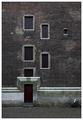
| 09/04/2005 11:09:23 PM |
Door & Latticeby indy79Comment: iIt's a nice composition , but not very inspiring to me. It seems rather underexposed. I can barely make out the lattice. I just calibrated my own monitor, so I believe it is correct. You may want to check into it too. |
| Photographer found comment helpful. |
| 09/04/2005 10:51:25 PM |
dimes&limesby myceliumComment: Good job making it interesting by putting the dimes into the lime. It makes all the difference. That's why I liked it better than the other lime dime photo int his challenge. You might want to play with the lighting to see if you can get more interesting effects, still it gets 9 just as it is. |
| Photographer found comment helpful. |
| 09/04/2005 10:47:32 PM |
Disneyland & Lightsby wetlandComment: This was the first one I looked at and I immediately knew this challenge was going to be tough. Beautiful lights and perfect framing. 10 |
| Photographer found comment helpful. |
Home -
Challenges -
Community -
League -
Photos -
Cameras -
Lenses -
Learn -
Help -
Terms of Use -
Privacy -
Top ^
DPChallenge, and website content and design, Copyright © 2001-2025 Challenging Technologies, LLC.
All digital photo copyrights belong to the photographers and may not be used without permission.
Current Server Time: 08/24/2025 09:03:03 AM EDT.