| Image |
Comment |
| 10/10/2005 12:05:35 AM |
|
 Photographer found comment helpful. Photographer found comment helpful. |
| 10/09/2005 11:43:15 PM |
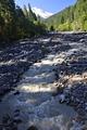
Mount Baker-Snoqualmie National Park (Cards for Tourists)by CantiqueComment: *Critique Club*
The colors are nice and bright, but at the same time seem flat to me. It could be my monitor. I use a laptop and it is SO BRIGHT! I really like how the water stream curves its way through the picture. With the trees on the sides and the mountain in the background, you have yourself one great image. I think that this would have scored better if the water wasn't so muddy. It looks almost like chocolate milk. Ummm yummy. I like the image, I think you cropped it well. Another reason why you might have rec a low score for this picture is the title. It looks to me like you meant for it to be a post card for travlers and not a greeting card. But what a beautiful place. Wish I was there!
Mandy |
| Photographer found comment helpful. |
| 10/09/2005 11:05:01 PM |
Love by nico_blueComment: *Critique Club*
I am giving YOU a critique? What is this world coming to? I guess everyone has an opinion. First of all I can't stop staring at the picture. It is wonderful!! There are a lot of things I want to say, but I won't because there are kids like Joey that use this website. WOnderful picture, would not change a thing!-love the wet hair. The duotones are perfect for this image as well as the shadows. You are amazing.
Mandy |
| Photographer found comment helpful. |
| 10/09/2005 10:58:52 PM |
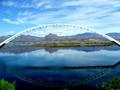
Inspirationalby ArpeggioAngelComment: *Critique Club*
Wow! This is a beautiful image that is perfect for a greeting card! IF the reflection was less smeared and the picture was straight you would have scored in the 6's! Great picture! What I like most is the green bushes in the corners. They go well against the blue water. Mountains look wonderful, Just an all around nice picture. Congrats to you.
Mandy |
| Photographer found comment helpful. |
| 10/09/2005 10:15:12 PM |
|
| Photographer found comment helpful. |
| 10/09/2005 10:13:51 PM |
friendshipby clictacameraComment: *Critique Club*
There are popular greeting cards that are "snapshots". I think that the reason they work is because there is a since of nastalga (i bet that is spelled wrong) to them. They have selective desaturation or other processing techniques added to make them look more than just a vacation or a get-together with family type of image. Your image is very cute but not greeting card material IMO. This might have worked better in BW.
Mandy |
| Photographer found comment helpful. |
| 10/09/2005 01:09:52 AM |
. Finding My Feet .by 3amfromkyotoComment: OH! OH! OH! I LOVE THIS!! I WANT IT!!!! Please make it a print. PLEASE! I will buy it. It is wonderful. It is great! I would love to have a signed print. |
| Photographer found comment helpful. |
| 10/08/2005 11:47:52 PM |
For Motherby dartompkinsComment: * Critique Club *
Great picture! The sepia tones are wonderful. Gives you a nice warm and fuzzy feeling. I really like everything about it so I am sorry I am the one to critique it. If I have to say something, it would be the mothers facial tones. They are a little blown out, but I don't think that it hurts your photo. Great job and good luck in future challenges.
mandy |
| Photographer found comment helpful. |
| 10/07/2005 06:42:13 PM |
|
| Photographer found comment helpful. |
| 10/06/2005 06:22:37 PM |
|
| Photographer found comment helpful. |
Home -
Challenges -
Community -
League -
Photos -
Cameras -
Lenses -
Learn -
Help -
Terms of Use -
Privacy -
Top ^
DPChallenge, and website content and design, Copyright © 2001-2025 Challenging Technologies, LLC.
All digital photo copyrights belong to the photographers and may not be used without permission.
Current Server Time: 08/28/2025 12:24:20 PM EDT.