| Image |
Comment |
| 07/26/2005 02:38:32 AM |
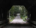
the covered bridgeby U622Comment: I would have tried a fill flash here. I want to see all those nice timbers forming the structure. |
 Photographer found comment helpful. Photographer found comment helpful. |
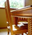
| 07/26/2005 02:38:01 AM |
|
| Photographer found comment helpful. |
| 07/26/2005 02:37:40 AM |
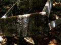
#2by jrtoddComment: Nice shot, sharp, but not very "creativity is key"
Dont be offended, still a superbly sharp image. |
| Photographer found comment helpful. |
| 07/26/2005 02:36:32 AM |
|
| Photographer found comment helpful. |
| 07/26/2005 02:35:58 AM |
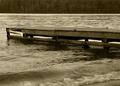
Weathered and Wornby neenee1999Comment: I would have maybe gotten a lower angle on this but over all good. Also maybe would crop out some of the wave splashing as it distracts. When I see the calmness of the lakes, and the solitude of the little pier I feel peaceful until that wave comes crashing in. |
| Photographer found comment helpful. |
| 07/26/2005 02:34:27 AM |
|
| Photographer found comment helpful. |
| 07/26/2005 02:33:16 AM |
|
| Photographer found comment helpful. |
| 07/26/2005 02:32:01 AM |
|
| Photographer found comment helpful. |
| 07/19/2005 06:12:32 PM |
|
| Photographer found comment helpful. |
| 07/18/2005 11:10:44 AM |
We Don't Need No Stinkin' Realtorsby JutildaComment: I like how the FOR SALE sign jumps out me. It makes me feel like the owners are desperate to become independent from this house. The white picket fence is nice as well. Small town USA feeling. The blue hue is different. I can see how it works though.
Overall I enjoyed it, somewhat a Darkside of Suburbia :) |
| Photographer found comment helpful. |
Home -
Challenges -
Community -
League -
Photos -
Cameras -
Lenses -
Learn -
Help -
Terms of Use -
Privacy -
Top ^
DPChallenge, and website content and design, Copyright © 2001-2025 Challenging Technologies, LLC.
All digital photo copyrights belong to the photographers and may not be used without permission.
Current Server Time: 08/19/2025 12:19:21 PM EDT.