| Image |
Comment |
| 05/16/2006 05:16:50 AM |
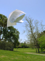
Three Sheets to the Windby GeneralEComment: Hi from the Critique Club!
This was one of the few images to really meet the spirit of this challenge. It is clearly well thought out and shows a creative mind. The use of printed papers adds enormously to the effect and interest. The sheets have made appealing curves and shapes and have seperated well.
The trees help suggest the idea of wind, but had the sheets been solely against the blue sky, instead of against the trees, I think you would have scored even higher. But compositionally it does adhere to the rule of thirds well.
A well executed, creative take on the challenge. Message edited by author 2006-05-16 05:22:34. |
 Photographer found comment helpful. Photographer found comment helpful. |
| 05/15/2006 05:38:05 AM |
The early bird catches the worm.by charlievComment: Hi from the Critique Club!
This is a difficult one.
As far as the challenge is concerned, there is nothing in this image that suggests an 'early' bird; the sun is not rising, the bird has no watch on and is not reading the morning paper:)The worm has obviously overslept as he is missing from the image, like the signs of early morning:) But hey, we trust you when you say it is early morning;)
I actually like the composition in a abstract way; the angles created by the green against the blue work well. The plant shooting straight into the middle of this is quite dynamic. BUT....very little, if any of this image is in focus. My eyes are watering trying to do the job the camera failed to do. I desparately want to like this image...but the focus!!!! Enough said;) |
| Photographer found comment helpful. |
| 05/07/2006 11:52:21 PM |
|
| Photographer found comment helpful. |
| 05/07/2006 11:51:12 PM |
|
| Photographer found comment helpful. |
| 05/07/2006 10:59:05 PM |
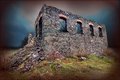
Guildford Hotelby QikiComment: Hi from the Critique Club!
This image reminds me of those cynatype photographs of the past. Together with the subject and the word Heritage this indeed could be an old photograph.
The crispness and cleaness of this image really add to its appeal. There is so much detail to look at and hold the viewers attention for a while.
The dark left hand side of the building does break up the balance of the image a little.
The image does appear to be tilting a little, but that's part of the joy of photographing buildings:)
A really interesting negative, well done! |
| Photographer found comment helpful. |
| 05/07/2006 10:48:10 PM |
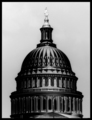
Capital Ideaby bobdaveantComment: Hello from the Critique Club!
First of all, I had to do a double take when I first saw this image- I couldn't believe it was a negative!
The wonderful tones and contrast make me think of a lovely, velvety smooth bar of chocolate, that I want to indulge my senses in.
The repeating patterns of the architecture, create a wonderful rhythm and are aesthetically pleasing. None of the detail has been lost in the negative version, it's crisp and clean.
Compositionally, there is a lovely balance between positive and negative space.
I can't really fault this! |
| Photographer found comment helpful. |
| 05/07/2006 10:36:37 PM |
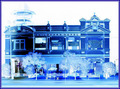
The Jugglerby liebeComment: Hi from the Critique Club!
This is a really dramatic image. There are great dynamics happening here: My eye was immediately first drawn to the pin at the top, which really stands out against the black. The eye then searches for the middle pin, then finally the bottom one - so the eye is drawn down the image. Once at the bottom, our attention shifts to the tree and then that building, which draws the eye dramatically up the the image, to begin the process over again. This circular movement of the eye mimics the circular movement of juggling, giving it an added dimension.
The symbolism I see in your image is that the building represents big business. On each floor there are many employees 'juggling' with the demands of work and family.
The perspective you chose to shoot from really helps make this image powerful.
The focus and DOF are well executed, capturing both the motion, tree and building.
The man's trousers are perhaps too bright in this negative version, but the rest of the image is so dynamic that it doesn't distract too much. |
| Photographer found comment helpful. |
| 05/07/2006 08:03:37 AM |
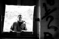
1/2 a Manby moviemanComment: Hello from the Critique Club!
This is an interesting, deceptively subtle image, that holds the attention and suggests a story: Has the man at the window been chasing or searching for someone and has finally found them inside? Or, has he stumbled upon something illicit? The expression on his face gives little away and leaves us guessing.
Actually, the longer I look at it, the more I feel that 'I' as the viewer am looking out of a hiding place, and I feel trapped. This feeling is intensified by the man's stare and the fence just visible behind him.
The wood around the window is not prefectly square, but looks as though it is leaning over through tiredness or old age...again it creates interest for the viewer.
The 1/2 on the wall is intriguing and I want to know what is written below it, what it means, who wrote it. In a wonderful moment of observation you have echoed the 1/2 on the wall with the 1/2 of the man. Again creating interest for the viewer.
The black and white works well here adding to the story feel. There is a good range of tones and nice contrast.
Technically this is a really difficult one to get right as far as correct exposure is concerned and it seems some voters considered the background to be blown out. However I agree with Larus, I like it. My eye was led straight to the subjects eye, the BG did not distract me at all.
A really intriguing image |
| Photographer found comment helpful. |
| 05/05/2006 07:39:13 AM |
|
| Photographer found comment helpful. |
| 05/05/2006 07:32:57 AM |
|
| Photographer found comment helpful. |
Home -
Challenges -
Community -
League -
Photos -
Cameras -
Lenses -
Learn -
Help -
Terms of Use -
Privacy -
Top ^
DPChallenge, and website content and design, Copyright © 2001-2025 Challenging Technologies, LLC.
All digital photo copyrights belong to the photographers and may not be used without permission.
Current Server Time: 08/06/2025 10:24:52 AM EDT.