| Image |
Comment |
| 06/09/2005 02:22:26 AM |
|
 Photographer found comment helpful. Photographer found comment helpful. |
| 06/09/2005 02:21:06 AM |
|
| Photographer found comment helpful. |
| 06/09/2005 02:19:59 AM |
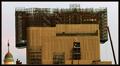
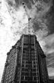
house-on-houseby MAKComment: Horizontal lines are askew and it throws off the balance of the picture... Nice picture though
Cheers,
Eric R Thibodeau |
| Photographer found comment helpful. |
| 06/08/2005 05:08:23 AM |
Big Digby CaaneComment: This could have been a great picture, unfortunately, I find there is too much sky and not enough of the construction site. I don't know if ther ewas something in your way from your vantage point but there doesn't seem to be. Also, looat the vertical lines on the building they are very slanted...
Cheers,
Eric R Thibodeau |
| Photographer found comment helpful. |
| 06/08/2005 05:02:47 AM |
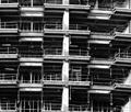
preparing to move-inby asneemComment: For me this has the potential to be a nice picture but there are a couple of elements that throw off the balance. First off, the horizontal lines are slanted to the right, the main vertical line is skewed and also too much in the center ( it's very imposing) and finally there is no start or end, a tighter top/bottom crop would help this picture... But that just my opinion! What I do like is use of black and white and shadow.
Cheers,
Eric R Thibodeau |
| Photographer found comment helpful. |
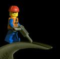
| 06/08/2005 04:56:42 AM |
Building Hammersby colourBlindComment: This is a very cute picture. However, since it is a studio pic, I would have tried to eliminate the shadow across the subject's face and also the flash spot on the little guy's helmet is off putting. Creativity gets a high score but that is countered by the technique.
Cheers,
Eric R Thibodeau |
| Photographer found comment helpful. |
| 06/08/2005 04:19:57 AM |
Upward Ho!by dpakohComment: Nice sky, seems a little overexposed on the left. It's also an interesting shape for a building. Good Shot...
Cheers,
Eric R Thibodeau |
| Photographer found comment helpful. |
| 06/04/2005 11:40:47 AM |
Blue roseby nico_blueComment: Wow, love this picture. That's a shade of blue that you don't see every day. Good job! The only thing I might have done a tighter crop at the top end, the effect dies off a little in the dead zone... But that's just me being Picky... Cheers
Eric R Thibodeau |
| Photographer found comment helpful. |
| 05/19/2005 08:48:41 AM |
Breakfast of Championsby totaldisComment: I like the idea but the composition gets me a liitle. There is too much white doing nothing and it's a bit too tight on the top and bottom. But as I sad I really like the idea!
Cheers,
Eric R Thibodeau |
| Photographer found comment helpful. |
Home -
Challenges -
Community -
League -
Photos -
Cameras -
Lenses -
Learn -
Help -
Terms of Use -
Privacy -
Top ^
DPChallenge, and website content and design, Copyright © 2001-2025 Challenging Technologies, LLC.
All digital photo copyrights belong to the photographers and may not be used without permission.
Current Server Time: 08/04/2025 04:33:06 PM EDT.