| Image |
Comment |
| 02/15/2006 07:23:08 PM |
|
 Photographer found comment helpful. Photographer found comment helpful. |
| 02/13/2006 02:02:17 AM |
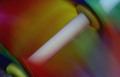
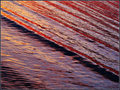
"Spinning Colors"by crystaldmComment: Can't think of a more appropriate presentation - the diagonal composition for this form makes sense. I think the color is good, has a dense quality with no apparent loss of detail - a bit more brightness would have been received better. fyi - 7 |
| Photographer found comment helpful. |
| 02/09/2006 10:20:59 AM |
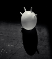
Fleetingby elee3009Comment: fyi - 7 I enjoy the nearly subliminial shadow subject, offset with overpowering arch. graphic - very good & interesting foto. |
| Photographer found comment helpful. |
| 02/08/2006 05:49:06 AM |
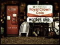
Cola Warby sherComment: cool, I love this... looks like no diets sold here - Tab, Diet Rite Cola. A great view, well made. |
| Photographer found comment helpful. |
| 02/08/2006 04:27:51 AM |
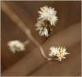
Winter Puffsby admart01Comment: I said a 7, mainly for colour - beautiful & gorgeous winter browns, but white balance is off - your blacks are not as black as they could be. (are you using photoshop? - click that black eye dropper in curves or levels on a dark area) The primary winter blossom suffers from a softness and subsequent lack of detail. This lens should be so sharp it will make your eyes bleed - hand held in this light may not be an option for camera shake. I think dof is good, but another half stop or so will help sharpen and define your primary bloom without much effect on the background, especially since you are also using some background blur technique. Consider raw - and process in 16 bit as far a you can, you may see slight tonality improvement. I think this crop is awkward, I would have played with a perfect square for this composition. |
| Photographer found comment helpful. |
| 02/07/2006 10:14:27 AM |
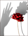
candy stripesby crystaldmComment: your portfolio has some interesting studies and good subjects, I like the found object black feather the best and this is another. The rendering of selective desaturation on the depth of field is an obvious choice & the right design decision. Your color off desat on the background works for this, and is arresting, but I think the effect usually is employed too strongly and think so for this one too. An option might be to fade the selective color gradually, still keeping some, maybe just a slight amount of color. The fade would still keep the drama of your intention to isolate and enhance the character of the strong floral stem, but provide a more engaging and subtle color transition. Very good eye for subject. |
| Photographer found comment helpful. |
| 02/07/2006 08:54:32 AM |
Fool's Paradiseby RKTComment: An accomplished lesson of isolation - disassociation/reassociation of form - perfect method. An evocative title. a favorite. |
| Photographer found comment helpful. |
| 02/07/2006 03:45:36 AM |
|
| Photographer found comment helpful. |
| 02/06/2006 10:22:33 PM |
|
| Photographer found comment helpful. |
| 02/03/2006 09:22:54 AM |
|
| Photographer found comment helpful. |
Home -
Challenges -
Community -
League -
Photos -
Cameras -
Lenses -
Learn -
Help -
Terms of Use -
Privacy -
Top ^
DPChallenge, and website content and design, Copyright © 2001-2025 Challenging Technologies, LLC.
All digital photo copyrights belong to the photographers and may not be used without permission.
Current Server Time: 06/21/2025 06:30:04 AM EDT.