| Image |
Comment |
| 08/05/2005 10:11:16 AM |
Cribbageby LadeeMComment: I agree with alfresco, a point of reference would be one thing to help establish your intent. I don't know the first thing about cribbage, so wouldn't understand that the one you focused on is in the lead. Also, the glare on the right is taking some attention away from the subject. A personal opinion...I often don't care for the closest item in a series being out of focus, and in this case, it's the most prominent piece taking up quite a bit of the frame. Not to be harsh, just trying to help relay what I see in this shot. Hope it helps. |
 Photographer found comment helpful. Photographer found comment helpful. |
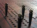
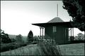
| 08/03/2005 02:33:51 PM |
Tapsby SCI 009Comment: disregarding the challenge theme, I think this could use a little more contrast and separation between the headstones and the grass/weeds. A different B/W conversion method may yield that. Also, a lower point of view may be a more interesting perspective. As it is, it's a decent shot (background sky is a little distracting), and the placement in the challenge is about what I would have guessed. BTW, thanks for commenting on one of my shots. |
| Photographer found comment helpful. |
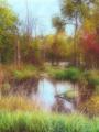
| 08/03/2005 10:49:13 AM |
My Hidden Pondby taterbugComment: I really like this 'nice but subject-less photo'. I think the blur is what makes the shot. Although, a couple of ducks or crane standing in teh water may help, I think it's great as-is. Very nice! |
| Photographer found comment helpful. |
| 08/03/2005 10:44:02 AM |
Serenityby striderx77Comment: Nice tones. Something to anchor this shot would make it much stronger, IMO. |
| Photographer found comment helpful. |
| 08/03/2005 10:41:53 AM |
Adrenaline Rushby striderx77Comment: The sky is exposed nicely, but the coaster and people are a bit dark. You may be able to help this a lot with a selection and some levels/curves adjustments. Getting this just a little sooner so the cars are on the other side of the loop, would be cool as well. |
| Photographer found comment helpful. |
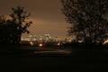
| 08/03/2005 10:38:24 AM |
City of Goldby striderx77Comment: I like the colors in this, and looks like a nice skyline shot. I would maybe crop a bit off the left, some of the bottom, and quite a bit of the trees on the right to bring more attention to the skyline. |
| Photographer found comment helpful. |
| 08/03/2005 12:35:22 AM |
|
| Photographer found comment helpful. |
| 08/02/2005 11:00:31 PM |
A Room With a Viewby datcatComment: I don't care for the color treatment. You're right, nice view. Good composition, like the flowers in the foreground. |
| Photographer found comment helpful. |
| 08/02/2005 10:59:23 PM |
|
| Photographer found comment helpful. |
| 08/02/2005 10:57:14 PM |
Critical Careby BradComment: That black cat can't be a good sign! I like the B/W and the texture/grain. |
| Photographer found comment helpful. |
Home -
Challenges -
Community -
League -
Photos -
Cameras -
Lenses -
Learn -
Help -
Terms of Use -
Privacy -
Top ^
DPChallenge, and website content and design, Copyright © 2001-2025 Challenging Technologies, LLC.
All digital photo copyrights belong to the photographers and may not be used without permission.
Current Server Time: 08/26/2025 02:29:03 PM EDT.