DPChallenge: A Digital Photography Contest You are not logged in. (log in or register
 
Browse Settings
Currently viewing:
Registered UserCLarson557

Show comments:

Per page:

Order:

Comments:


Comments Made by CLarson557
Pages:   ... [181] [182] [183] [184] [185] [186] [187] ... [201]
Showing 1831 - 1840 of ~2002
Image Comment
Highway in the Sky
05/09/2003 11:17:39 AM
Highway in the Sky
by CreativeFlyPhoto

Comment:
Hi Amy,
Greetings from the Critique Club:

Just to start out...I really like your photo. I liked it during voting and, of course, I still like it now. In my opinion, you have taken what would be a simple monorail snapshot and turned it into photographic art. What makes the picture is the reflection of the setting sun and horizon in the front car. The colors are beautiful.

If I remember correctly, the monorails at DisneyWorld move quickly, so I'm impressed that you were able to freeze it and get it in such nice focus. Just the front nose is a tad blurry, so I can tell that it was a moving monorail.

The angle of your shot is pleasing to the eye. I disagree with one comment that suggested you crop out part of the left side. That is the best part of it where the colors are rich. It also shows the track in front of the train and allows it somewhere to go. Your border is simple black and not overdone. Frames your picture nicely.

My only complaint is that it is a little overexposed on the right side. Actually, I think you could crop off a little more of the back of the train (perhaps the last two sections) and not lose the effectivness of the shot. In fact, the closer crop would make the front car more dramatic. I think it will also take out some of the negative space of the blaa sky and fill your picture in better. Just a thought.

Overall, it is a very nice photo and meets the challenge head on.

Good luck
Connie
Photographer found comment helpful.
Afternoon
05/08/2003 07:58:27 PM
Afternoon
by jimmythefish

Comment:
Critique Club: Greetings
CLarson557

Composition:
I like the plant pictures in your set. Although maybe a little on the dark side, the filtering light and the shadows are nice, especially with the leaves in the top one. Sorry, I'm not a plant person, so I don't know the name of the plant.

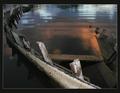
I'm in agreement with others who have commented on your above work...that the left picture seems out of place. Since you left no explaination, I am left with my creative imagination. What I believe it could be is a window seal. So, considering that, with the amount of bright sunlight coming in the window, the pattern of light seems a bit out of balance...meaning that there should be more sunlight showing in the top photo. However, since this is a triptych with three different photos, that is forgivable. However, it is just a thought...if you were to balance out the set in respect to light.

In regards to the bottom fern picture, I like the transition between the lower dark area of the photo on the left and the ferns. The lighting is balanced with the sorce of light on the ferns coming from somewhere below and out of the picture.

Framing/Border:
The pictures are arranged nicely in the set. It's simple and fitting. The black border is even and does a very good job in presenting the photos. I actually didn't notice the thin white line at the bottom until I read the comments you recieved and it was brought to my attention. Just a minor thing and I really didn't find it distracting, although, if a print were to be made, it probably should be fixed.

Technical Aspects:
Once again, I'm still stopped by the picture on the left. I'm not sure what it is I'm actually seeing. The focus is on the lower wooden area and, once again, I'm puzzled as to how it fits in, especailly with the upper portion out of focus. I'm finding it hard to comment on it any other way. I do like how you were able to bring out the texture in the wood.

In the plant pictures, you show nice texture of the leaves. However, I do feel that it could be lightened up just a tad without blowing out the ones lit by the sunlight and without losing the effect of the shadows. It would not only give the lighting more balance in your set as I talked about above but also would be a little more pleasing to the eye.

B/W is effective in this because of the use of shadows and light. I really do not think it would be as nice in color...although my curiosity is heighten to see a colored version just to see the difference. The focus is nice and shows good texture and dimension.

Overall:
A very well put together arrangement of pictures. Only a few troubling areas. One can tell that this is done by someone who is experienced and works well with a camera. You have a nice eye for shooting thought provoking photos, paying good attention to light and shadows. I did take a look at your others challenge submissions and I was quite impressed.


-I hope you find this helpful. This is my first critique since joining the club, so I hope I covered everything. If you have any questions, you can notify me.
Photographer found comment helpful.
Once it had been useful
05/07/2003 03:54:17 AM
Once it had been useful
by Jean

Comment:
Not that the ribbon winners deserved their wins this week, but I think this one should have been up there as well. I was very disappointed at not seeing it there. ...And I noticed that I wasn't the only one that picked this one as a favorite. Congrats on such a good photograph.
Photographer found comment helpful.
Black and White
05/07/2003 01:49:29 AM
Black and White
by Jean

Comment:
I like the unique-ness of this photo. I like the angle at which the glasses where shot and the lines of the window panes. I do think, however, this would have been better to be in true black and white. There is color along some of the edges that I feel takes away from the quality of the shot.
Photographer found comment helpful.
Hi there! Greetings from Frisco!!
05/05/2003 01:04:11 AM
Hi there! Greetings from Frisco!!1st Place
by Pep Ventosa

Comment:
Definately a great post card. I love the lay out. Nice use of the text. Very fitting.
Photographer found comment helpful.
Longhorn Ranch
05/05/2003 12:46:35 AM
Longhorn Ranch
by Anachronite

Comment:
Hey!! I used to live in Cisco, TX! I'm really enjoying this challenge and being able to re-visit places. Sorry...onto more important things. :-) The placement of these longhorns is absolutely perfect!! You had to have trained them to pose, however, it would have helped if the beautiful one in front had his eyes open. The lighting is perfect, the colors came out great and there is good focus and definition. True spirit of Texas! 10
Photographer found comment helpful.
Orange County, CA
05/05/2003 12:40:04 AM
Orange County, CA
by StevePax

Comment:
I really like the composition of your photo for your postcard. The lighting and color is nice. I feel like I could actually smell the oranges. The text is well placed and very fitting. The bright blue border really hurts it, though.
Photographer found comment helpful.
You Might be a Redneck if...
05/02/2003 03:57:47 AM
You Might be a Redneck if...
by cercy

Comment:
This one makes me laugh...thank-you. I like the positioning of the riding lawnmower man in your picture with the vastness of the empty road beside him. Now, all he has to do is hand signal a right hand turn and I would laugh even more. The sepia tone to the photo is effective. I don't even mind the blowen out sky. I just wish it was more in focus. -8- Good luck in the challenge.
Photographer found comment helpful.
Once it had been useful
05/02/2003 03:51:55 AM
Once it had been useful
by Jean

Comment:
You almost can't tell that this was actually a boat at one time, however, it definately is. This has got to be the winner for the week. The lighting is excellent...I love the colors and reflections of the beautiful water. Then, in contrast, is the ugliness of the boat or what is left of it. You show great detail of the peeling paint and the moss collecting on the surfaces of the portion in the water. I like the angle at which it was shot, with the back portion of the boat trailing off into the shadows. Very clean and well framed. What more can I say, but WOW 10+ My favorite for this challenge.
Photographer found comment helpful.
Covered Wagon of the Old Wild West
05/02/2003 03:40:12 AM
Covered Wagon of the Old Wild West
by Bitz

Comment:
Definately meets challenge. The lighting is good and focus is excellent. Perhaps shooting the wagon closer and at a different angle where it would show more detail would make this a little more interesting. Like the chipped paint on the wheel, the wooden construction of the wagon or the ropes that hold the covering in place. It's just a thought. All in all, as a whole, it is technically a nice photograh in my opinion -7- Good luck in the challenge.
Photographer found comment helpful.
Pages:   ... [181] [182] [183] [184] [185] [186] [187] ... [201]
Showing 1831 - 1840 of ~2002


Home - Challenges - Community - League - Photos - Cameras - Lenses - Learn - Help - Terms of Use - Privacy - Top ^
DPChallenge, and website content and design, Copyright © 2001-2025 Challenging Technologies, LLC.
All digital photo copyrights belong to the photographers and may not be used without permission.
Current Server Time: 08/03/2025 04:00:36 PM EDT.