| Image |
Comment |
| 06/14/2003 01:50:01 PM |
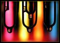
The Highlighted Area by inspzilComment: This is a REALLY cool abstract photo. Very unique idea and that scores points for me. The paperclips and drops are nice. I like the colors. They are brilliant Good job 8 |
 Photographer found comment helpful. Photographer found comment helpful. |
| 06/11/2003 09:51:35 PM |
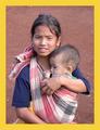
LIFEby swaroskjiComment: Yes, I can see this as the cover for LIFE. Good job |
| Photographer found comment helpful. |
| 06/11/2003 09:43:19 PM |
National Geographicby InnaNComment: This definately looks like a National Geographic Magazine cover. I would like to know who these kids are. Are you sure that they weren't already on a magazine cover? :-) |
| Photographer found comment helpful. |
| 06/11/2003 04:56:47 PM |
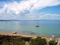
Vacationsby bobgaitherComment: The clouds are absolutely breathtaking and the mountains in the background are nice. This is a lovely picture and it's done well, but I don't actually see this as a magazine cover. Why? Because I don't know how it could be edited to fit the dimensions of the cover. If you crop out the viewer's right, you cut out the clouds and if you crop left, you have the clouds, but cut out the boat and people in the water. I would actually see this picture on the inside of the magazine featuring this place in an article. 8 Good luck in the challenge. |
| Photographer found comment helpful. |
| 06/11/2003 04:38:28 PM |
Sailing Magazineby alanfreedComment: Very nice...I can actually imagine this being on your magazine cover. I really like the colors and the choppy water. Only drawback I see is that the background seems a little dull. Perhaps a little tweak on the contrast would help? 8 Good luck in the challenge. |
| Photographer found comment helpful. |
| 06/11/2003 12:58:21 PM |
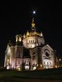
The Architect's Journalby gowf67Comment: Very good shot and definately a good cover for your magazine. I like the clean lines and shadows. You must have used a special filter to give the lights the star shape. Works well here. Also, I like how the statue at the top of the building is raising its cross to the "star" above. Too bad the cars had to show in your picture. |
| Photographer found comment helpful. |
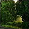
| 06/11/2003 12:39:39 PM |
Country Livingby jjbeguinComment: Outstanding!! Extremely gourgeous shot. I love how the sun is peeking out from the trees and the early morning misty feeling I get looking at this. Most definately a great cover for your magazine. 10+ Good luck in the challenge. |
| Photographer found comment helpful. |
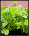
| 06/11/2003 12:37:18 PM |
Home Gardenerby AlexanderComment: The leaves, especially the top ones seem a little overexposed. Perhaps shielding the sun from them or moving them into the shade would have helped some. |
| Photographer found comment helpful. |
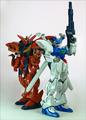
| 06/11/2003 12:35:35 PM |
Model Graphix: Paying Attention To Detailsby zerocusaComment: Yes, I could see this on the cover of your magazine. However, using a different background would be a good idea. I invision a space ship flying amoung the milky way here. Or something like that...just an idea to make it more interesting. |
| Photographer found comment helpful. |
| 06/11/2003 12:32:21 PM |
Scientific American - Relativistic DNAby ArtifactsComment: Yes, I could definately see this on the cover of your magazine. There just seems to be some grainy noise that could possibly be easily cleaned up before you would send it to the editors for consideration. |
| Photographer found comment helpful. |
Home -
Challenges -
Community -
League -
Photos -
Cameras -
Lenses -
Learn -
Help -
Terms of Use -
Privacy -
Top ^
DPChallenge, and website content and design, Copyright © 2001-2025 Challenging Technologies, LLC.
All digital photo copyrights belong to the photographers and may not be used without permission.
Current Server Time: 08/06/2025 09:07:43 AM EDT.