| Image |
Comment |
| 09/28/2005 11:18:33 AM |
New babyby pacpintoComment: Very nice. I like the soft focus and the lighting. I can really see this a more of a birth announcement postcard with the baby's stats listed in the blank area on the right. |
 Photographer found comment helpful. Photographer found comment helpful. |
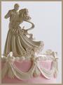
| 09/28/2005 11:17:02 AM |
Weddingby LindaLeeComment: Very pretty! I like the muted colors and the placement of the cake in the picture. I like the color of the complementry border, but it is a little too think, IMO for such a delicate picture. 6 |
| Photographer found comment helpful. |
| 09/26/2005 06:42:59 PM |
|
| Photographer found comment helpful. |
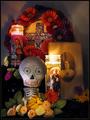
| 09/26/2005 06:41:25 PM |
Día de los Muertosby RKTComment: "Day of the Dead" ... Is that the equivalent of Halloween in the States? I like this picture. I'm not sure what everything represents, however the lighting and the composition are right on. |
| Photographer found comment helpful. |
| 09/26/2005 06:39:25 PM |
Thanksgivingby LouisonComment: Not enough in this picture. I would probably pass over it in the card shop. |
| Photographer found comment helpful. |
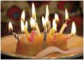
| 09/26/2005 06:37:18 PM |
Hooray, Its Your Birthday!by banditComment: Very cute. Nice capture. One suggestion...since this challenge allows spot editing, I probably would have desaturated the yellow/pink hue from the puppy's chests and legs. |
| Photographer found comment helpful. |
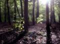
| 09/26/2005 12:17:09 PM |
Bereavementby TallblokeComment: Beautiful. I like the softness of the photo with the light showing through the trees. Would definately consider this in the card store. |
| Photographer found comment helpful. |
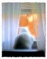
| 09/26/2005 12:16:31 PM |
New Homeby frogletComment: Interesting angles in this picture. It kind of looks like flowers and maybe someone looking out the window. Would possibly like to see more of that. I think this could use just a little boost of contrast. |
| Photographer found comment helpful. |
| 09/26/2005 12:15:19 PM |
Missing Youby DottieDComment: I really do like the border for this card. What would make me pass over this in the card store would be the overexposed brick background outside the window. It really distracts from the soft whites of the rest of the picture. |
| Photographer found comment helpful. |
| 09/26/2005 12:13:16 PM |
|
| Photographer found comment helpful. |
Home -
Challenges -
Community -
League -
Photos -
Cameras -
Lenses -
Learn -
Help -
Terms of Use -
Privacy -
Top ^
DPChallenge, and website content and design, Copyright © 2001-2025 Challenging Technologies, LLC.
All digital photo copyrights belong to the photographers and may not be used without permission.
Current Server Time: 08/02/2025 10:39:52 AM EDT.