| Image |
Comment |
| 04/08/2003 10:37:30 AM |
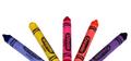
Colors of Springby willtataComment: the photo seems a bit dark and under-saturated (the colors are a bit dull). the concept is simple (although not that original) so these other aspects are even more key to its success. |
 Photographer found comment helpful. Photographer found comment helpful. |
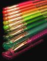
| 04/08/2003 10:33:35 AM |
Urban Rainbowby jgal76Comment: why urban? (had to ask since i can't find much to suggest to improve the photo - nicely done). the symmetry could be just a little better. |
| Photographer found comment helpful. |
| 04/08/2003 10:31:03 AM |
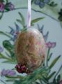
Easter Eggby websterComment: um . . . i'm not sure if the background adds anything to the photo, and the colors are a little dull, and the focus seems a little soft on the whatever it is stuck to the bottom of the egg. that said, eggs are tricky with the voters (see my hungarian eggs submission). |
| Photographer found comment helpful. |
| 04/08/2003 10:22:36 AM |
Let's Paintby ThomasComment: its cool how narrow the focus area is. nice shot, and well saturated (esp. versus many other submissions where people seemed to have omitted that step). only suggestion might be to use a white or black piece of paper in the top left to more effectively create empty space there. |
| Photographer found comment helpful. |
| 04/08/2003 10:20:10 AM |
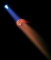
Melting Pointby autoolComment: neat. i wish i knew what you were melting. the flame almost looks like a spotlight, and this looks hazardous for your camera ;-) you might have boosted the saturation to bring the blue and red out a little more. |
| Photographer found comment helpful. |
| 04/08/2003 10:18:46 AM |
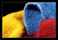
Wash Colors Separatelyby scab-labComment: nice. you might consider lowering the gamma (light) a little and boosting the color (saturation) a bit to increase the intensity and contrast of the colors. |
| Photographer found comment helpful. |
| 04/08/2003 10:16:04 AM |
Mom's gift Quilt handquilted by Momby Crafty SueComment: i think these are actually quite challenging pictures to take because its hard to give the photo a professional look versus just a snapshot. i think the symmetry actually hurts the photo, and maybe choosing a lower angle would have given some more depth of field and made the photo more interesting (and i always love increased saturation to bring the colors out). |
| Photographer found comment helpful. |
| 04/08/2003 10:13:50 AM |
Writing Rainbowby WILDBLUEComment: good focus and dof. i like stronger colors (saturation), which could have been done in post processing, or simply by reversing the order and bringing the brighter colors up to the front. |
| Photographer found comment helpful. |
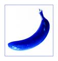
| 04/08/2003 10:12:32 AM |
Banana Blueby GotchyaComment: props you can eat. well done, i like the blue, but overall its a little over exposed - like the soft edge on the lower left end of the banana. a yellow background might have been a neat twist. |
| Photographer found comment helpful. |
| 04/08/2003 10:09:21 AM |
Duoby lionelmComment: very nice. only improvement i might suggest is that the picture is a little tight, especially for the background image. |
| Photographer found comment helpful. |
Home -
Challenges -
Community -
League -
Photos -
Cameras -
Lenses -
Learn -
Help -
Terms of Use -
Privacy -
Top ^
DPChallenge, and website content and design, Copyright © 2001-2025 Challenging Technologies, LLC.
All digital photo copyrights belong to the photographers and may not be used without permission.
Current Server Time: 08/04/2025 10:00:40 PM EDT.