| Image |
Comment |
| 09/16/2009 05:31:29 AM |
Eight Are Awakeby pixelpigComment: That's a lot of garden gnomes. Interesting choice of subjects, but the environment surround them leaves a lot to be desired. I picture these guys set up out in the garden with a background and surroundings of great interest. Shot like this, it just seems like a snapshot of clutter. I'd really like to see this one taken with an interesting environment for my eye to roam and explore. 4. |
 Photographer found comment helpful. Photographer found comment helpful. |
| 09/16/2009 05:29:11 AM |
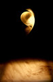
smile in orbitby cutoutComment: I have no idea what this is, but I like the abstract presentation. The more I look at it, the more I like it. I appreciate the originality that you presented to the voters and viewers. This is one of my favorites in this challenge right now. 8. Now what the hell is it? |
| Photographer found comment helpful. |
| 09/16/2009 05:27:19 AM |
chalk up!by unbreakableComment: Lose that flash! The image itself has potential, but billiard balls are tough to shoot. This is especially true when shooting with the small, harsh, on-camera flash unit. There is a bright spot of distraction on every ball. This makes it difficult for my eye to appreciate the image. 4. |
| Photographer found comment helpful. |
| 09/16/2009 05:23:23 AM |
Alternative Sunriseby karmatComment: Awesome tonal range with such a small, minimalistic presentation. That second petal on the left is a bit blown, this providing a small distraction and trap for my wandering eye. I like the composition, but that spot near the top on the right is driving me nuts. I keep trying to clean my monitor. Even still, nice capture and a strong presentation. 7. |
| Photographer found comment helpful. |
| 09/16/2009 05:20:49 AM |
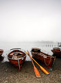
Morning Watch, Winter Harborby Bear_MusicComment: I like the serenity of the scene. It makes me feel like autumn is approaching. I would like to see the water even more still, if that's even possible to capture. Nice, peaceful scene. I'd lie to see this one at a larger resolution to really enjoy the detail. 6. |
| Photographer found comment helpful. |
| 09/16/2009 05:16:09 AM |
Plethora of Pensioners at Platform Nineby PaulComment: I like this image. I have a soft spot for well done street photography, and I like the way this one fits into the challenge. There are many, many areas of interest that keep my eye moving, all the while holding it inside the frame save the one lady on the end of the leading line on the right side. Even still, my eye likes this one, but the tones are flat. There are some true whites, but the blacks are definitely missing. With a simple contrast of curves adjustment, this one would portray a great deal more drama. Here is the adjustment I would have made:

That is with a simple, 30 second curves layer added to the entire image. Even still, I like what you have seen and captured here. I am voting this one a 7, but with a few slight adjustments this one would have crawled even higher for me. Nice capture. |
| Photographer found comment helpful. |
| 09/16/2009 05:08:04 AM |
Pa9esby paperpagesComment: Clever titling, but the 9s fall off into the comparatively huge frame. 4. |
| Photographer found comment helpful. |
| 09/16/2009 05:07:18 AM |
Burned landby keyzComment: I like the idea, but the depth of field feels too shallow for this particular capture. It looks like the back matchsticks are falling off into softness. In my opinion, of you are using nine objects in a challenge that is titled Nine, all nine subjects should be in crisp focus. I like the composition. 5. |
| Photographer found comment helpful. |
| 09/16/2009 05:02:24 AM |
Pearl Dawnby Ecce_SignumComment: I really had to search for the overall relation to the challenge subject. This is a neat image, but it is a shoehorn entry into the challenge. Nice technicals, but this one would better serve you in a different challenge. 3. |
| Photographer found comment helpful. |
| 09/16/2009 05:01:06 AM |
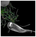
Fore...by LutchenkoComment: I get that its a 9 iron, but at first glance, I see a 6. I like the deep black you capture in your background to make your subject pop, but the ball needs to be a bigger part of the frame and better lit. Good start, but it could definitely use more time in the setup and lighting. 5. |
| Photographer found comment helpful. |
Home -
Challenges -
Community -
League -
Photos -
Cameras -
Lenses -
Learn -
Help -
Terms of Use -
Privacy -
Top ^
DPChallenge, and website content and design, Copyright © 2001-2025 Challenging Technologies, LLC.
All digital photo copyrights belong to the photographers and may not be used without permission.
Current Server Time: 07/30/2025 05:59:04 PM EDT.