| Image |
Comment |
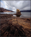
| 05/03/2006 02:10:19 PM |
Kleifarvatnby arngrimurComment: Great exposure, terrific lighting, crisp focus and awesome composition. I think that about sums it up. |
 Photographer found comment helpful. Photographer found comment helpful. |
| 05/03/2006 02:09:23 PM |
First Communionby twm122Comment: Nice exposure and cool composition, but the focus seems to be a little off. I know that its hard to control everything, but that lone white candle on the benh is a bit distracting. Great tone and coloring. |
| Photographer found comment helpful. |
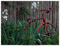
| 05/03/2006 02:07:34 PM |
Days Gone Byby msdoubletroubleComment: Great composition and very interesting subject, but the lighting is too flat. You have a very nice start, but the exposure looks off. |
| Photographer found comment helpful. |
| 05/03/2006 02:05:31 PM |
Popby glodaComment: Yummy! Very nice and creative. I like the depth of field you used here and the super crisp eyes make this a very nice shot. I would like to see her tongue and the lolipop in focus. It looks almost like an artificial blur that you applied. Nice capture overall. |
| Photographer found comment helpful. |
| 05/03/2006 02:02:57 PM |
stream of lifeby arsenalComment: Great idea, but the lighting and multiple elements make it too busy and confusing. The exposure is nice and the focus is sharp, but I'd try to isolate the stream a bit more. |
| Photographer found comment helpful. |
| 05/03/2006 01:48:21 AM |
Divisionby nards656Comment: --Trading Post Comment--
I really can't see the blur, but I think that you suffered from not choosing complementary colors. Red's complement is green and blue's is orange. Either way, I like this iamge. The composition is nicely balanced and the wodd in the middle really works well to draw the eye up and through the image. My only ding in voting was the colors. Still, very nice work. |
| Photographer found comment helpful. |
| 05/03/2006 01:45:08 AM |
Missing Man Formationby MelethiaComment: --Trading Post Comment--
Top 15 finish, very well-done. I think shifting more to your right and cropping off some more of the left would have made it even better. My favorite element in the shot is the texture that the metal sculptures revealed in negative. Very well seen and nicely executed. Congrats on the top 15! |
| Photographer found comment helpful. |
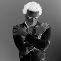
| 05/03/2006 01:41:45 AM |
...rorrim ,rorriMby timfythetooComment: --Trading Post Comment--
I am surprised that it didn't do better. This is definitely one of the most creative shots of the challenge. The composition is very nice and the lighting looks great for a negative image. The brightness of your hair is a bit overbearing, but not enough that I would have voted low. I didn't vote in this challenge, but this would have been in the 7 range for me. Nice work and awesome creativity. |
| Photographer found comment helpful. |
| 05/03/2006 01:34:55 AM |
spookyby DanSigComment: --Trading Post Comment--
I bet it was a really mice portrait, but, other than the eyes, it doesn't pop as a negative image. The eyes, hands and hair really jump out, but the white shirt that he was wearing adds too much darkness as a negative. I absolutely agree, it is spooky. I didn't vote in this particular challenge, but I would have voted 5 or 6. Definitely above average, just not the wow factor as the ribbons. |
| Photographer found comment helpful. |
| 05/03/2006 01:30:50 AM |
Event Horizonby LouisComment: --Trading Post Comment--
I didn't vote on the negative image challenge, as it was way too painful to sort through that many negative images. That siad, I am very suprised that this one didn't place higher. It is one of the few that still leaves a pleasant image as a negative. The focal point is perfect, though centered, leading the eye all aound the photograph. This is also a very interesting depth of field. Even looking at the original, its hard to determine how you pulled it off. I also think that the lighting and exposure are terrific. I have no idea on what would improve the scoring of this one. It would have been one of my 7s or 8s had I voted. |
| Photographer found comment helpful. |
Home -
Challenges -
Community -
League -
Photos -
Cameras -
Lenses -
Learn -
Help -
Terms of Use -
Privacy -
Top ^
DPChallenge, and website content and design, Copyright © 2001-2025 Challenging Technologies, LLC.
All digital photo copyrights belong to the photographers and may not be used without permission.
Current Server Time: 08/01/2025 11:41:44 PM EDT.