|
|
|
Showing 791 - 800 of ~1005 |
| Image |
Comment |
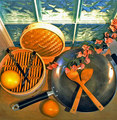
| 05/24/2006 11:32:58 PM | Asian Contemporary Still Lifeby chaliceComment: --Trading Post--
You came up with a very nice composition and layout for this shot. You chose interesting subject matter and it all is nicely focused. There appears to be a slight red hue over the entire image, kind of like the WB is off. Also, it feels just a little cramped with the left edge of the bowl missing and the right edge of the wok touching the border. |  Photographer found comment helpful. Photographer found comment helpful. |
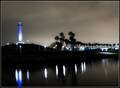
| 05/23/2006 03:16:15 AM | The Lighthouseby reemasComment: Hey there from the Critique Club
First off, always try to include some info about the shot in the Photographer's Comments section. It really helps out when we know what the photographer was thinking and what equipment/lighting/etc. were used, especially when you request a critique.
Camera Work/Technical: Well chosen settings to produce a nice, high-scoring photograph. I really like the WB here, as it rendered near-perfect tones.
Lighting: Impecable. You captured great lighting in all areas of the shot.
Composition/Content: Well seen, well composed and well captured.
My Opinion: I think you have a great image here, but it is a hair over processed. It looks like just a bit too much neat image.
| | Photographer found comment helpful. |
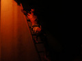
| 05/23/2006 02:58:37 AM | DaVinci Codeby andy_pondyComment: Hey there from the Critique Club
First off, always try to include some info about the shot in the Photographer's Comments section. It really helps out when we know what the photographer was thinking and what equipment/lighting/etc. were used, especially when you request a critique.
Camera Work/Technical: This one is tough to critique fairly because nothing seems to be in focus. If that was the intent of the capture, including that info in the comments section would be helpful for the critique. I will add that I really like the WB that you chose. You captured a photograph that projects a really great mood.
Lighting: I think it's nicely lit, but I would have liked to have seen the exposure just a bit longer. This would have included more detail.
Composition/Content: Very well done. I like the way you composed this one so that the frame is split between the dark and the light.
My Opinion: Great idea, just not fully executed. With better focus and a bit more detail, this one would have scored a great deal higher.
| | Photographer found comment helpful. |
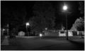
| 05/23/2006 02:50:24 AM | A Quiet Evening on My Streetby Buckeye_FanComment: Hey there from the Critique Club
First off, always try to include some info about the shot in the Photographer's Comments section. It really helps out when we know what the photographer was thinking and what equipment/lighting/etc. were used, especially when you request a critique.
Camera Work/Technical: Everything in the frame is nicely focused and nicely exposed. The lights are just a bit blown out, but nothing outside what you'd expect with a night photograph.
Lighting: This one is nicely lit. It really provides for a very calm, peaceful mood.
Composition/Content: This area is lacking in your capture. As rick13601 pointed out, there really is nothing that grabs the eye. It just looks open and peaceful, but lacks a real point of interest.
My Opinion: I believe that this one scored pretty well for what you captured. Technically, you have a fine image. Great lighting, great exposure and great BW post-processing. With a more defined subject, this one would have scored much, much better. It fits the challenge very well, and the title compliments it perfectly.
| | Photographer found comment helpful. |
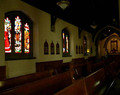
| 05/23/2006 02:33:43 AM | "Hello god" - a holy placeby -kipComment: Hey there from the Critique Club
First of all, welcome to DPC!! Don't be discouraged. Most of us have some 4s lying in past challenges, so you're in good company. Keep shooting and keep entering challenges. It is a great way to learn how to present images that others like.
Camera Work/Technical: It's really difficult to pick out any one area of interest in the frame, thus making it difficult to determine what you were intending the viewer to see.
Lighting: Yeah, this lighting is tough. When shooting is spots like this, up that ISO. The D70 does a fine job with high ISO noise reduction, so use it when the need arises.
Composition/Content: You did a nice job with a perspective-type of composition. The church benches work well to draw the viewer deep into the photograph. I would like to see the rest of that arched wall in the background.
My Opinion: You met the challenge very well, and with better lighting, this one would have done much better. You had some interesting elements in the capture, but the lighting all but killed the interest. Keep shooting, and keep entering.
| | Photographer found comment helpful. |
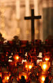
| 05/22/2006 02:49:17 PM | Praying cornerby mecfcostaComment: Hey there from the Critique Club
First off, always try to include some info about the shot in the Photographer's Comments section. It really helps out when we know what the photographer was thinking and what equipment/lighting/etc. were used, especially when you request a critique. The location doesn't really help me understand what you were trying to achieve.
Camera Work/Technical: You produced a very interesting point of view here, but nothing really pops as being crisply focused. I like the WB you used to give the warmth in the photo. While I normally like shallow depth of field shots, this one would have benefited from more focus, even deep into the background.
Lighting: Spectacular. The warmth of the candles and twinkles in the background are the strongest elements in the image. I really like the moodiness that your lighting provides.
Composition/Content: Nice job using the candles to draw the viewer's eye deep into the frame, to the cross and into the sparkling background. I like your vantage point here, and it adds tremendously to the overall image. It looks like everything is tilted just a bit to me. It is so slight that it looks more accidental than intended.
My Opinion: Interesting photograph that met the challenge very well. I think that this one scored to its full potential as is. With a deeper depth of field and a slight straightening, this one might have closed in an a 6.
| | Photographer found comment helpful. |
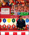
| 05/22/2006 02:15:11 AM | Keeper of the Gameby timfythetooComment: --Trading Post--
I like it. I think it would have scored much, much better if you'd gotten him to look at the camera. As it is, it looks more like a candid than a portrait. Still, one of the better ones in the challenge. | | Photographer found comment helpful. |
| 05/22/2006 02:13:11 AM | happy fishermanby DanSigComment: --Trading Post--
Nice choice for an environmental portrait, but it looks to be more of a candid. Having him pose a bit for you would have certainly increased your score. Very close to another 6, so not bad overall. | | Photographer found comment helpful. |
| 05/22/2006 02:09:09 AM | Looking through the mirror...by KelliComment: --Trading Post--
Very interesting choice of subject, and nicely composed. As Tim said, it looks like a quick snapshot. I think this one would have scored well if the focus had been better. You hit the challenge perfectly, though. | | Photographer found comment helpful. |
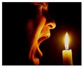
| 05/22/2006 12:27:28 AM | Like a Moth to the Flameby marcelliebComment: Hey there from the Critique Club
Camera Work/Technical: Nice choice of WB here to establish a warm tone. It really adds to the mood of the capture. I can't put my finger on it, but something seems a bit off focus.
Lighting: I like what you accomplished here with the single candle light. It produces some very nice highlights and shadows on the face. The flame itself is just a tad overexposed.
Composition/Content: The face is a bit centered, but it works well with the candle balancing the photo from the right side.
My Opinion: Very nice capture, and I think that this one scored to its full potential. It meets the challenge very well.
| | Photographer found comment helpful. |
|
Showing 791 - 800 of ~1005 |
Home -
Challenges -
Community -
League -
Photos -
Cameras -
Lenses -
Learn -
Help -
Terms of Use -
Privacy -
Top ^
DPChallenge, and website content and design, Copyright © 2001-2025 Challenging Technologies, LLC.
All digital photo copyrights belong to the photographers and may not be used without permission.
Current Server Time: 08/04/2025 11:01:20 PM EDT.
|