| Image |
Comment |
| 06/03/2006 09:41:36 AM |
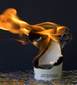
Careful...beverage...extremely hotby MelethiaComment: --Trading Post Comment--
Congrats on a strong score and a great top 15 finish.
Camera Work/Technical: Great focus and strong settings to produce color that the eye expects.
Lighting: I am assuming that this was natural light in addition to the flame in the image. It came off very nice with no detail lost in shadows or highlights.
Composition/Content: Very nice rule of thirds use that moves the eye around the frame. I agree with kristy_mcn with her comment on the flame. It feels chopped off, and it provides a very strong leading line that leads the eye right out of the photograph. I think that the flame should have been included to its terminus.
My Opinion: You captured a very nice and very creative image that I think scored pretty close to its potential.
Eric
|
 Photographer found comment helpful. Photographer found comment helpful. |
| 06/03/2006 09:33:34 AM |
Enjoying my ultimate success.by timfythetooComment: --Trading Post Comment--
Camera Work/Technical: Everything seems well focused, but your subject is also a bit small. WB is on as your colors really pop, giving a great spring time feel.
Lighting: The lighting is a bit splotchy, with some mildly distracting highlights on the child, as well as the green grass in the foreground.
Composition/Content: Nice composition, but a bit distant. I do like how the two of you are riding close to the bottom left of the frame. The child, then you, then the tree provide for some very interesting leading lines that keep the eye moving around the frame.
My Opinion: This is a high-quality snapshot that I am sure will please for years to come. I think that you met he challenge very well, but I don't think it was exactly what the voters were looking for. Then again, who ever knows what the voters are really looking for some days.
Eric
|
| Photographer found comment helpful. |
| 06/02/2006 03:21:39 PM |
Hot Handby timfythetooComment: --Trading Post Comment--
Camera Work/Technical: Great focus on the hand while still showing the motion of the fire. The colors are also very nice, adding a nice warmth beyond the obvious heat of the capture.
Lighting: Also very well captured. Your use of flash is terrific to the point that I can't even tell that the flash was used.
Composition/Content: The centered composition works very well for this capture. The hand position in great and just enough of the arm is viewable to keep the eye moving up the entire frame.
My Opinion: Wee envisioned and well captured. While a 6.1 is nothing to scoff at, I think that this one should have scored much better.
Eric
|
| Photographer found comment helpful. |
| 06/02/2006 12:41:37 AM |
Giftby jaxedComment: Nice start. I like your choice of composition here, but use that full 800 that D&L were so kind to offer for portfolio work. I like it. |
| Photographer found comment helpful. |
| 06/01/2006 11:53:25 PM |
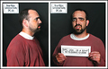
Busted!!!by timfythetooComment: --Trading Post Comment--
Camera Work/Technical: Very creative, one of the most creative of the challenge. This is a wonderfully executed double exposure, and it scored pretty well due to that fact.
Lighting: The flash looks a little harsh for the image on the left, but near flawless for the right hand image.
Composition/Content: Again, very interesting and very creative. Great job with post-processing to finish with a very nice image.
My Opinion: I like it. I think that it scored pretty close to its potential, and you ended up with another well-deserved 6+.
Eric
|
| Photographer found comment helpful. |
| 06/01/2006 11:27:46 PM |
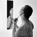
my daily shaveby DanSigComment: --Trading Post Comment--
Camera Work/Technical: Crisp focus and a pretty nice tonal range. Great depth of field, keeping both you and your reflection in focus.
Lighting: The lighting is a definite strength in this capture, but it is just a bit too harsh for my taste. The area behind the mirror is so bright that it really competes for attention.
Composition/Content: Great idea, terrific composition, and very well executed.
My Opinion: I think that you captured a very interesting and very creative self portrait. With the lighting toned down a bit, this one probably would have done even better.
Eric
|
| Photographer found comment helpful. |
| 06/01/2006 11:19:07 PM |
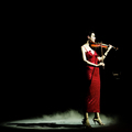
total successby DanSigComment: --Trading Post Comment--
Congrats on one more goal crossed off.
Camera Work/Technical: Excellent focus and great coloring. Excellent settings to catch a crystal clear image with no distracting motion.
Lighting: While it provides a great effect, I think that its a little harsh. It looks like you lost some detail in her face, as it was a bit overexposed.
Composition/Content: Wonderful in both areas. Her figure and shadow very well together to move the viewer through the frame.
My Opinion: You met the challenge very well, and you finished with a well-deserved top 10.
Eric
|
| Photographer found comment helpful. |
| 06/01/2006 11:09:34 PM |
Invasion of Privacyby tngrndreamComment: --Trading Post Comment--
Camera Work/Technical: The first thing that jumps out at me is the graininess and flat details. Some NeatImage would have helped out a great deal. Great colors and toning, but the grain really detracts from the color image.
Lighting: Overall a bit flat, but you did a pretty good job with what you had to work with.
Composition/Content: Great expression and a very neat idea. I think that the motion blur adds some interest to the image. The positioning of the camera could have been better. The door behind you is very distracting.
My Opinion: You met the challenge well, but this one needed better execution. I think that it scored to its potential as it is.
Eric
|
| Photographer found comment helpful. |
| 06/01/2006 11:03:45 PM |
Mby LouisComment: --Trading Post Comment--
Congrats on a nice finish and your second highest score so far.
Camera Work/Technical: Great focus and really nice detail capture. The sweat beads, the zipper and the leather texture all jump out and grab the viewer's eye.
Lighting: Very well done, and I'd call it a successful first. I like the mood created by the lighting, but I'd like to see that right eye with a bit more detail.
Composition/Content: This is a very strong composition that benefits from the strong expression here.
My Opinion: Great work, and a fine score. I think with some detail in that eye, you'd have easily been at a 7.
Eric
|
| Photographer found comment helpful. |
| 06/01/2006 10:52:53 PM |
A child's crowning achievementby KelliComment: --Trading Post Comment--
Camera Work/Technical: Amazing focus! The detail that you captured throughout the image is very nice, and works very well to draw the viewer's eye around the subject.
Lighting: The lighting is a bit harsh, but not all bad. The gradient that you created from top to bottom provides some interest, but I think that it is just a touch too harsh, mostly on the top. The top area looks to be a little overexposed.
Composition/Content: Interesting, but I think it would have benefited if it were around the kid's neck with a big smile and funky pose.
My Opinion: You met the challenge, and I think that your score should have been a bit better based on the technical aspects alone. The composition could have been better, but I don't think that it's a sub-5 capture.
Eric
|
| Photographer found comment helpful. |
Home -
Challenges -
Community -
League -
Photos -
Cameras -
Lenses -
Learn -
Help -
Terms of Use -
Privacy -
Top ^
DPChallenge, and website content and design, Copyright © 2001-2025 Challenging Technologies, LLC.
All digital photo copyrights belong to the photographers and may not be used without permission.
Current Server Time: 08/06/2025 05:48:28 AM EDT.