| Image |
Comment |
| 06/09/2006 02:49:35 AM |
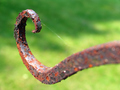
Octopus Gardenby eljay128Comment: Hey there from the Critique Club
Camera Work/Technical: Very nice focus and a terrific depth of field. The perfect point of your subject is nicely isolated from the background using great colors along with the great depth of field.
Lighting: Your subject is well lit, but the shadow/highlight contrast of the background is a bit distracting. Perhaps shifting your position a bit or waiting for a different time of day would have helped out.
Composition/Content: Your chosen composition is a great strength. The rusted iron provides a very nice leading line that pulls the eye right into the main focus of the image. The great depth of field keeps the eye on what is most important inside the frame.
My Opinion: Nice work meeting the challenge, as well as producing an image that is a good deal better than the 5.28 that it scored.
Eric
|
 Photographer found comment helpful. Photographer found comment helpful. |
| 06/09/2006 02:42:54 AM |
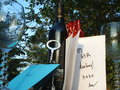
Birthday greetings, bottle of wineby snafflesComment: Hey there from the Critique Club
Camera Work/Technical: Everything in your frame is nicely focused. Your colors are spot on, this your chosen white balance is also on.
Lighting: You chose a great time of day for this capture. Your lighting produced a very peaceful feeling with great highlight and mild shadows.
Composition/Content: The composition is a bit too busy and feels too crowded for my personal taste. I think composing this one without the blue envelope or the glass on the left would have loosened it up a great deal.
My Opinion: Terrific job meeting the challenge, and with a slight composition change, this one would have scored much higher.
Eric
|
| Photographer found comment helpful. |
| 06/09/2006 02:36:35 AM |
Dusty Old Lampby dahvedComment: Hey there from the Critique Club
Camera Work/Technical: Your image is nicely focused and the exposure is near flawless. You did a really nice job capturing nice detail on the lamp as well as on the wall.
Lighting: Very nice and very peaceful. The lighting you represented here lends a very moody presentation. I like it.
Composition/Content: For such a simple subject, you produced a very nice composition. You contrasting lights and darks works very, very well together to keep the viewer's eye flowing through the image.
My Opinion: Technically, you have a near flawless image. Your lighting is great and your composition in wonderful. I think your score suffered only because you subject is fairly commonplace. I believe that the voters need more vibrant color most of the time to hand out better scores. Even still, you produced a very nice image. Great work.
Eric
|
| Photographer found comment helpful. |
| 06/09/2006 02:25:46 AM |
"A taste of honey... tasting much sweeter than wine" -Please Please Meby br o kenl o veComment: Hey there from the Critique Club
Camera Work/Technical: Nice focus. Your bloom detail turned out nice and crisp. I would like to see a more shallow depth of field. Opening up that aperture would really make the bloom jump off or a blurred background.
Lighting: I like the time of day you chose to shoot this, as it did a fine job separating your background and foreground. You did lose a little detail on some of the bloom petals with some slight overexposure.
Composition/Content: I am not too fond of the centered composition for his particular image. I think opening up the crop a bit and shift you position to one side would have greatly improved the composition.
My Opinion: I think it met the challenge just fine. I am not familiar with many of the Beatles' songs, so your title helped out.
Eric
|
| Photographer found comment helpful. |
| 06/09/2006 02:18:25 AM |
I want to hold your handby KitaComment: Hey there from the Critique Club
Camera Work/Technical: The gaussian blur makes it a it difficult to tell where your focus is. Even beyond the GB, I can still see some crisp focus on the nails and the rings. I believe I would have opened up the aperture a bit to add some blur to the background. This would have helped isolate the subject off the background a bit better.
Lighting: Your lighting is very nice and very even. The subject is lit very nicely, and the darker background helps isolate your subject.
Composition/Content: I like your choice for a centered composition here. I think an even tighter crop would have made it even better.
My Opinion: Nice job meeting the challenge. With a little less blur on the foreground and a little more on the background, this one would have pulled an even better score.
Eric
|
| Photographer found comment helpful. |
| 06/09/2006 01:58:12 AM |
Curly Swirlsby TechoComment: Hey there from the Critique Club
Camera Work/Technical: This is a very interesting image that appealed well with the voters. Perhaps it is my aging eyes, but the focus seems a little soft to me. Very nice post-processing to render an image that the voters would love.
Lighting: Near flawless, and this, of course, is the strength of the image. The lighting you chose for this setup made for a terrific textured feel.
Composition/Content: Excellent, as well. The shapes play together very well to keep the viewer's eye moving throughout the entire image.
My Opinion: You created a very appealing, vibrant image that the voters loved. Congratulations on yet another top ten finish.
Eric
|
| Photographer found comment helpful. |
| 06/08/2006 08:11:54 PM |
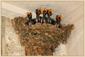
"Crying, Waiting, Hoping"by MelethiaComment: --Trading Post Comment--
First of all, congrats on your best scoring photograph to date. I would encourage you to include your post-processing in the Photographer's Comments along with the great info that you've already included.
Camera Work/Technical: Great, crisp focus and a nice job keeping the entire scene in focus.
Lighting: The lighting is very even. I think I am reading that you used the on camera flash. If that is indeed the case, you did a fine job with it.
Composition/Content: Not bad, but I think that a portrait style crop might have worked better than the landscape. I find myself wanting to see the bottom of the nest.
My Opinion: This is a very nice image and a well-deserved top 15 finish. I think that I would have used a white border and shot it in portrait orientation. I think this one would have broken 7 with those two changes.
Eric
|
| Photographer found comment helpful. |
| 06/08/2006 08:04:59 PM |
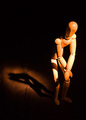
unwilling modelby timfythetooComment: --Trading Post Comment--
Camera Work/Technical: Man, that's nice focus on the most important part of the subject. Add to that the terrific depth of field you used, and you end up with a great shot.
Lighting: Very creative and very interesting. I really like the profile-type of image you produced with your light positioning.
Composition/Content: Very nice. While the lit part of the face is centered, the rest of the image works very well to keep the eye flowing. The centering adds strength to the image.
My Opinion: Well seen, well captured and well processed. Another fine production.
Eric
|
| Photographer found comment helpful. |
| 06/08/2006 07:56:01 PM |
Woody Presleyby tngrndreamComment: --Trading Post Comment--
First off, always try to include some info about the shot in the Photographer's Comments section. It really helps out when we know what the photographer was thinking and what equipment/lighting/etc. were used, especially when you request a critique. Secondly, congrats on your highest scoring photograph to date, as well as a top 100 finish.
Camera Work/Technical: You did a terrific job keeping all elements in crisp focus to render very nice detail.
Lighting: Excellent lighting. This is the strongest element in the photograph. Wonderful job capturing the detail around the shadow.
Composition/Content: Again, very nice. You created a composition that allows the eye to flow around the key elements very nicely.
My Opinion: Nice job meeting the challenge, but your subject has become commonplace around DPC. I think that the voters echoed the same feeling with their votes. This is a far better image than the 5.67 that it scored, but voters tend to vote lower when they see similar subjects over and again.
Eric
|
| Photographer found comment helpful. |
| 06/08/2006 07:46:52 PM |
A Glass of Wine with a Bottle to Goby chaliceComment: --Trading Post Comment--
Camera Work/Technical: No offense to any of your previous, but this your best technical shot, in my opinion. I like the crisp focus and the amazing detail you captured. The neat image was just a hair too much, giving some pixel distortion to parts of the wine bottle.
Lighting: I like it, but it's just a hair too harsh. Nice idea, and I think toning it down just a bit would have helped. The one area of the wine glass is too exposed. Outside of that, this is a fantastic capture.
Composition/Content: Really nice. The tight crop and composition that you created works very, very well for this subject. The wine bottle serves well to draw the eye in and up to the glass.
My Opinion: Your score suffered because of so many fantastic entries into this free-study type challenge. This is a terrific shot that would have scored much better had there not been so many other fantastic entries to compete against.
Eric
|
| Photographer found comment helpful. |
Home -
Challenges -
Community -
League -
Photos -
Cameras -
Lenses -
Learn -
Help -
Terms of Use -
Privacy -
Top ^
DPChallenge, and website content and design, Copyright © 2001-2025 Challenging Technologies, LLC.
All digital photo copyrights belong to the photographers and may not be used without permission.
Current Server Time: 08/07/2025 05:35:15 AM EDT.