| Image |
Comment |
| 12/15/2006 03:30:25 AM |
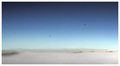
Flight Pathby BradComment: I really like this minimalistic feel. This is my second favorite of the challenge, and I hope it does very well. My only critique is the bird on the far left. It looks like a dust spec on my monitors, and I might have considered cloning that one out. |
 Photographer found comment helpful. Photographer found comment helpful. |
| 12/15/2006 03:30:22 AM |
Pining for the cedarby snafflesComment: It is sky, and it does hold a certain interest. I think that is needs a bit more to really hold the viewer. |
| Photographer found comment helpful. |
| 12/13/2006 02:06:07 AM |
|
| Photographer found comment helpful. |
| 12/08/2006 03:11:56 PM |
Aging Gracefullyby Dr.ConfuserComment: Hey there from the Critique Club
Camera Work/Technical: Terrific focus and perfect white balance to provide a very warm feeling to the capture. I do like your depth of field choice that provide the bokeh feel that emayner mentioned.
Lighting: Pretty nice work with very harsh lighting conditions. My only issue with the lighting is the harsh shadow on the left leaf, as well as the part of the branch. This creates a dark hole that distracts the eye, thus trapping it into one area of the image.
Composition/Content: Your chosen composition is just a bit tight. The leaf touching touching the bottom of the frame creates a feeling of tension that contradicts the overall warmth of the image.
My Opinion: I like it, and I think that the scoring was appropriate. While it is diagonal, I don't think that it captured the spirit of the challenge (nor did my sub-5 entry). If this were a bokeh challenge, I think the score would have peaked a bit closer to 6.
Eric
|
| Photographer found comment helpful. |
| 11/21/2006 08:17:49 AM |
Empty Sundayby rexComment: Very nice, and a pretty nice score to match. Congrats, bro.
E |
| Photographer found comment helpful. |
| 11/20/2006 01:32:51 AM |
|
| Photographer found comment helpful. |
| 11/20/2006 01:31:47 AM |
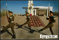
Kyrgyz Strengthby srichmondComment: Great subject and idea, but the missing foot from the front soldier hurts this one. It leads the viewer's eye right out of the frame. |
| Photographer found comment helpful. |
| 11/20/2006 01:30:24 AM |
|
| Photographer found comment helpful. |
| 11/20/2006 01:29:28 AM |
|
| Photographer found comment helpful. |
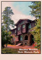
| 11/20/2006 01:28:24 AM |
Riordan Mansion State Historic Parkby elizadebComment: I see some color banding in the clouds, almost as if this one is over saturated. I do like the subject and composition, but it looks like your post-processing detracts from the end product. |
| Photographer found comment helpful. |
Home -
Challenges -
Community -
League -
Photos -
Cameras -
Lenses -
Learn -
Help -
Terms of Use -
Privacy -
Top ^
DPChallenge, and website content and design, Copyright © 2001-2025 Challenging Technologies, LLC.
All digital photo copyrights belong to the photographers and may not be used without permission.
Current Server Time: 08/09/2025 12:33:36 AM EDT.